
Brand Identity
Brand identity is more than a logo — it is a brand's whole visual system, from the first glance to the first touch. Making logo, colour, texture and typography work in harmony takes an aesthetic eye, a systematic approach and a consistent process.
What brand identity includes
 01
01Design horizons
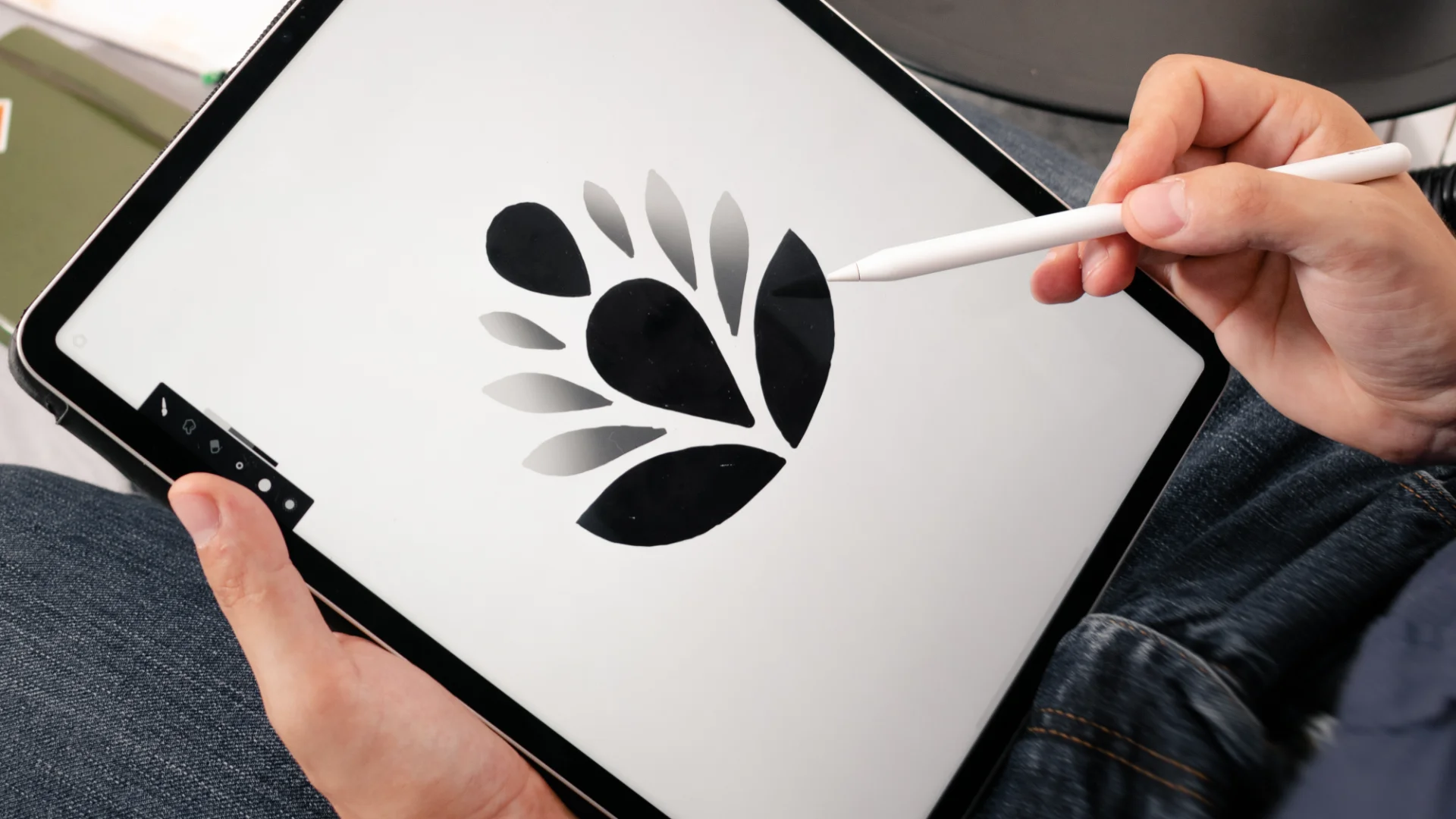
Before we draw a single line, we need to be sure we are looking in the same direction as our clients. Design horizons are visual worlds — not logos, not final design, but a feeling. They show where the brand could go, before we set off down the road together.
 02
02Trademark and logotype
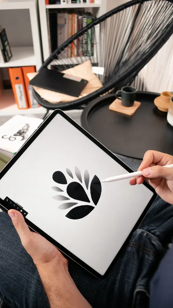
The mark is the face the world sees first — and the last thing that stays in a customer's mind. Done well, it does not simply identify: it accumulates trust with every encounter. Until the day it becomes a symbol of all the value your brand offers.
 03
03Typography
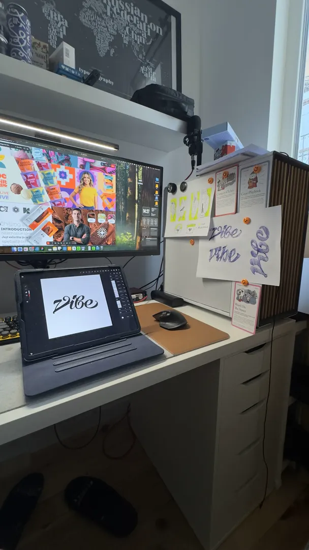
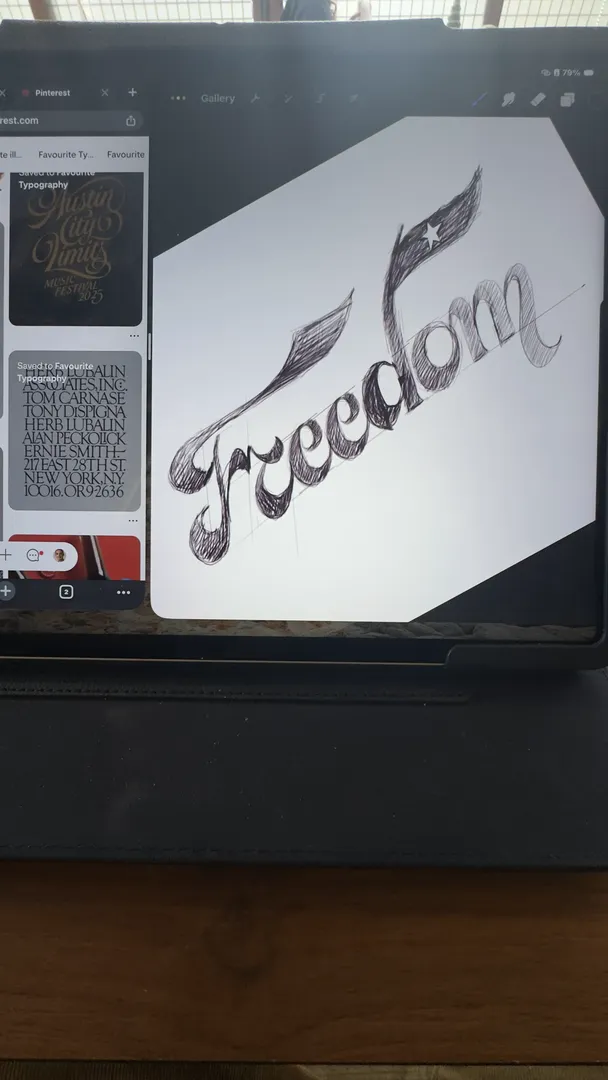
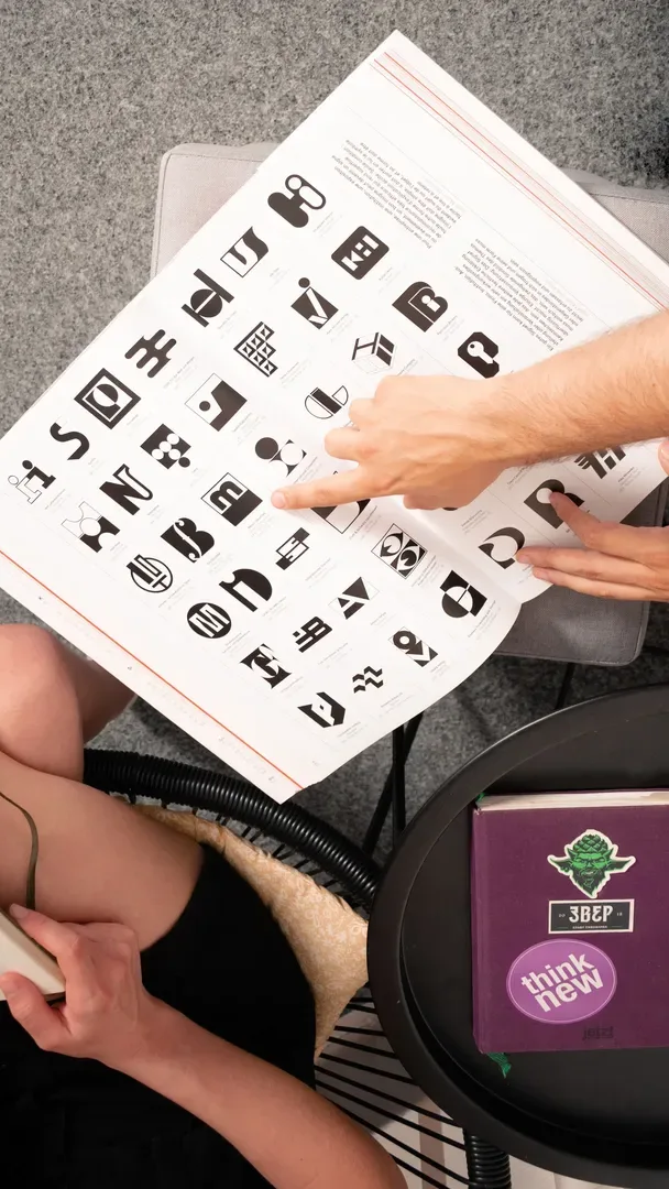
Most people pay no attention to typography. That does not mean it has no effect on them. Letters are the quiet voice of the brand, speaking sometimes with weight or lightness, with authority or warmth. Type systems are not a simple choice of font, but a choice about how you are present and how you feel at every point of contact with your audience.
 04
04Colour
If letters set the rhythm, colour is the melody. The colour system is the one element of a brand that acts before the brain has read a word. It does not persuade — it provokes. The right colour system does not just set you apart from the competition, it sets the emotional tone of every encounter with the brand.
 05
05Secondary graphic elements
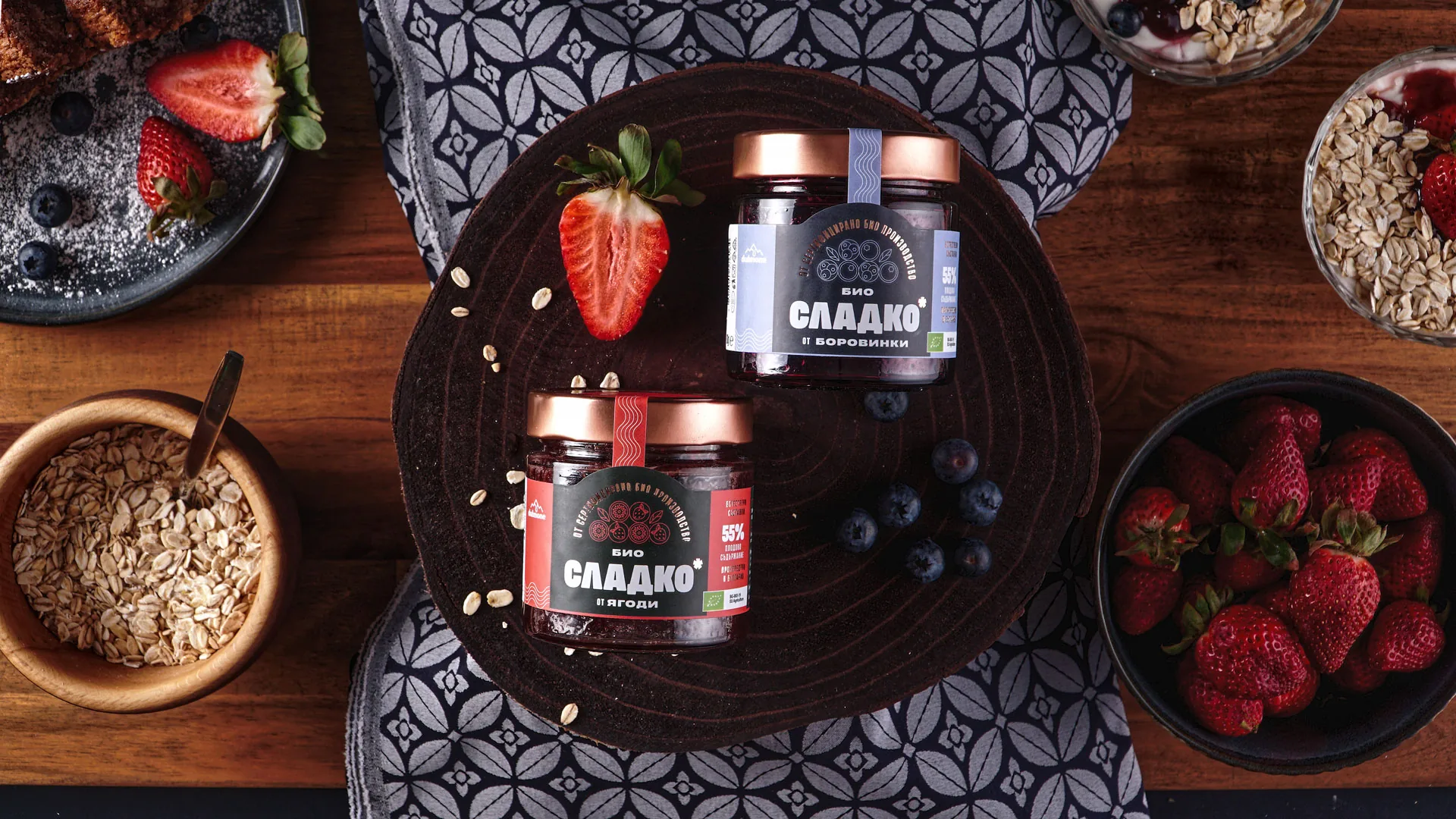
A brand does not live in the logo alone. It shows up everywhere — in the icons on the website, in the patterns on the packaging, in the illustrations on social media. The supporting design system is the language that binds all these elements into one consistent visual experience.
 06
06Animation & Motion
Movement is emotion. Animation breathes life into a visual identity — especially in the digital space, where attention is the most contested resource there is. The right motion does not just catch the eye, it holds it. And the more time someone spends with your brand, the less room is left for your competitors.
 07
07Brand guidelines
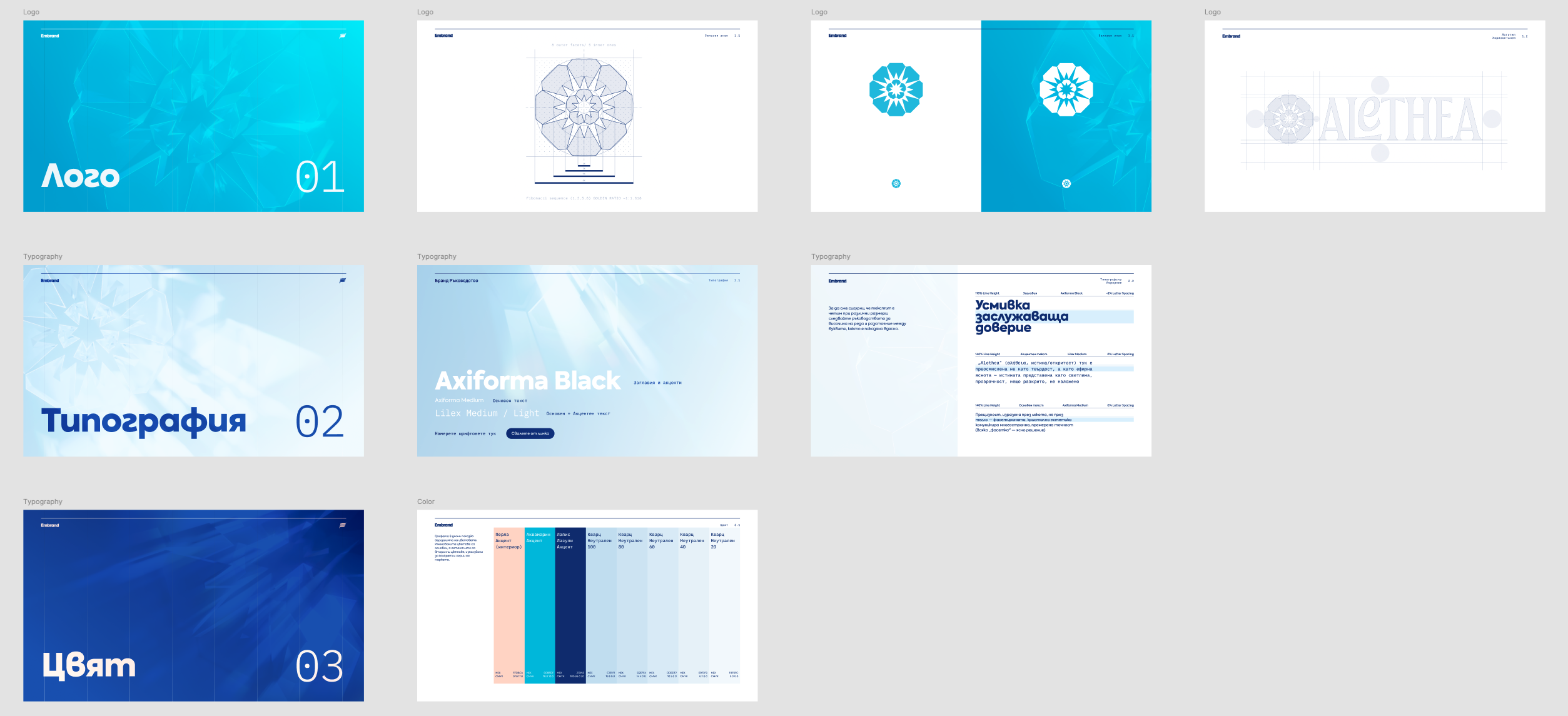
As a business grows and the team expands, more and more people start communicating the brand, and with that comes the risk of dilution. Brand guidelines are the document that makes sure everyone is on the same page about how the brand should look and feel.

Who it's for
Brand identity is for you if you know your business is far more valuable than it looks right now.
If your brand looks inconsistent and unconvincing because there are no clear standards for the team to follow.
If customers doubt the value of your business, or the care you put into it.
If a new product launch, a new market, a funding round or another high-stakes change is coming, one that needs full confidence in your brand.
It's not for you if you see design as surface decoration rather than an investment in lasting recognition. A brand identity is a living system: it takes time and attention before it starts paying dividends.
How the process works
Goal setting
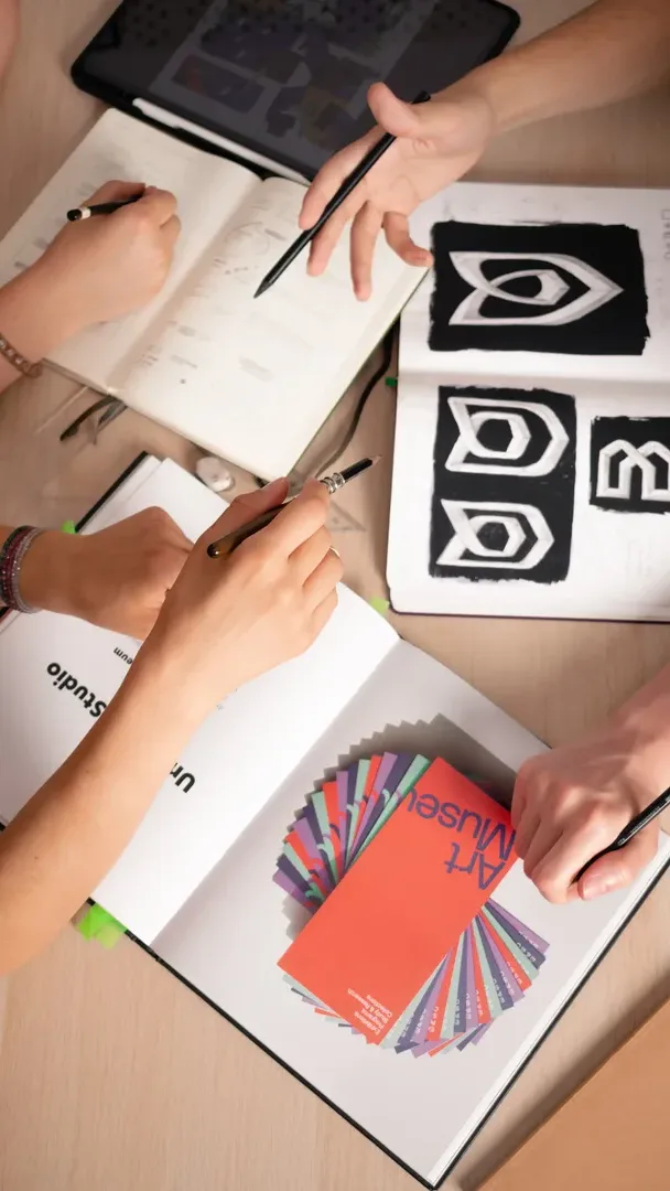
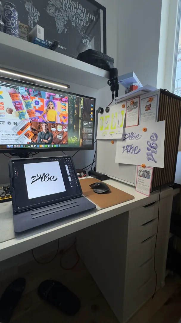
We pin down what sets you apart and what your audience is looking for. If there is already a brand strategy, it is the starting point for our research.
Design horizons
We explore many possibilities for the look and feel your brand could use to reach the goals of the brand strategy.
Design direction
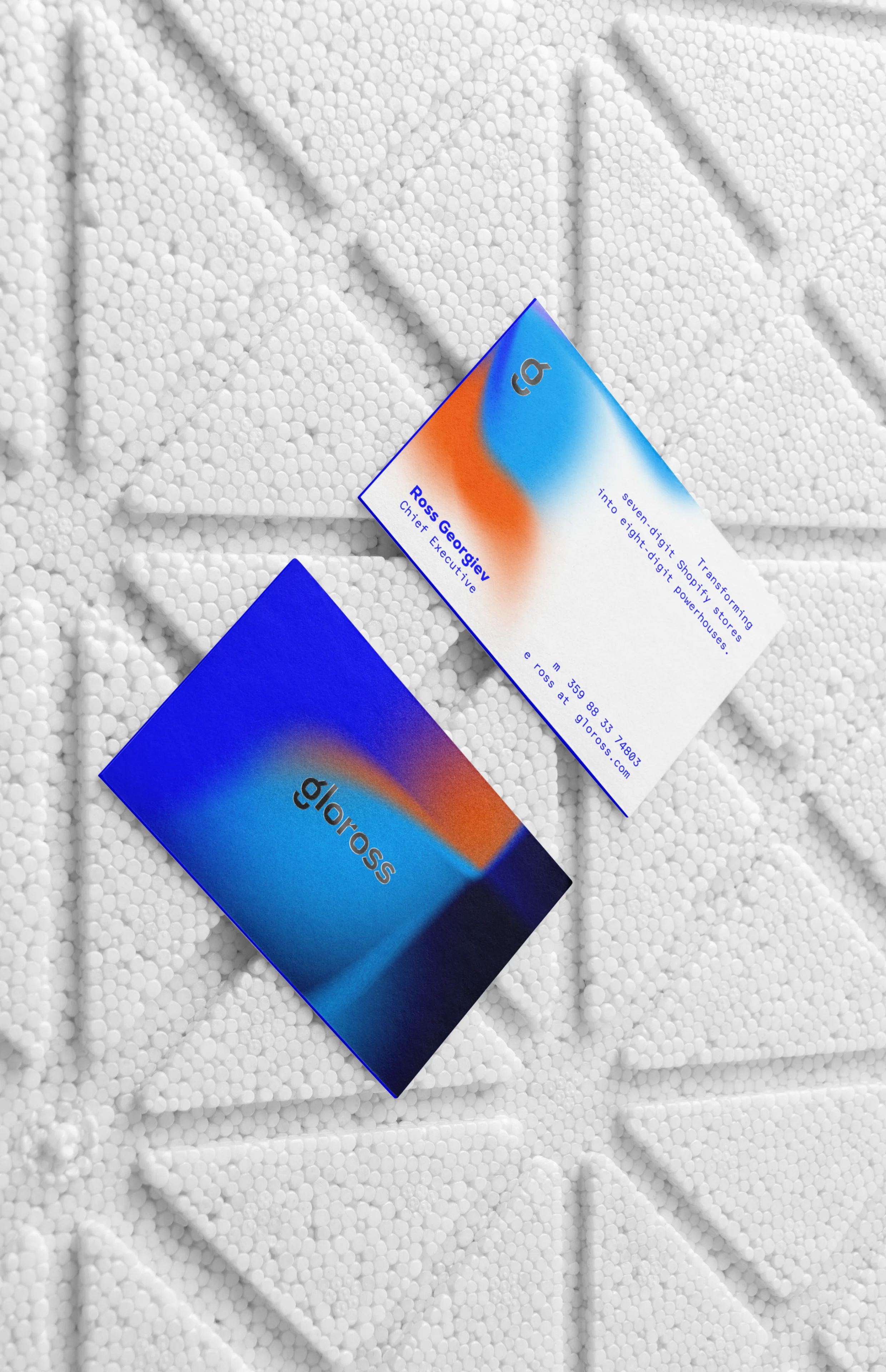
We refine the chosen design direction and present it so you can experience and feel it before you put thousands of euros into production and advertising.
Design system
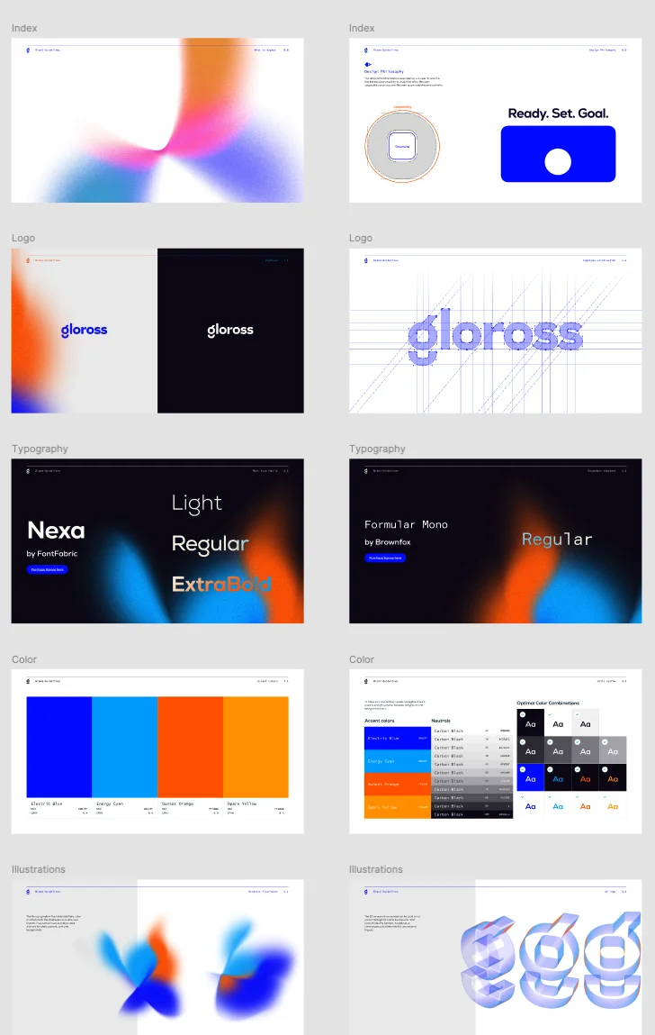
We carefully document every element of the brand identity, so your brand grows with confidence and consistency, whichever team you work with in future.
Timeline and investment
Timeline
at least 4 weeks
With well-set parameters and a brand strategy in place. The more ambitious the design system, the longer it takes to refine.
Investment
from €2,500/
monthFor new businesses, and those looking for everything they need for their first communication — trademark and logotype, typography, colour, application examples and brand guidelines.
Format
Flexible monthly engagement
Business is dynamic and expectations keep changing, so we let the project's scope narrow or widen as the work goes on.
Capacity
Up to 3 clients at a time
We aim to put our full attention into every project we work on, so we keep the number of new projects in line with our small team.
Part of our toolkit
 Affinity
 Figma
Figma
 Blender
 Cavalry
Featured project: Brand Identity
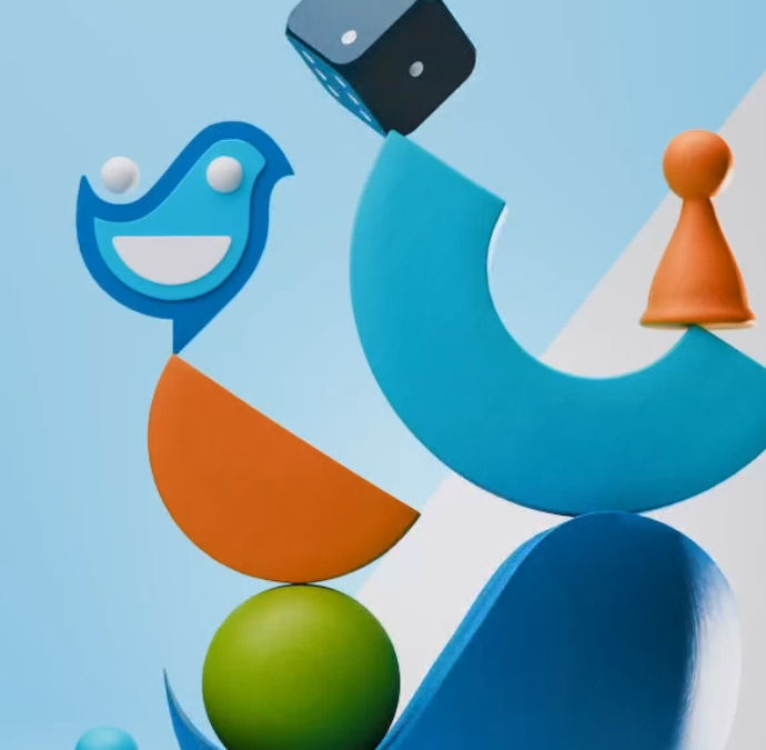
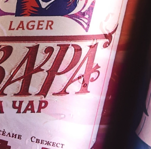
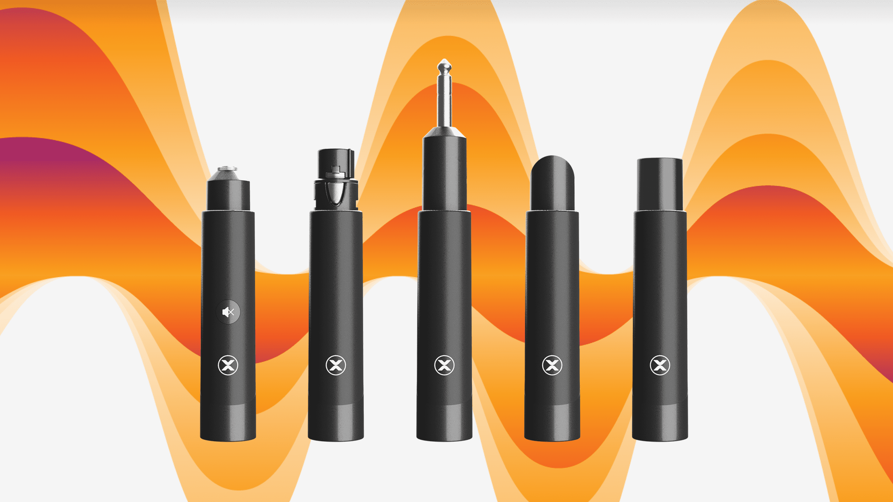
Every idea has its place. Let us talk about yours!
Questions we often get
What's the difference between a logo and a brand identity?
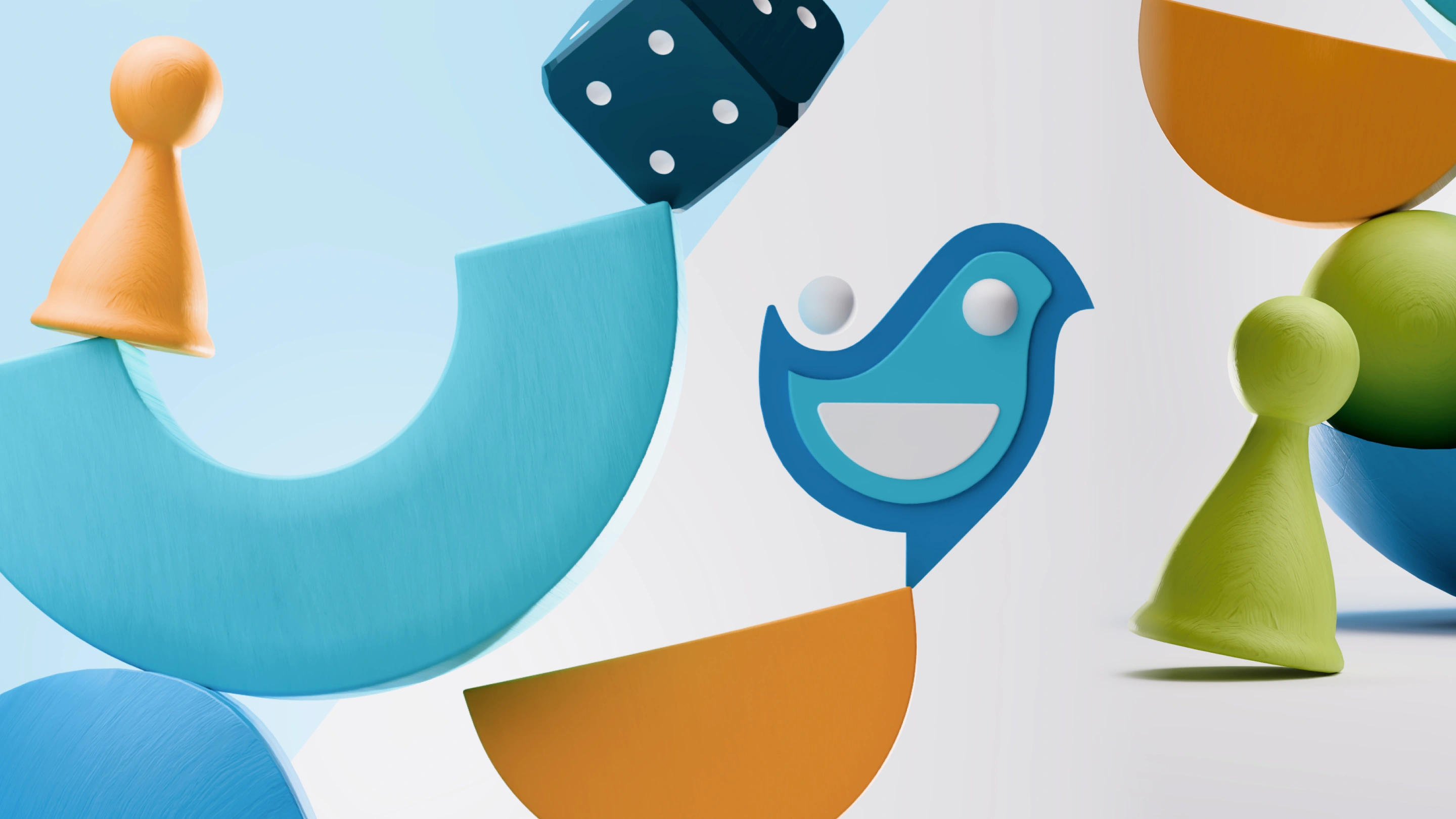
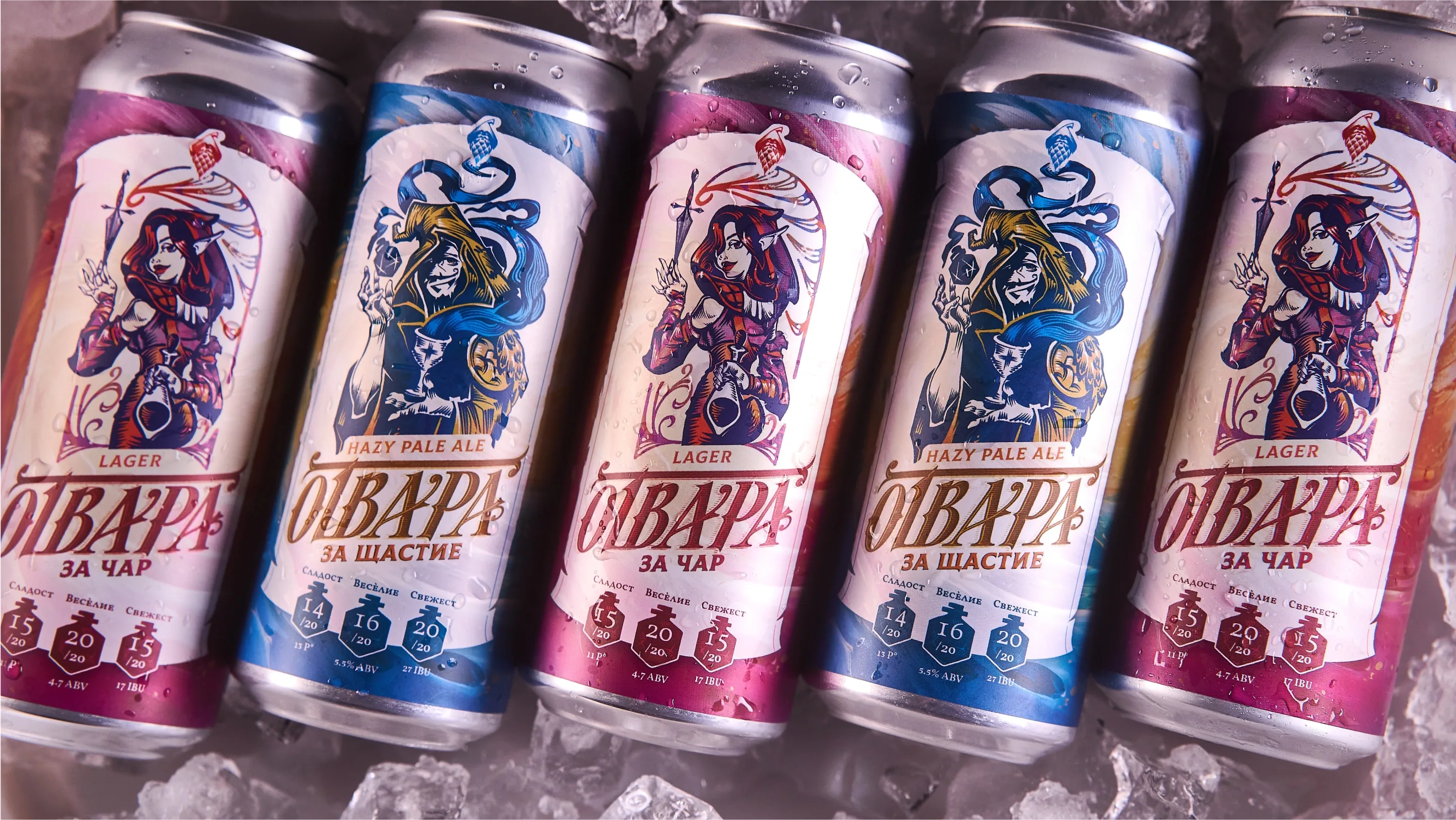
A logo is one element; a brand identity is the system that element lives in. Besides the trademark, it includes typography, colour, secondary graphic elements, motion and rules of application — everything that makes a brand recognisable even when the logo isn't visible. The full list is in “What it includes” above, and what it looks like as a finished system you can see at Отвара за Щастие.
How many design options will I see?
It all depends on the goals we set together. Our team always works through many directions, but we only discuss with you the ones that genuinely resonate with the brand's goals. Sometimes, the more choice we offer, the less certain our clients feel. So our focus isn't simply to give options — but ones that really stand out.
How long does it take to build a brand identity?
At least 4 weeks when a brand strategy is already in place. The more ambitious the design system, the longer it takes to refine. Most of that time isn't sketching. First comes research — what the business offers, how it is useful, how it stands apart, and what its audience is looking for. Then we generate 2–3 design horizons and narrow them down to the few that really carry the message. Then the brand identity is presented, and only at the very end comes finalisation and documentation. If the project also includes brand strategy or brand naming, each of those phases adds time before the design. Rushing is paid for later — a brand identity without a foundation doesn't hold up outside the mock-up.
What comes first — brand strategy or design?
Brand strategy. Without it, every visual choice is a beautiful guess, because there is nothing to judge whether it is right against. Brand strategy answers who you are, who you are talking to and why that is valuable to them in particular; only then does the design have something to express. At TYXIT, exactly this order is why the brand identity won investors' trust and not just fans' interest.
How do I know whether I need a rebrand or just a refresh?
Start from the cause, not the look. If the business has changed its audience, its market or its promise. If the change is fundamental rather than a gradual evolution, the problem is strategic and is solved with a rebrand. If the positioning is right but the execution is dated or inconsistent, a refresh of the existing system is usually enough. That is exactly what the first conversation is for — and we say honestly which of the two we see.
Why shouldn't I use a ready-made logo from the internet or an AI generator?
Two reasons. The first: someone will find out. Even if you tell yourself nobody will notice, it usually comes out — and the consequences are both legal and reputational. For a brand that wants to lead its category, that is a risk of lawsuits and lost revenue, not a minor detail. The second: on its own a logo means nothing — it is a vessel for the meaning the brand holds in the customer's mind. A ready-made mark doesn't know who you are talking to, who you compete with or how it will look on a pack, a sign or a screen. The difference is between a picture and a system.
What files do I get at the end?
Vector originals of the mark and logotype, print and screen formats, fonts with their licences, colour values for print and digital use, secondary graphic elements and brand guidelines that explain how everything is used. The aim is for your team to work without depending on us — and without having to guess.
Do you work with clients outside Bulgaria?
We have experience with clients from all over the world, which makes it easy for us to adapt to any organisational, time-zone and communication needs. We work in Bulgarian and English, and our time zone is EET (UTC+2/+3).
Perhaps what you need is
We have already helped brands around the world like









Embrand studio did an awesome job on our branding. They proposed multiple options, with a lot of explanation of their impact on the target audience. We were very impressed, and we managed to do great work together.

I am impressed by how deep he goes, wants to understand the needs of my brand, takes my thoughts into account. Then he structures and packages them in the name of the brand's success. Sasho does not work for the sake of his own portfolio, but as he believes is best for the needs of the brand he is creating.
Alex and the team at Embrand Studio are always giving you their best in both creative / out of the box, and methodical / rational thinking. They go the extra mile to get to know and understand your business, so that the end solutions they come up with can benefit the niche you're operating in and help you stand out from the crowd.