Home → Branding glossary → Colour system
Colour system
Colour is the one element of a brand that acts before the brain has read a single word — striking straight at emotion and our limbic system. That is why we shouldn't waste the chance to use it with purpose.
The three jobs of colour
Colour has three jobs, in exactly this order: legibility, recognisability and, only last, distinction. Most designers turn this pyramid upside down — they chase being different before paying attention to legibility. Distinction comes last because to be different meaningfully (rather than for its own sake), you first have to be understood. Never sacrifice content for style.
What a colour is made of
Every colour has three parameters. Hue is the melody — it gives temperature and emotion. Saturation is the volume — how pure or muted the colour is. Value is the rhythm — how light or dark it is, and it holds the structure of the composition.
Legibility needs both: contrast in value and a difference in hue. Light blue and dark blue have contrast, but no difference in hue. Blue and yellow have both.
How we choose a harmony
Harmony follows the brand's personality, not personal taste. Achromatic (black and white) brings drama and sophistication. Monochrome brings calm and depth. Analogous brings harmony and nuance without the contrast shouting. Complementary brings energy and vibration. Split-complementary and triadic bring playfulness and richness, but also more noise that has to be kept in check.
That is why the system describes not only the palette but the roles: which colour is for backgrounds, which for text, which for accents — and which combinations are never used. Every colour is checked both on screen and in print.
What it looks like when it works
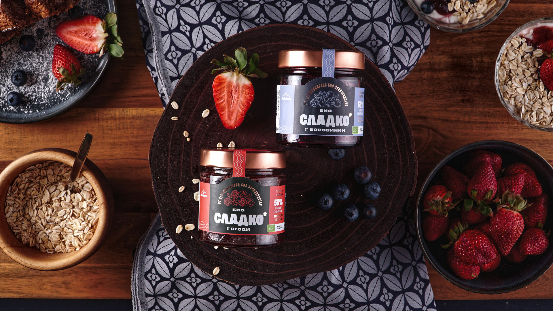
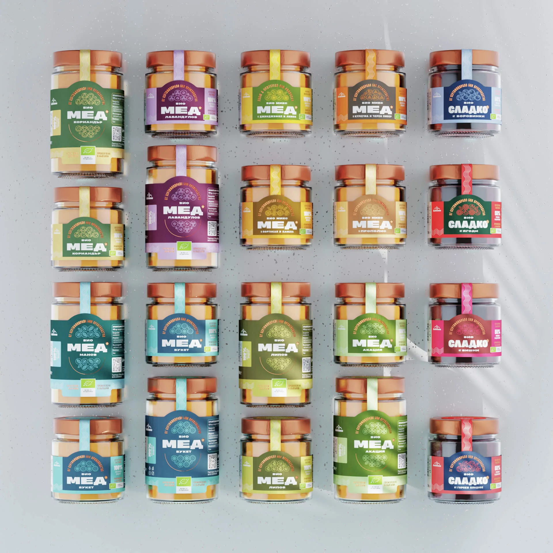
Recognisability always looks for a unifying principle. It is key to making more than forty different products from one brand feel like one design family. At Dulmone, colour sets each flavour line apart, while the system keeps the brand equally recognisable on the shelf in chains such as Billa and Lidl.
Related terms: Typography, Secondary graphic elements, Brand design system.