
Home → Branding glossary → Typography
Typography
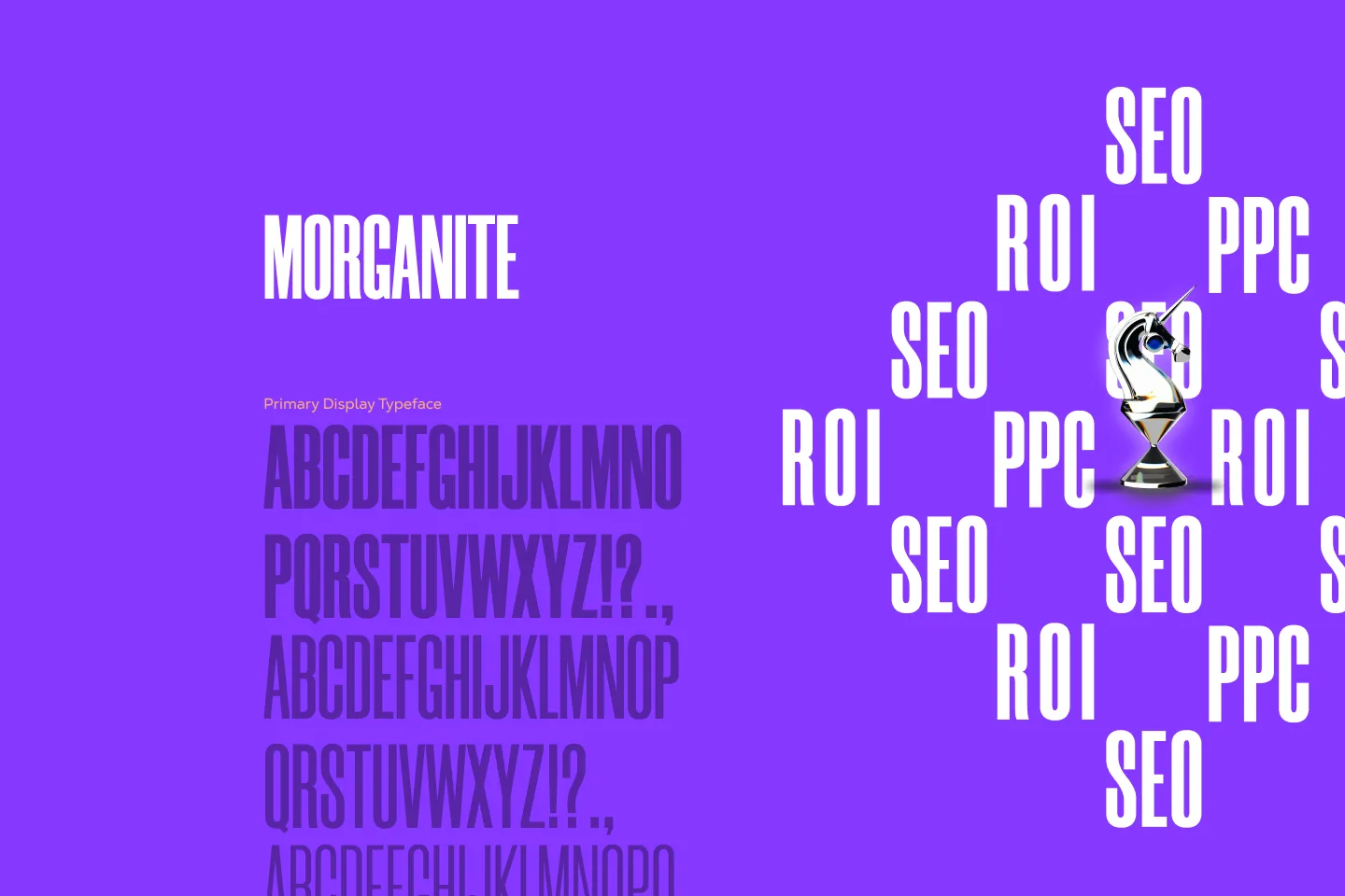
The typography around us is like the air we breathe. We often forget about it, but that doesn't mean its quality doesn't affect us.
Structure and emphasis
The shape of a text and its sense of weight and style work much like a musical composition — through a balance between structure and emphasis, between the familiar and the unexpected. Structure — a grid, consistent leading, measured spacing — creates a sense of security. But it can quickly turn into monotony and make the message white noise. Emphasis is the opposite force — deliberately breaking our own rules, because the brain registers anything surprising as important.
How hierarchy is built
Not all text is equal. Headings carry the essence of the message and should be seen at once. Body text should read easily and stay out of the way — the messenger must never matter more than the message. Notes and captions are there, but let the hurried reader skip them.
We set the sizes between them with a modular scale: a base (usually the body text size) and a constant ratio. With 16 pt body text and a ratio of 1.33, the headings become 21.3, 28.3 and 37.6 pt — different, but visibly part of one family.
How attention is directed
The strongest way to give a message weight is often not to add more of it, but to leave empty space — the way the important painting in a gallery gets a whole wall to itself. Then come the stronger tools: italics for delicate emphasis, bold (at least two weights above the body text), capitals — for headings only, and finally size. If you emphasise everything, you have emphasised nothing.
What it looks like when it works
The brand's type system fixes these decisions — families, weights, sizes and rules of use — so that the voice sounds the same everywhere instead of being reinvented with every new material. At YoungCeaser, classy typography and a disciplined system speak to an international audience. At Dulmone, precise typography sets each flavour line apart without the brand losing its recognisability on the shelf.
Related terms: Colour system, Trademark and logotype, Brand design system.