A packaging system for 23 organic honeys and jams in two languages — built in 2 months and taken onto Billa and Lidl shelves
Dulmone
THE SITUATION
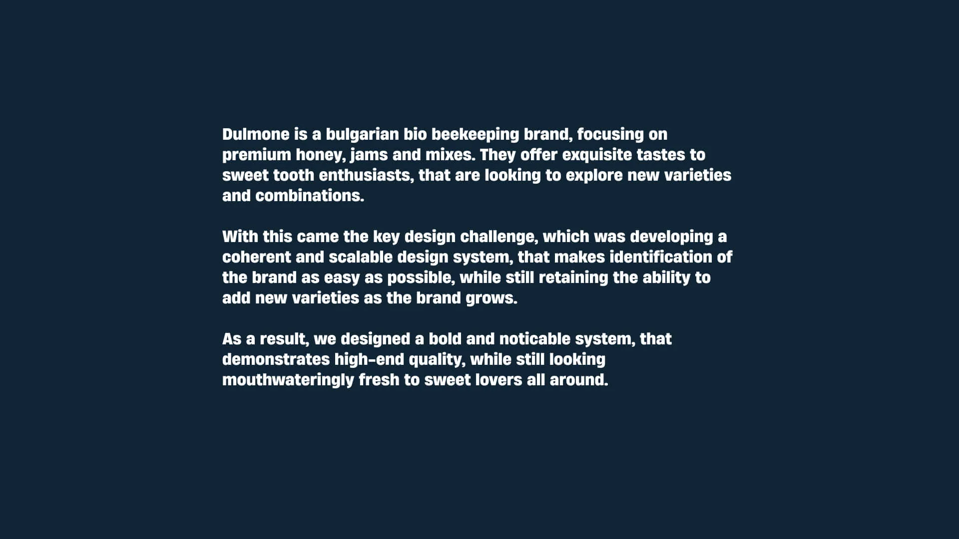
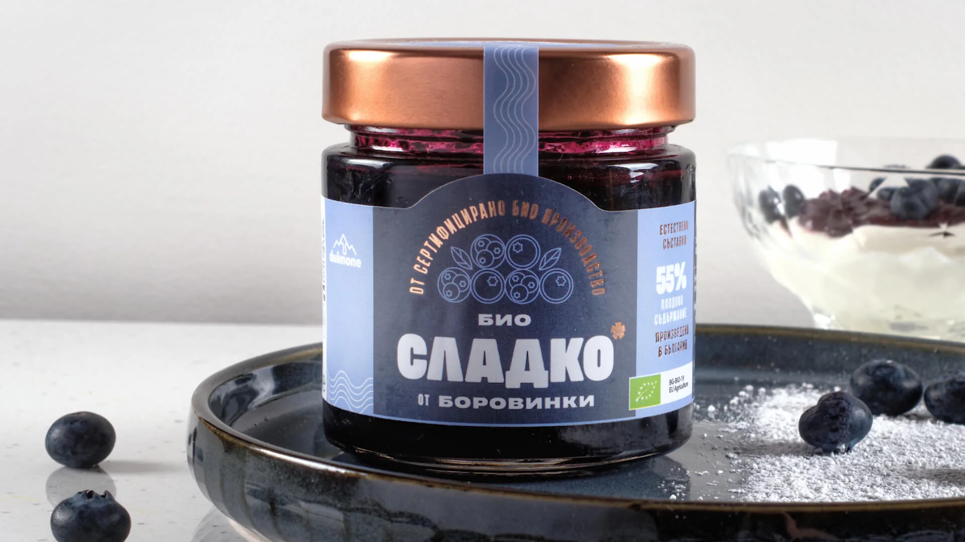
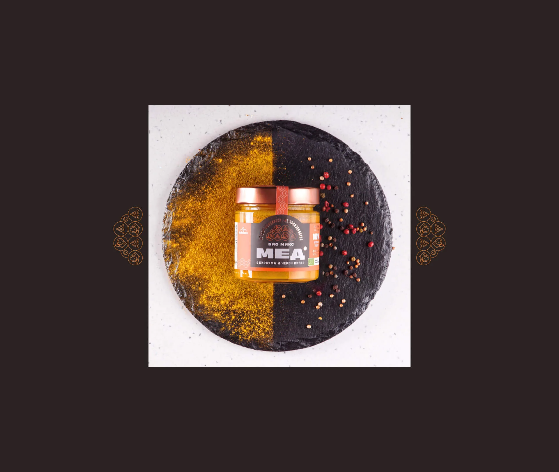
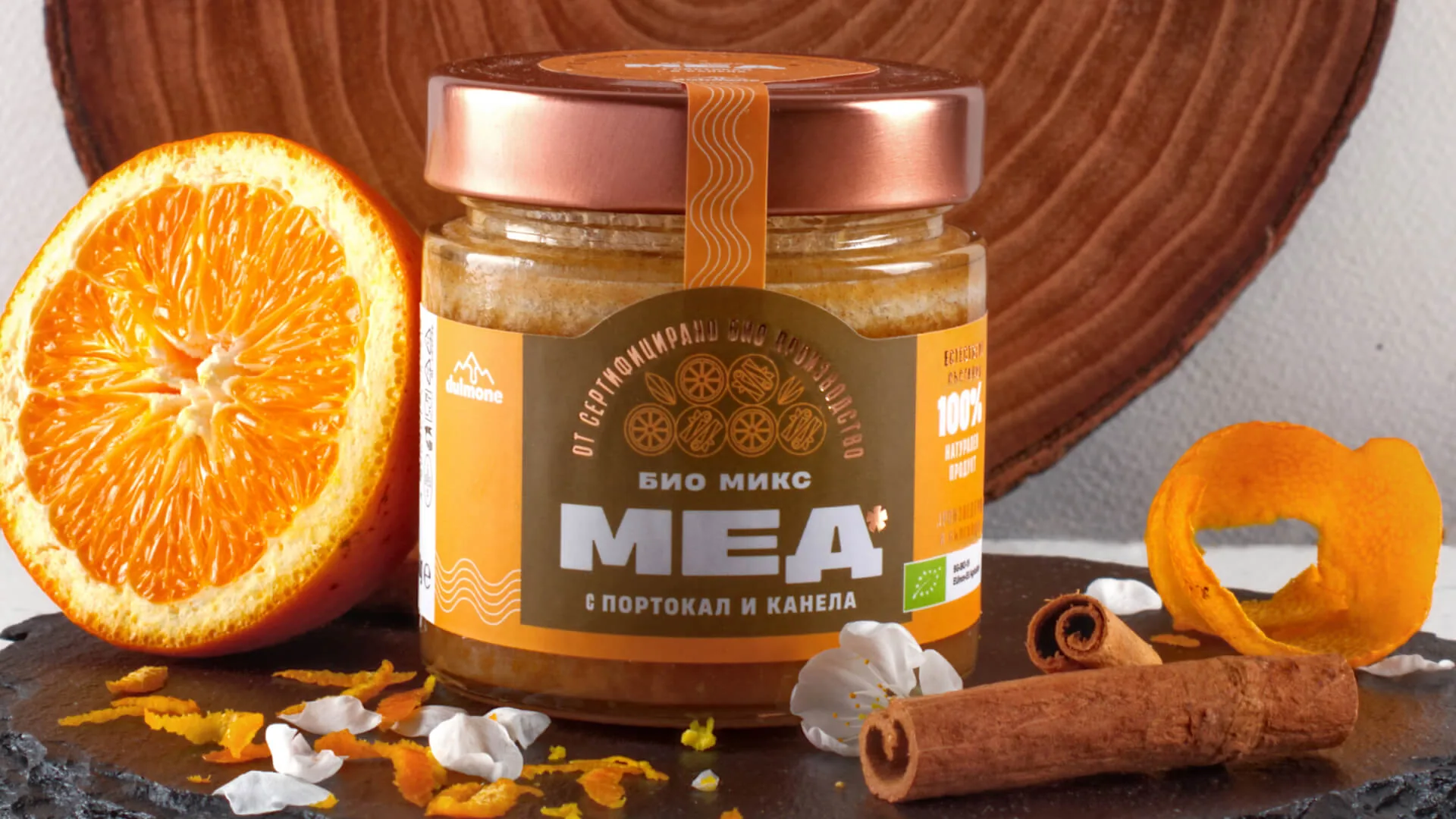
Dulmone is BG Hive's brand of organic honey, jams and honey blends from Plovdiv. The product was already on the market, but the brand needed a clear direction: what makes this honey valuable, and to whom. In a category full of look-alike jars, Dulmone wanted to look as appetising and unusual as its flavours. The brief was big: 23 products, each in Bulgarian and English, with plans to enter the German market.
WHAT WE DID
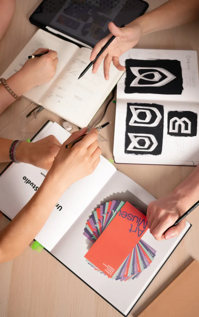
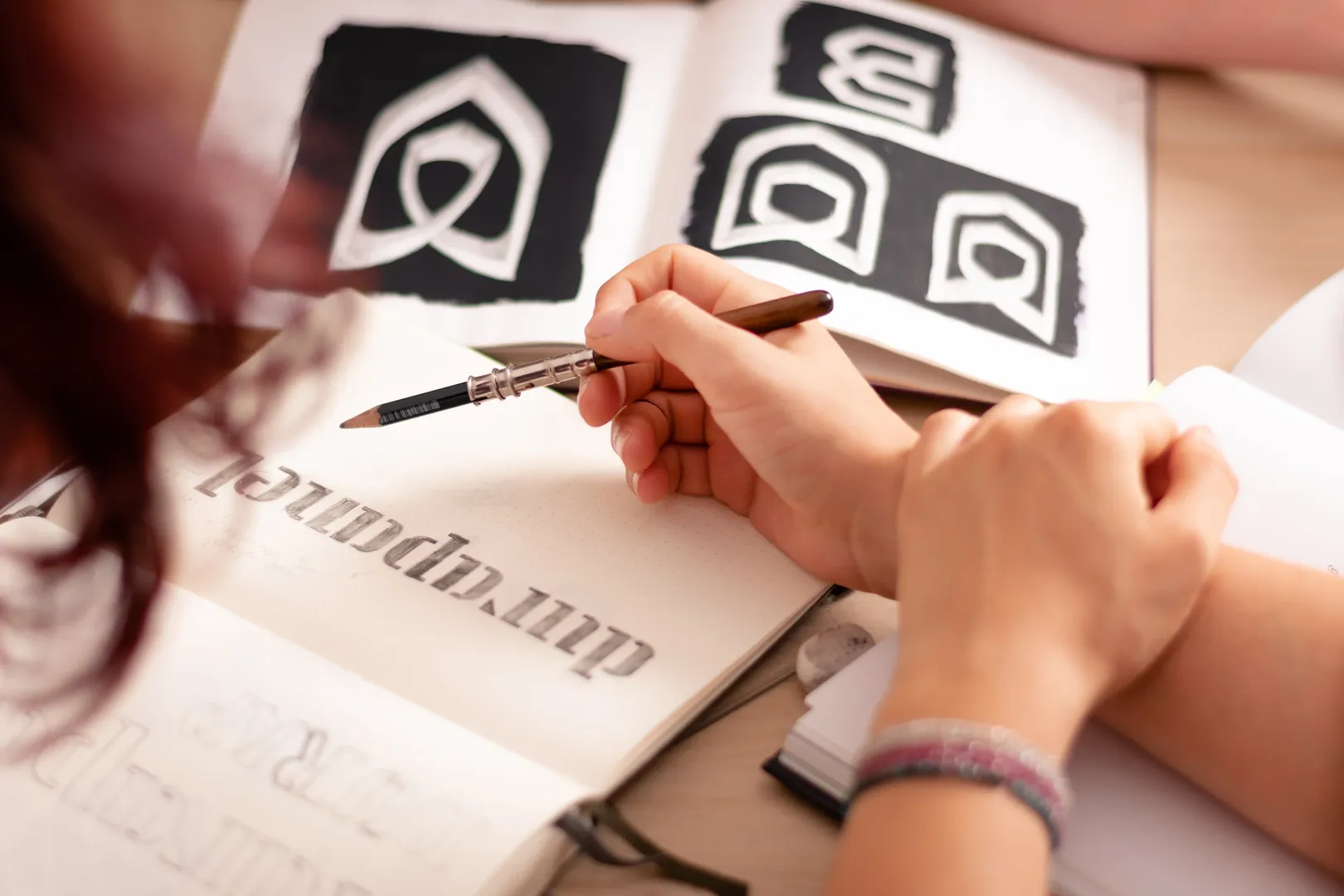
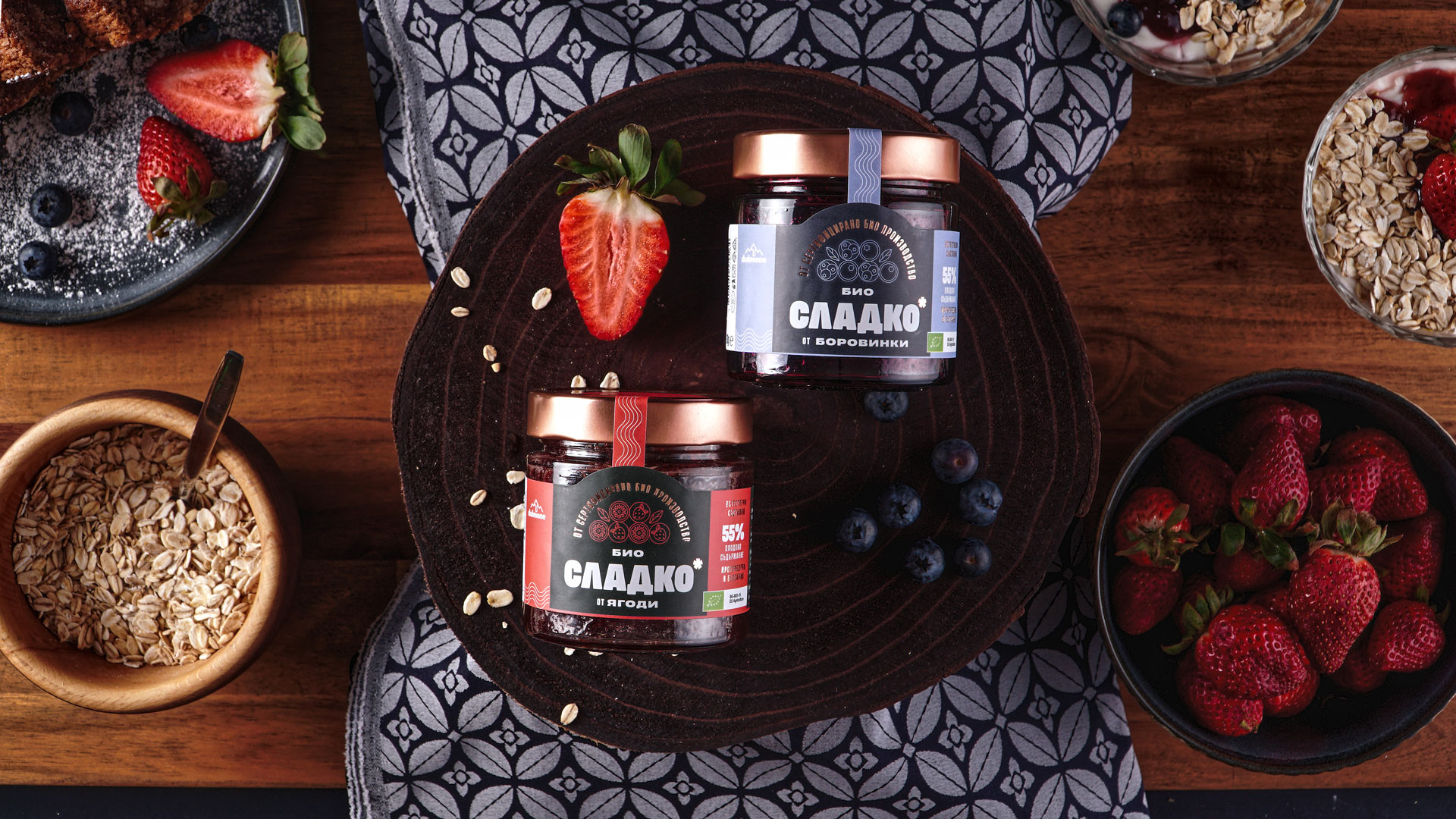
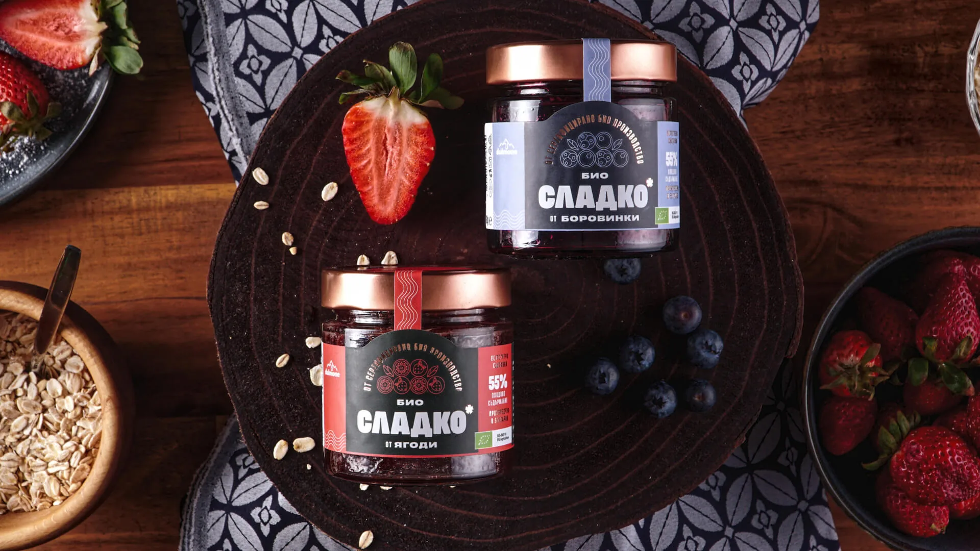
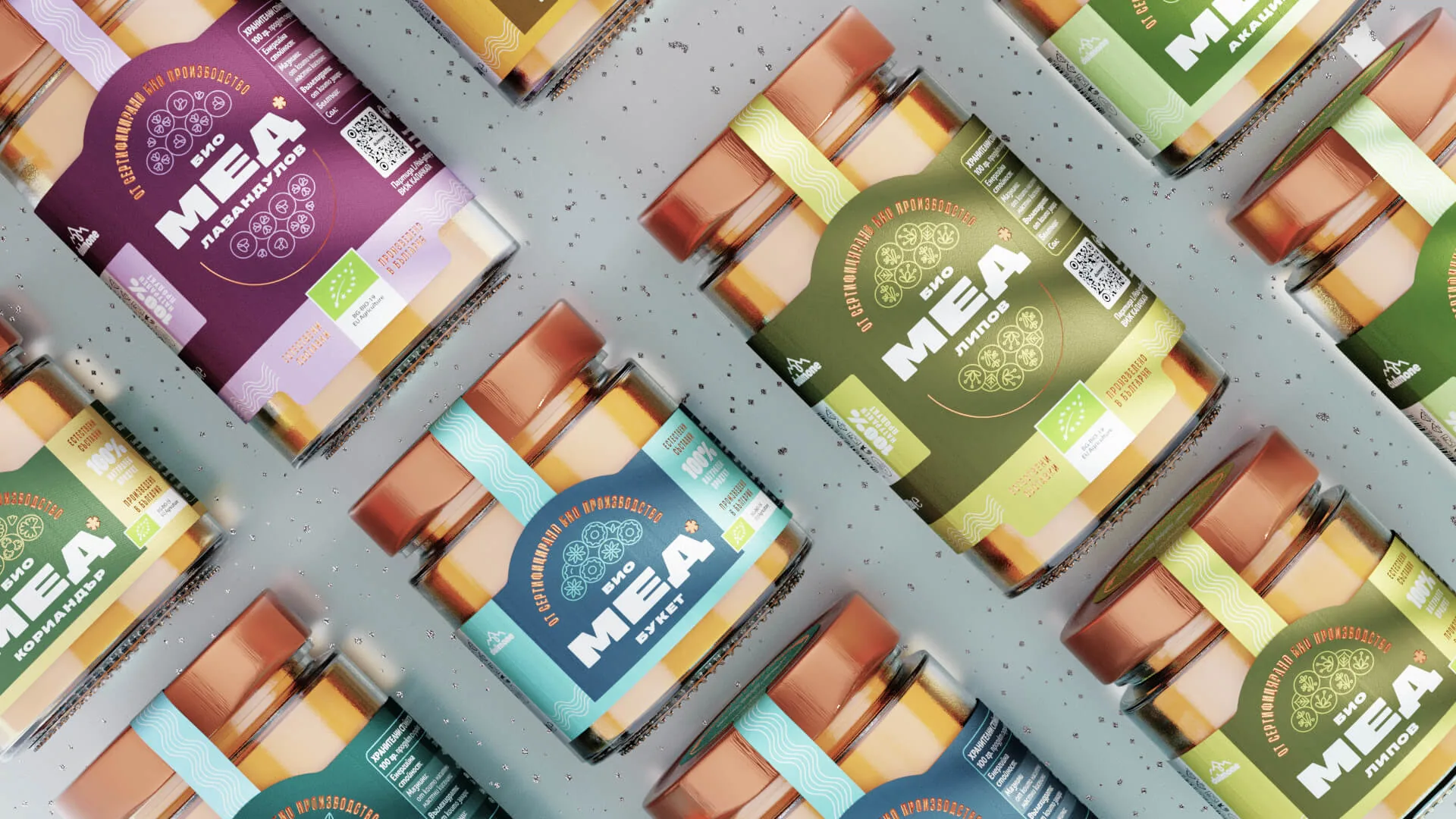
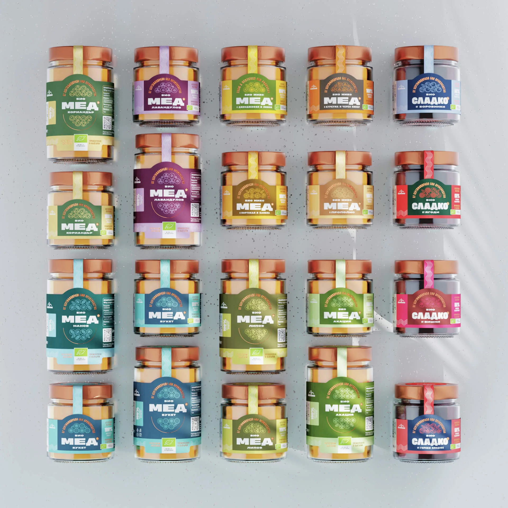
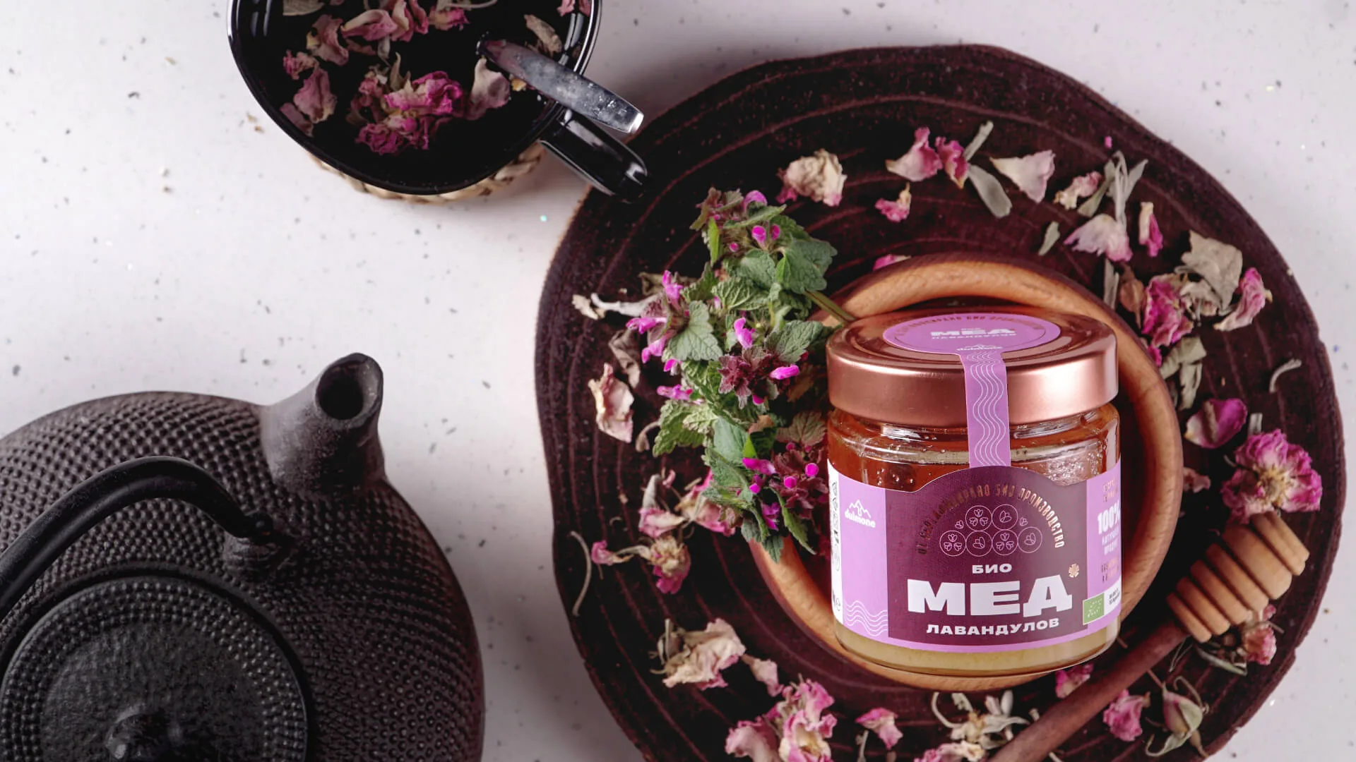
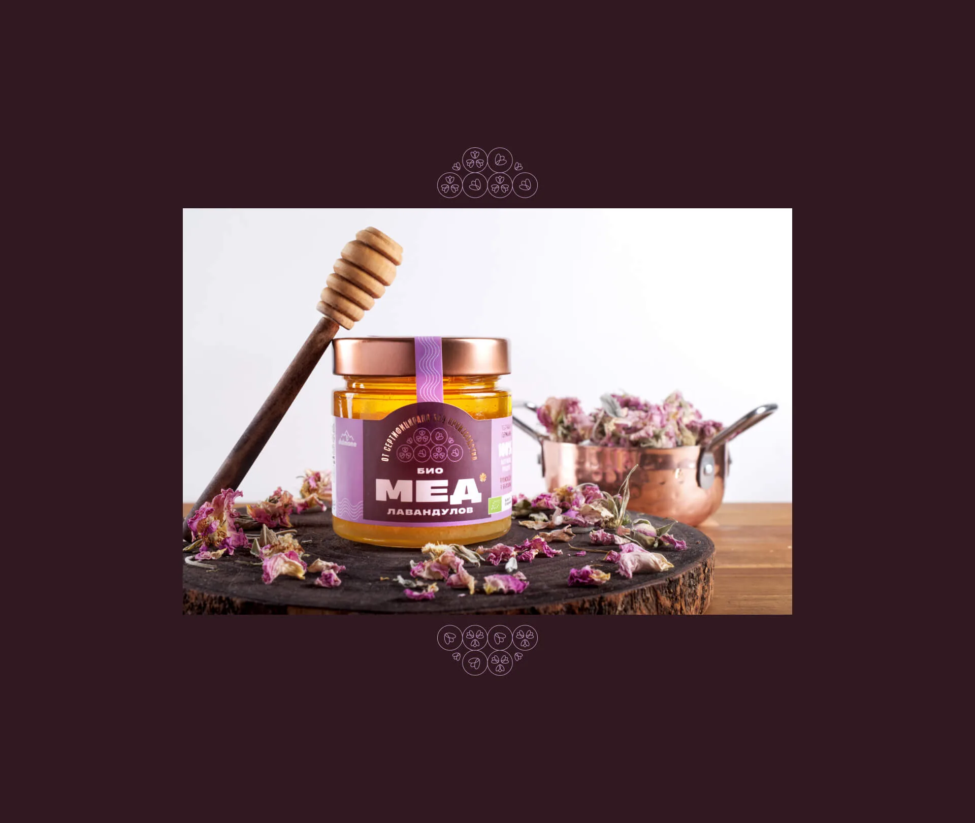
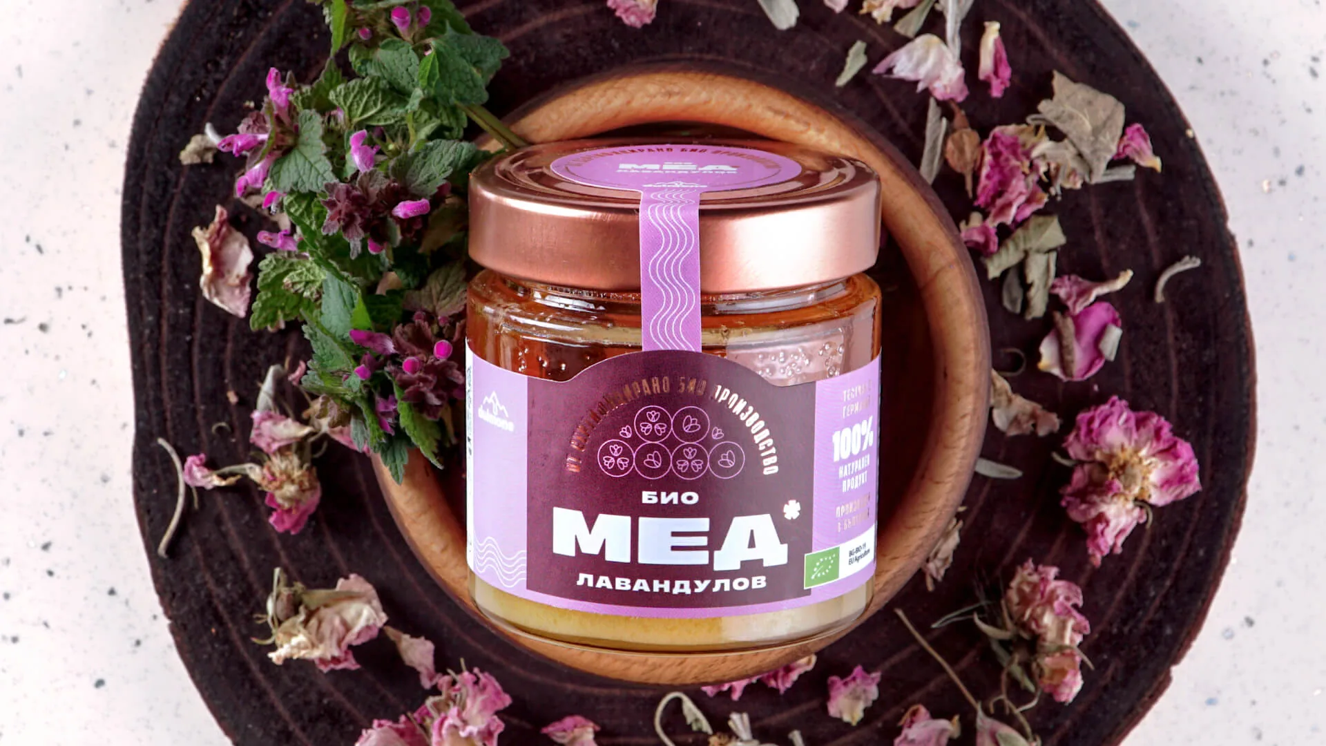
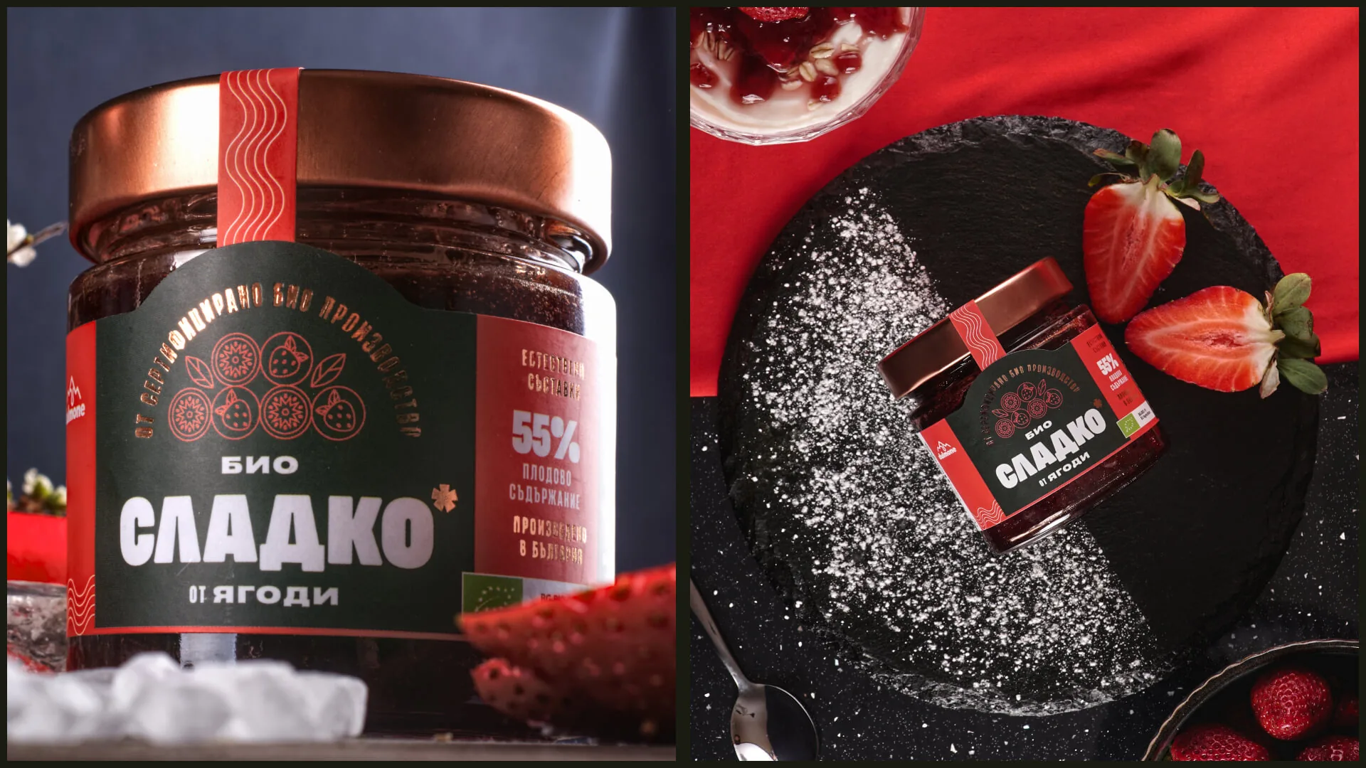
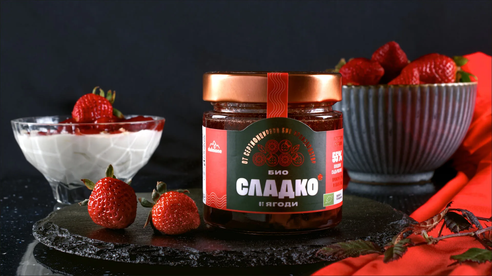
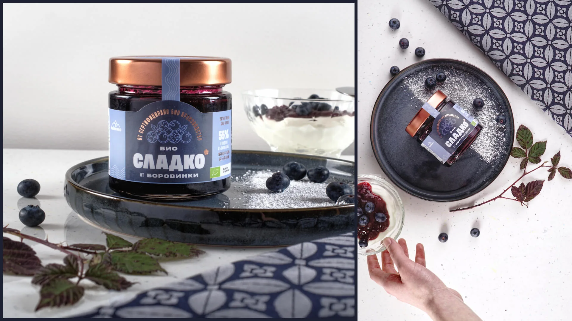
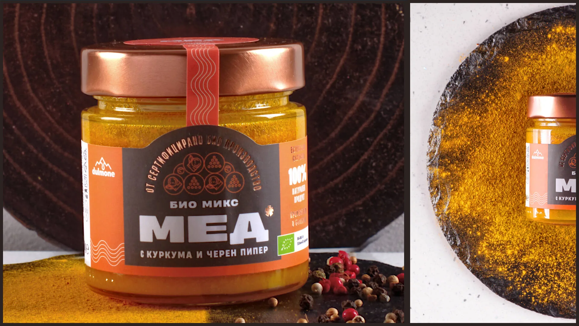
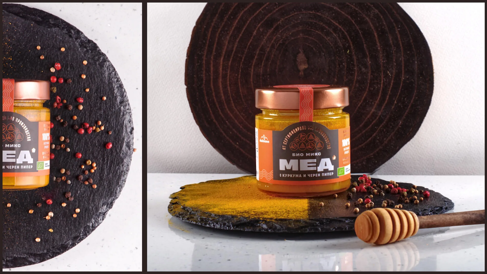
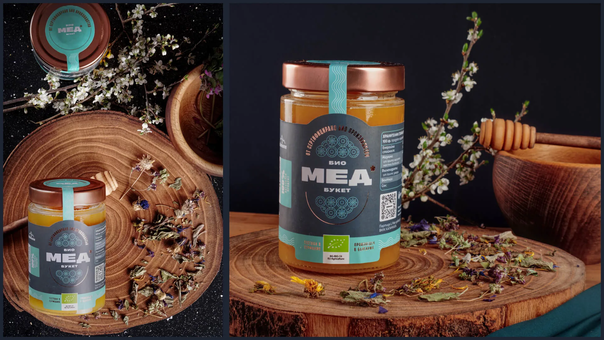
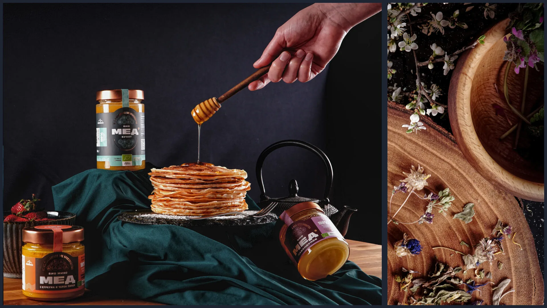
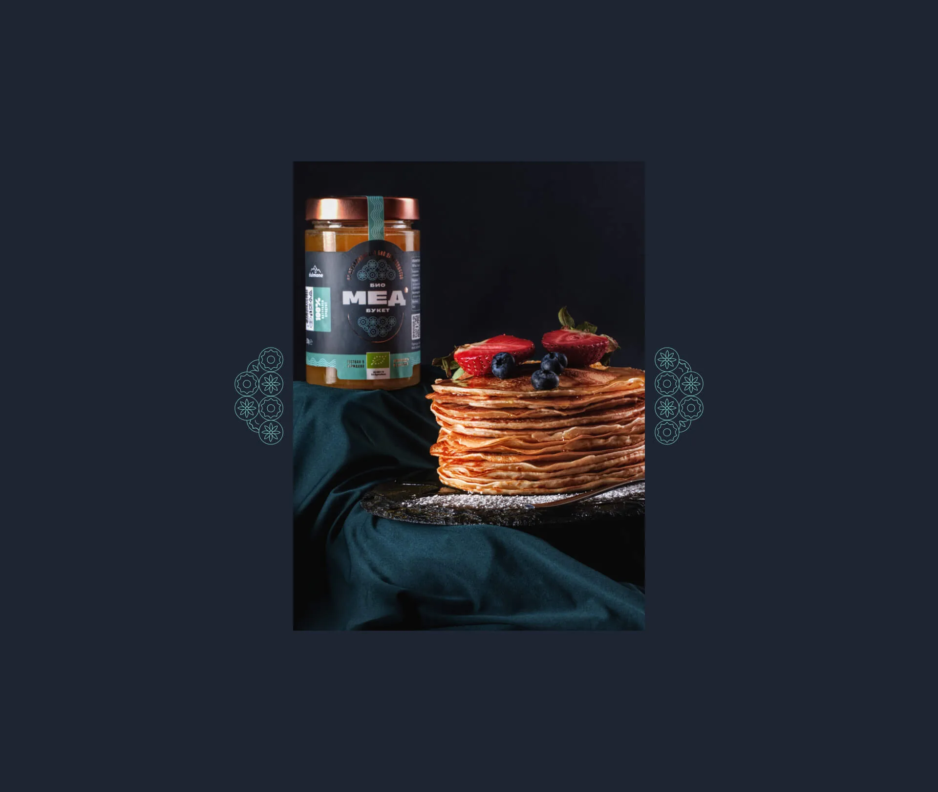
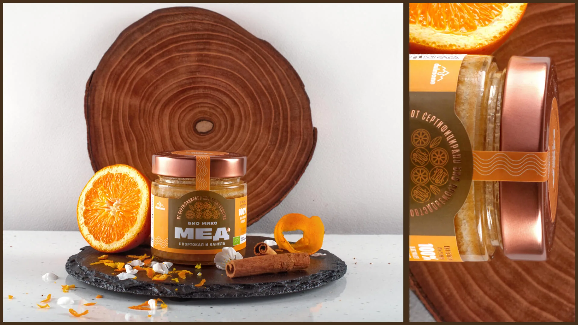
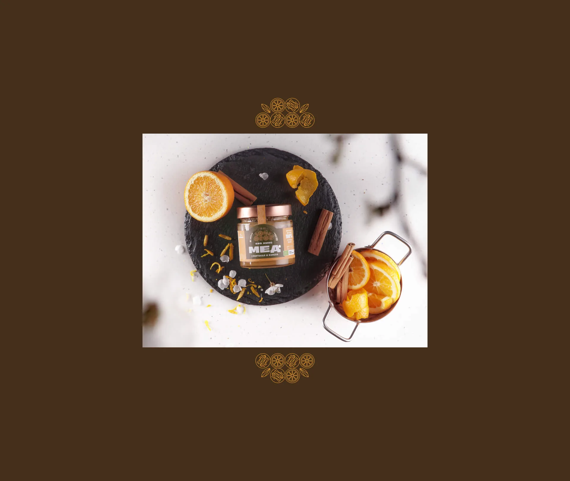
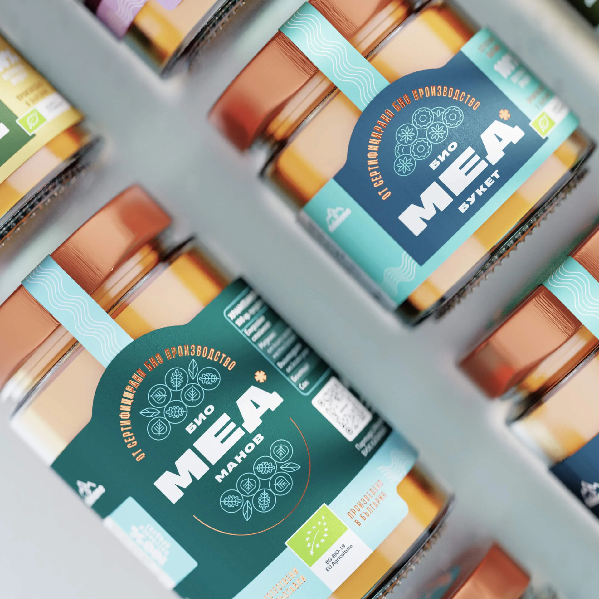
We started by asking what an organic honey can be besides food. We built audience hypotheses, each with its own stylescape, and together with the client chose the strongest one — "Nature's treasure": the ambitious professional who, in a hurried day, looks for small rituals to slow down. For him, honey is something precious, not just a product. The label works in two steps — first catch the eye from the shelf, then give a reason for the jar to stay in hand. Bold typography leads the eye, and bilinguality — a layout challenge in itself — led us to a flexible type system built on a variable typeface with a width axis, so the labels hold text of different lengths in both languages without losing their structure. Metallic print and a star invite a closer look at the details without the luxury feeling loud. A banderole label signals safety and an untouched product, and a QR code answers any questions that remain. Each flavour got its own accent and background colour, and a set of icons — sketched by Maria Vasileva and refined by Radimira Yordanova — tells the variants apart without words.
TEAM
Creative direction: Alexander Petrov · Design lead: Radimira Yordanova · Design: Maria Vasileva, Selen Petkova · Photography: Martin Mihaylov · Food styling: Katrin Staneva · Printing: Sira
THE RESULT
In 2 months the system covered 23 products in two languages — 46 labels that went to market and gave Dulmone a premium presence in chains like Billa and Lidl. It was planned for growth from the start: a new flavour is added with a new colour and icon, and the bilingual structure prepared the brand for the German market.
WORDS FROM THE CLIENT
With Embrand studio's guidance, we as a client got involved in the process early on, which gave us confidence from the start that we were moving in the right direction. This led us to a result with no compromises on quality, delivered within the deadline.

Georgi Yanakiev — CEO @ BG Hive