
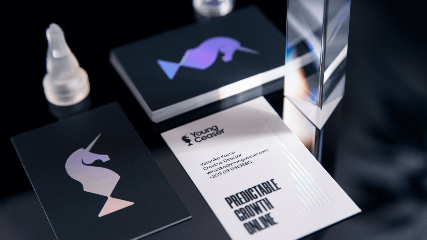
Brand strategy, identity and website for a digital agency that grew to 20+ manufacturing clients worldwide and tens of thousands of euros in monthly revenue

Young Ceaser
THE SITUATION
YoungCeaser is a digital marketing agency from Kazanlak — SEO, content and paid advertising for manufacturers around the world. Its work was already delivering results, but its own brand didn't speak the language of the high-calibre manufacturing clients it wanted to reach: founders of growing manufacturing businesses who had tried freelancers and agencies, had grown tired of inconsistent results, and were ready for a partner they could trust. The brand had to look as refined and dependable as the work it sells.
WHAT WE DID
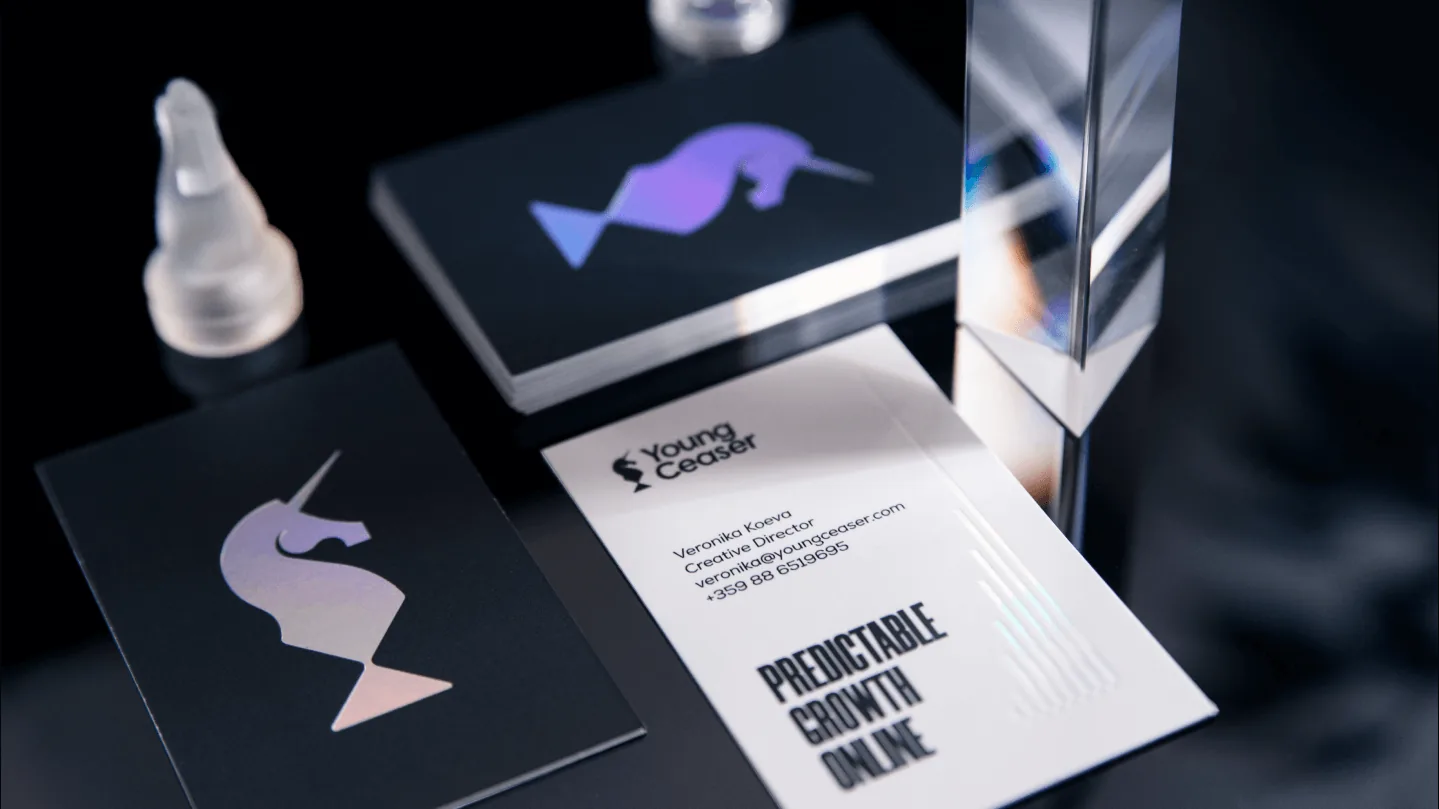
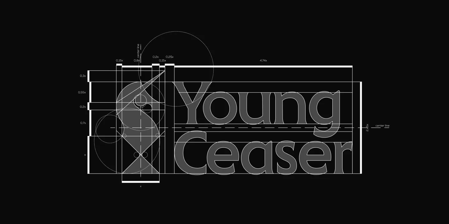
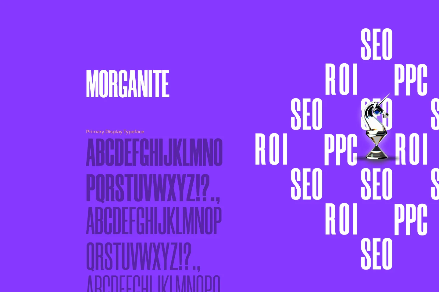
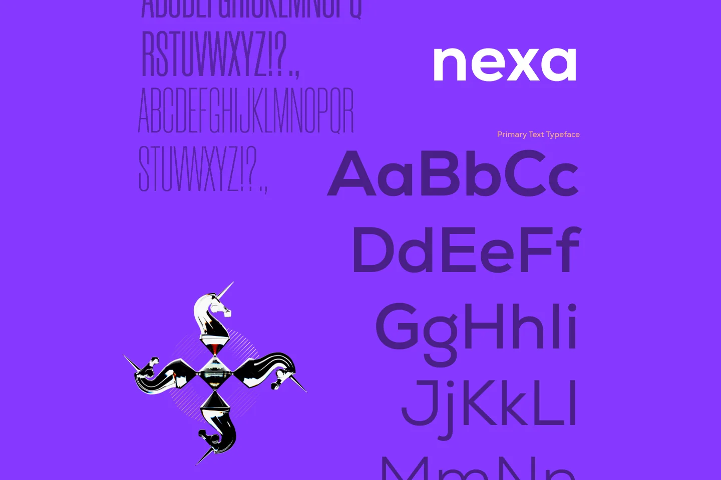
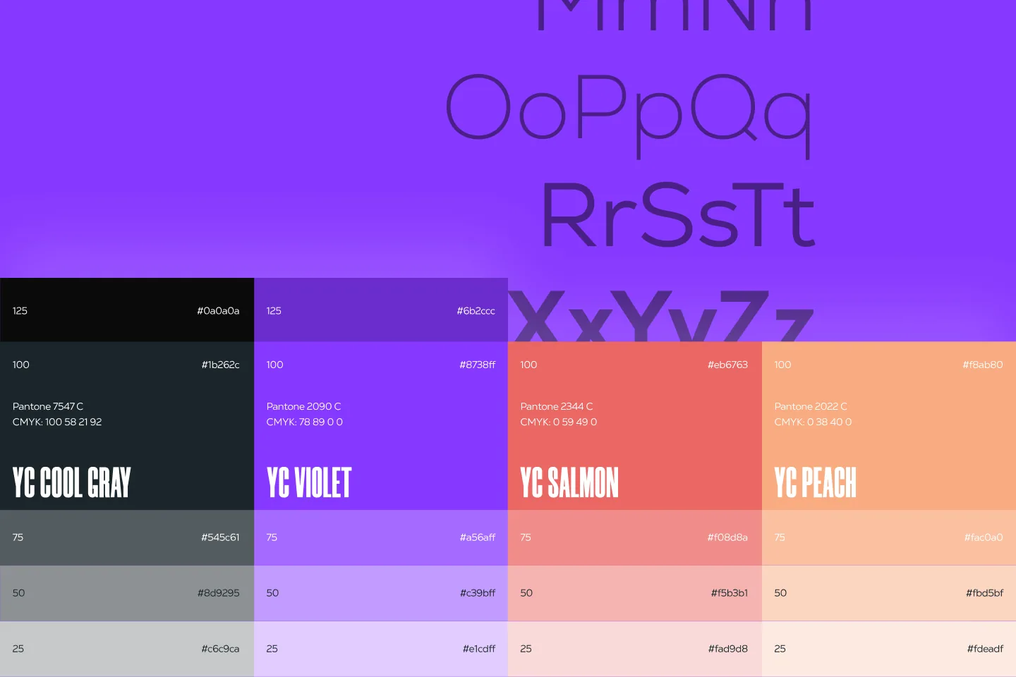
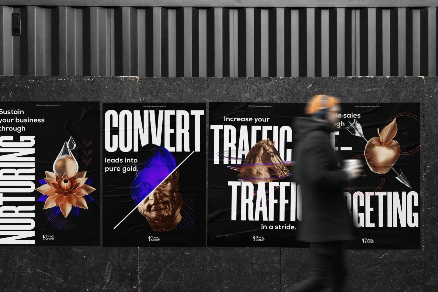
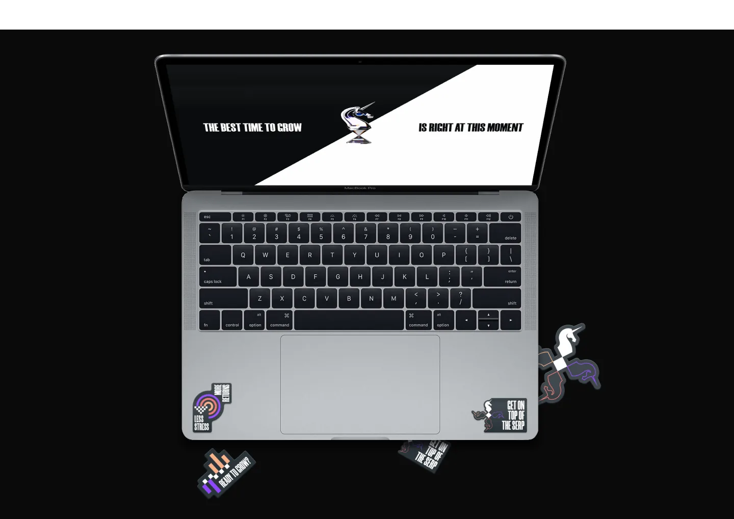
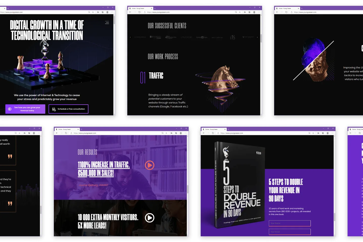
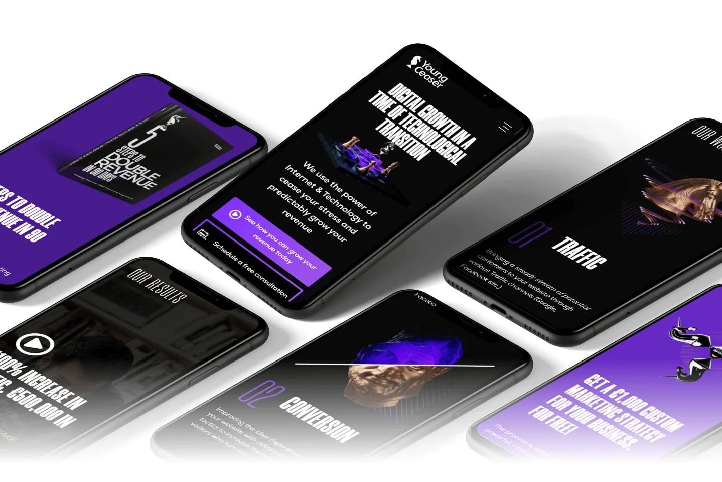
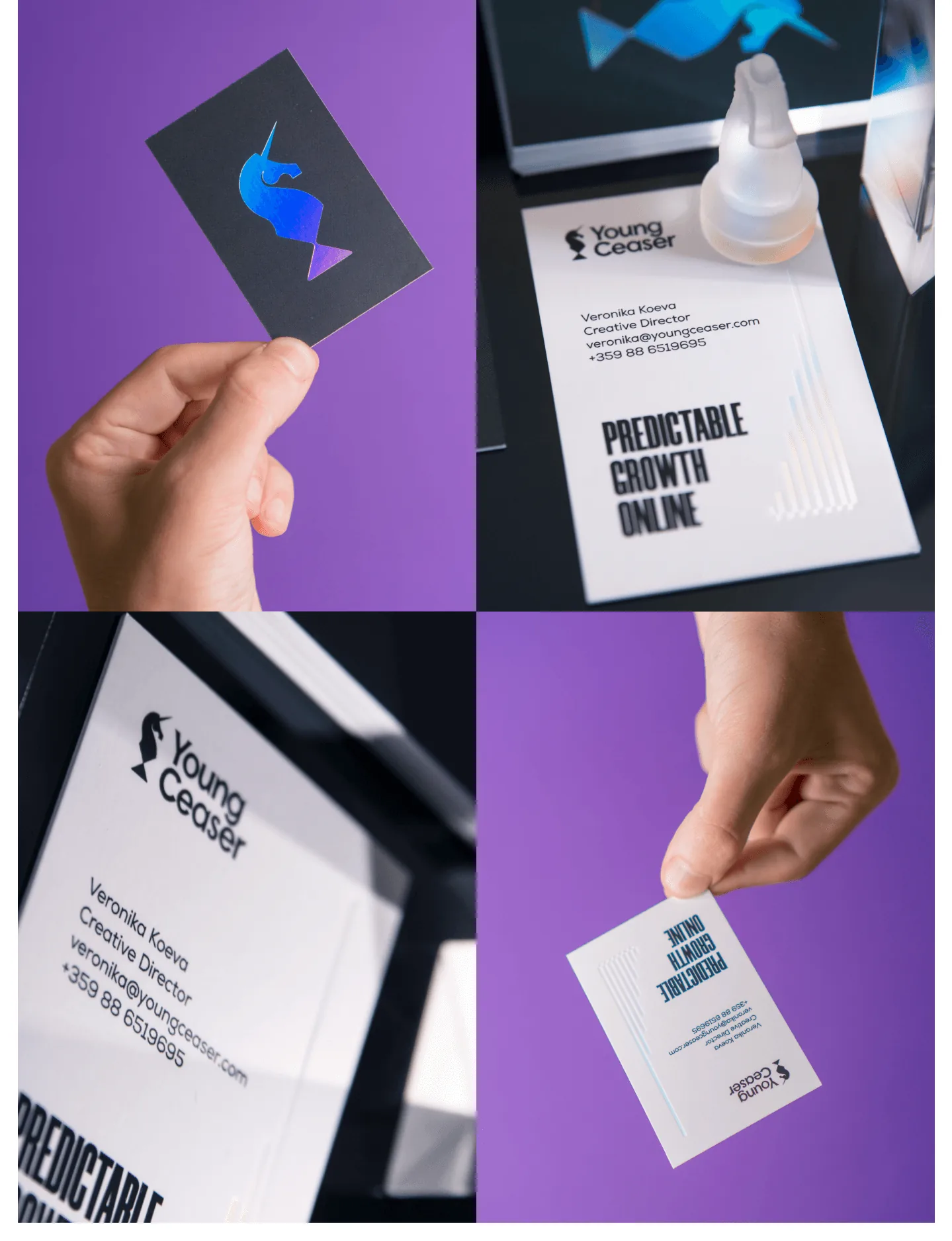
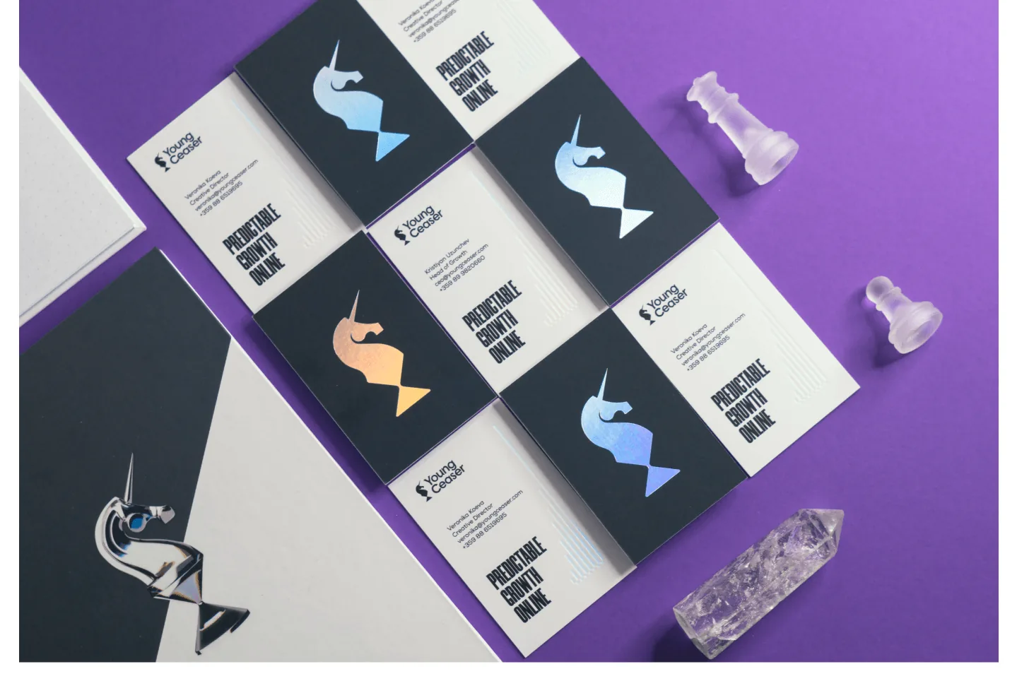
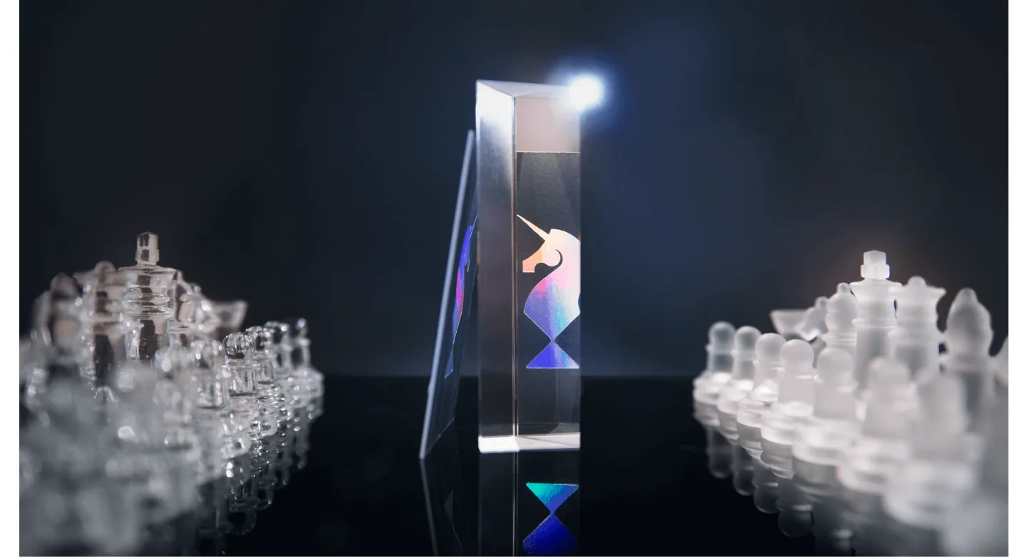
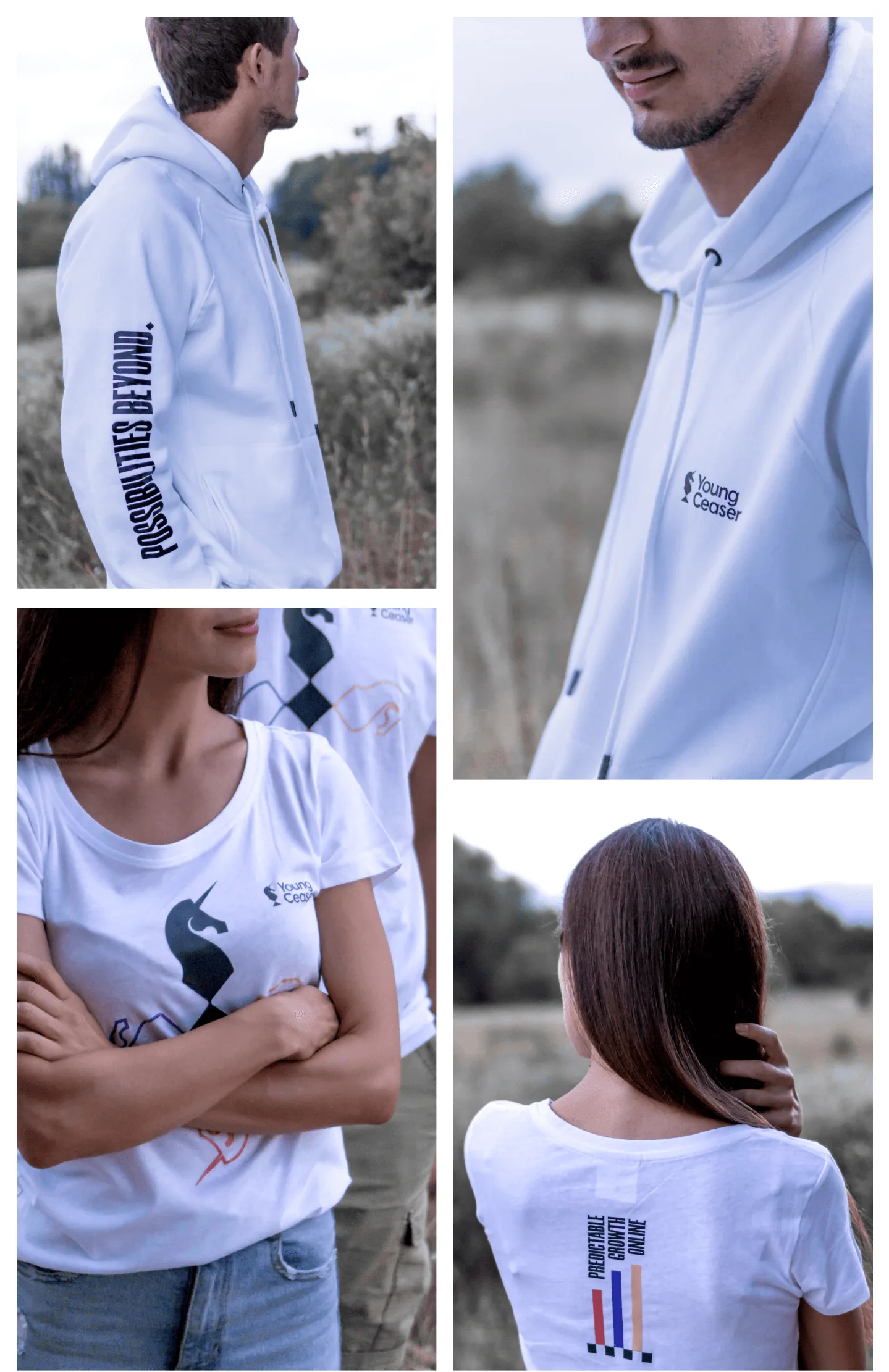
We started with an in-depth strategy sprint with the YC team. Over several in-person workshops we looked at who their most valued manufacturing clients were and what connected them to the agency, tested and scored several versions of the positioning, and arrived at the slogan "Possibilities beyond." Visually, we started from a metaphor the team already used: digital marketing is a game of chess, where strategy, timing and execution decide everything. And in business, a unicorn is the rare, exceptionally successful company — YoungCeaser set out to be exactly that rare breed of consultancy. Combining the two metaphors gave us the logo at the centre of this brand identity — a chess knight turned unicorn. The look was rounded out by a restrained, technological colour scheme, condensed and refined typography set in typefaces such as Nexa and Morganite, and a series of 3D illustrations that became a key part of the brand's web presence. The system carried into business cards with holographic foil, posters, notebooks and branded apparel.
TEAM
Brand strategy: Atanas Dzhingarov, Alexander Petrov · Art direction: Alexander Petrov · Web design: Alexander Petrov · Photography: Atanas Dzhingarov, Alexander Petrov · Print: Inkpression · Textile print: DST studio
THE RESULT
Over a long-term partnership with YoungCeaser, the agency grew to 20+ manufacturing clients worldwide, bringing in tens of thousands of euros in monthly revenue, and its team grew to 5+ people. The brand's role was to give it a look that meets the expectations placed on a business of that calibre. The visual language proved flexible enough to extend later to the website, print and digital lead-generation materials.
WORDS FROM THE CLIENT
Working with Embrand was completely different! They dove so deeply into who we are, what we do and what we believe in which resulted in such an inspiring design that makes me happy and excited anytime I see it.

Kristiyan Uzunchev — CEO @ YoungCeaser