We harnessed the power of mythology to build a craft beer brand with an untameable spirit and a taste that hits hard.
THE SITUATION
Zver Craft Brewery started in 2018 in Kazanlak with little more than a head brewer, a name, a general concept and three flagship recipes: a lightly smoked oat stout, a double-hopped pale ale and a saison with Roman chamomile. At the time, the Bulgarian market knew craft beer mostly through larger commercial players like Glarus, while homebrewing and small craft breweries were still in their infancy. Zver needed an identity and packaging bold enough to stand out on that shelf and to win over both seasoned connoisseurs and people trying craft beer for the first time.
WHAT WE DID
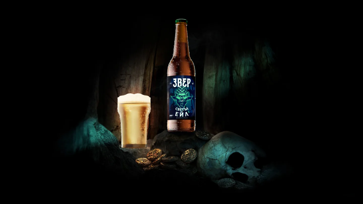
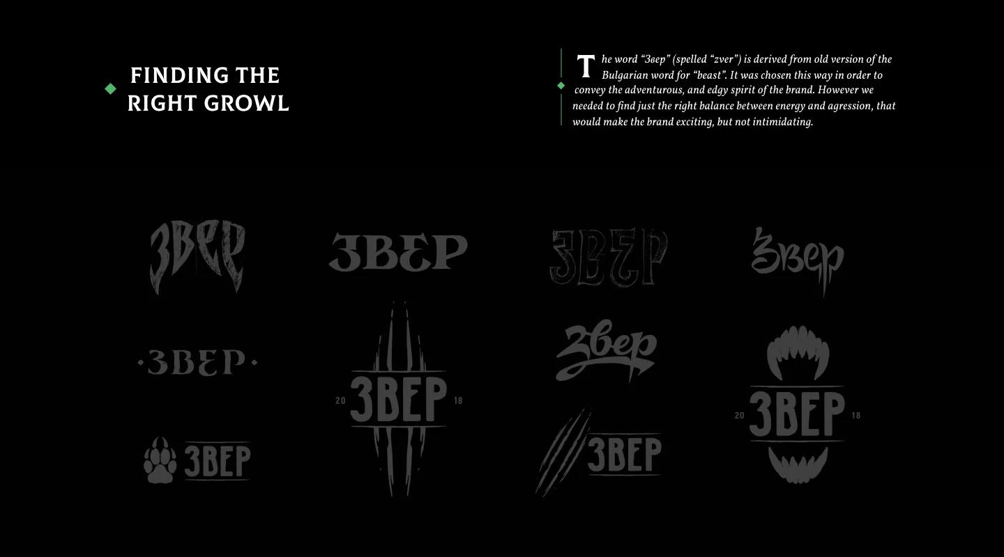
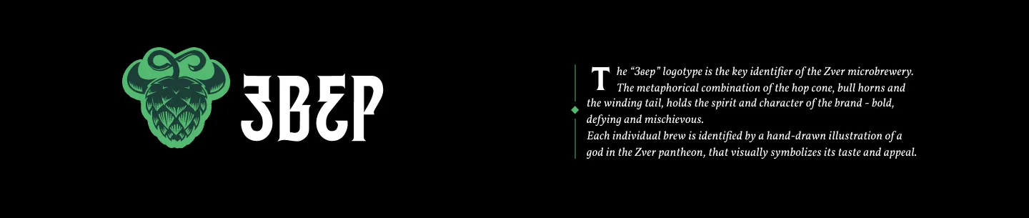
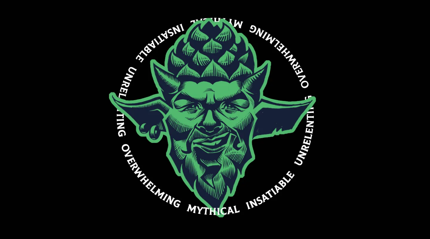
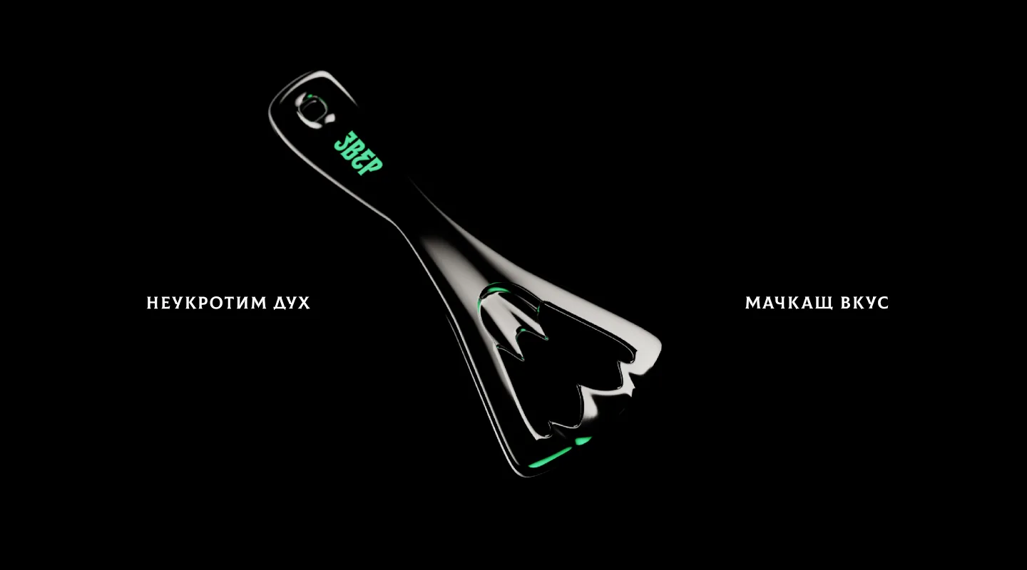
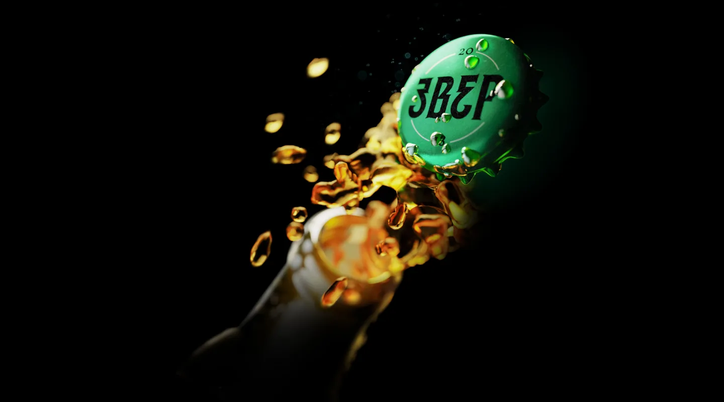
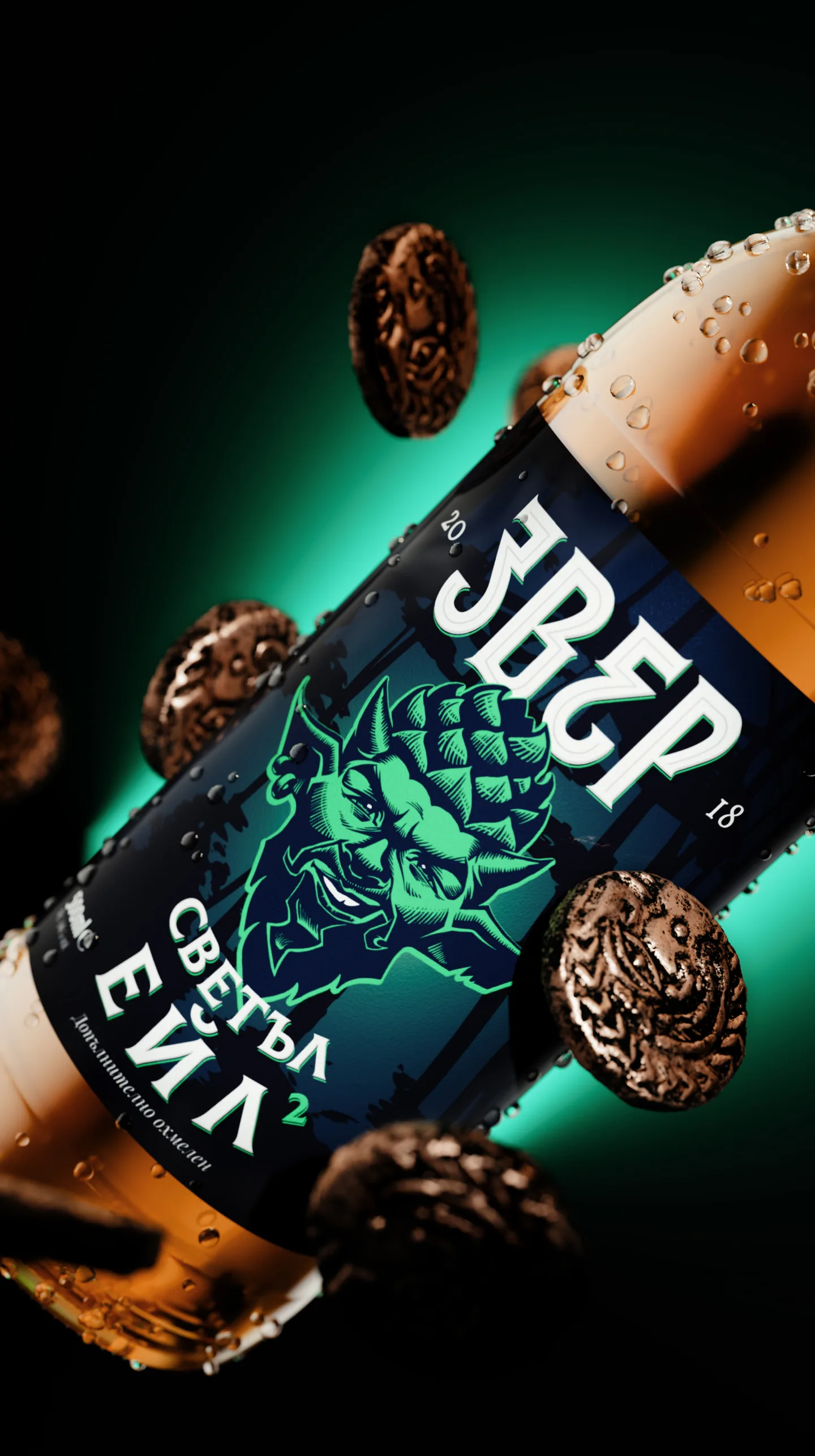
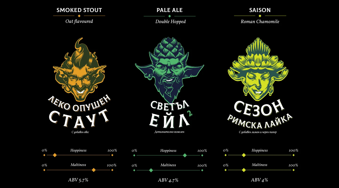
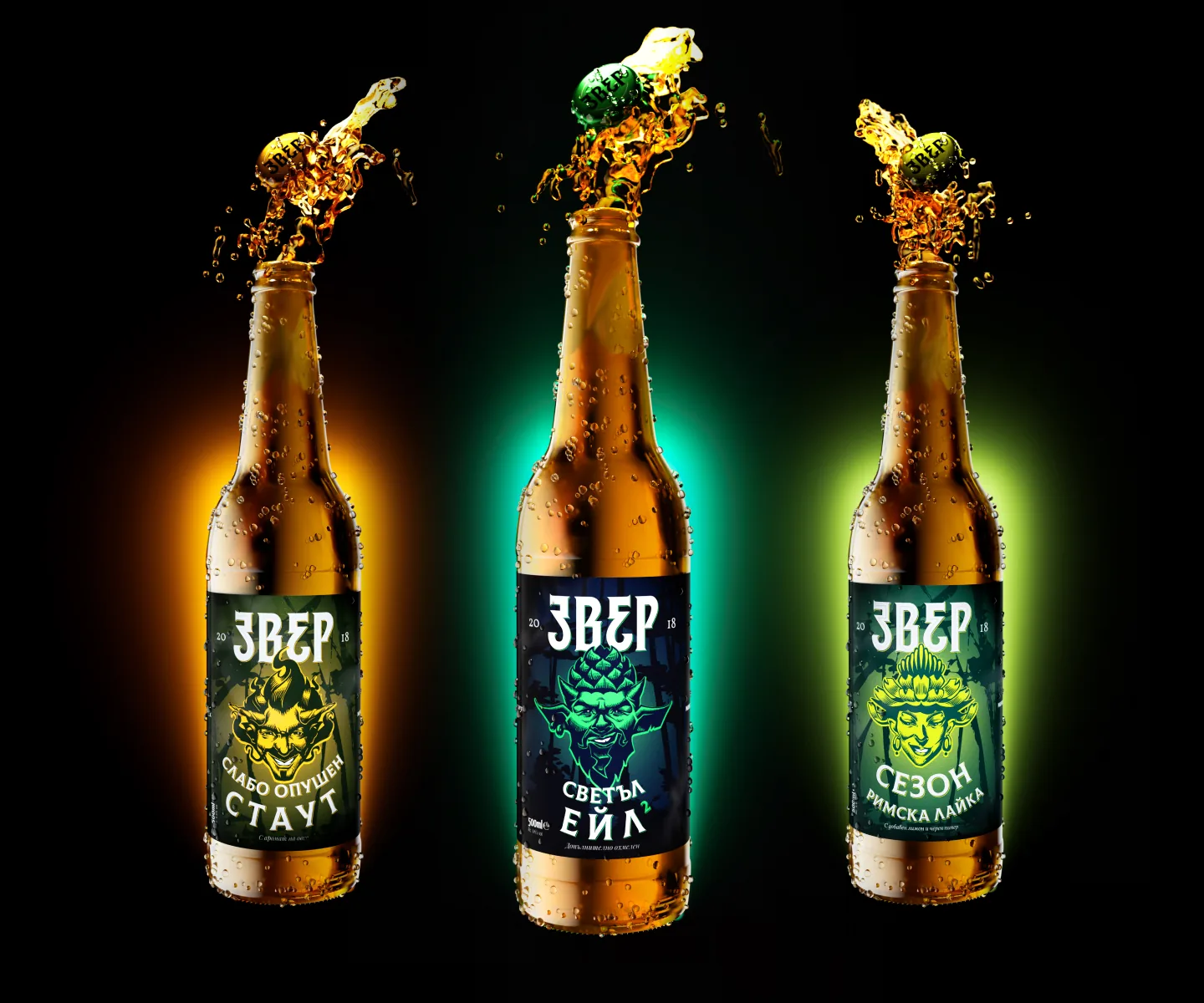
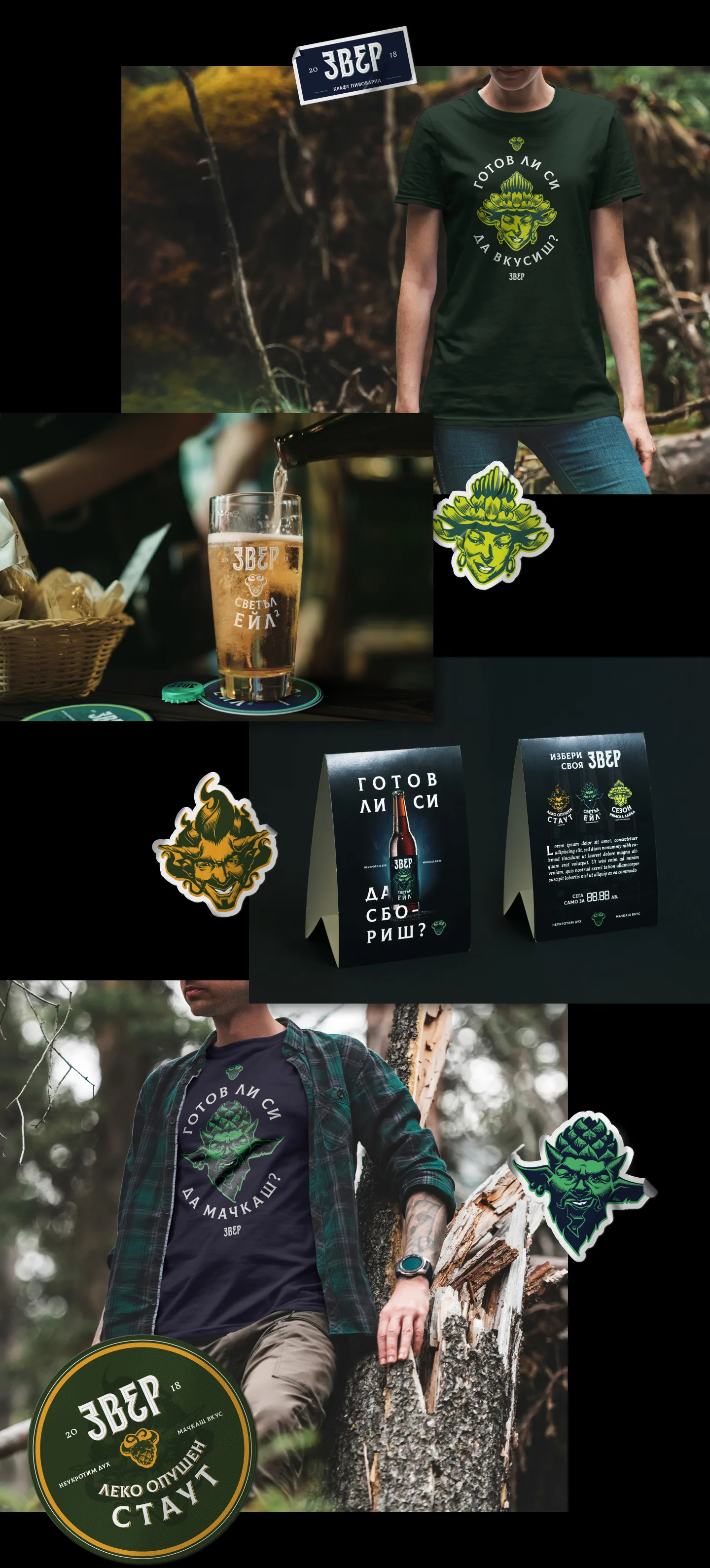
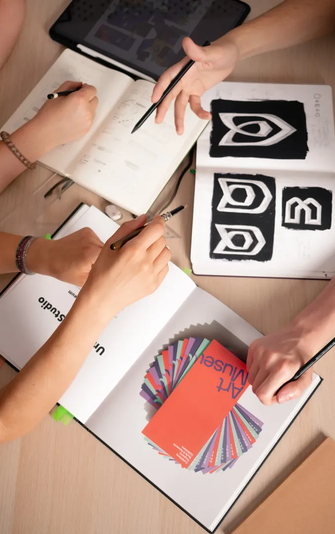
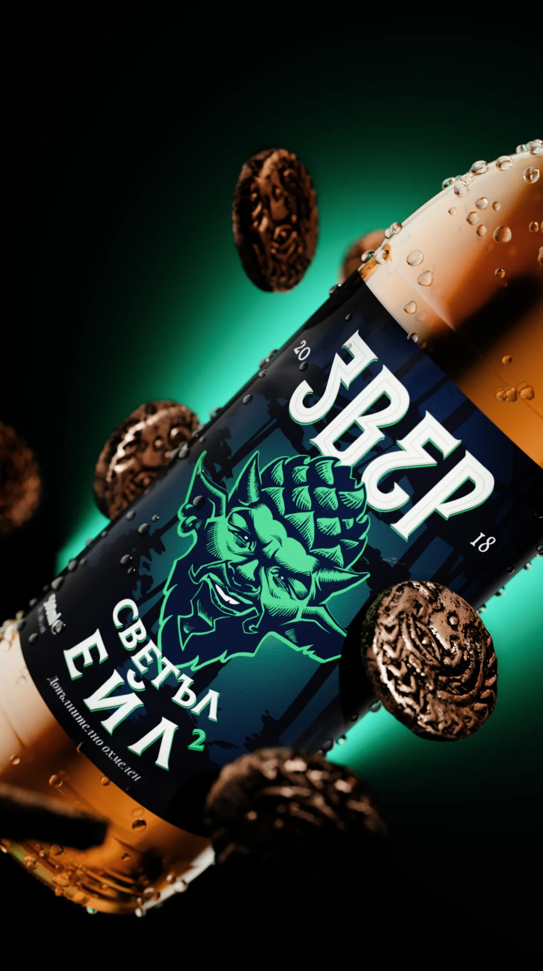
The name was the brewery's own. Звер (Zver) comes from the old Bulgarian word for “beast”. Our job was the story behind it: a silent beast shackled inside each of us, and what we might be capable of once we unleash it. We gave each of the three styles its own emotion and temperament and embodied it in a mascot illustration drawn from mythology and fantasy: a horned imp with flame-like hair for the stout, a goblin crowned with a hop cone for the pale ale, and a figure crowned with chamomile for the saison. The logotype went through about ten refined directions in search of the right growl, with enough energy and aggression to excite but not to intimidate. There were no export plans at the time, and the name's roots called for a connection with Bulgarian, so the work focused on Cyrillic lettering. The typography draws on Roman monumental inscriptions, giving the brand an air of history and myth. Colour follows character: greener tones for the more conventional styles and brighter ones for the more experimental tastes. Each label also carries simple hoppiness and maltiness scales and the ABV, so even a newcomer can read the beer at a glance. The system extended to bottle caps and a branded opener.
TEAM
Brand storytelling, logotype, illustration, packaging design and motion: Alexander Petrov
THE RESULT
In 3–4 months, Zver went from a name and three recipes to a complete, launch-ready brand: logotype, three mascot characters, labels for all three flagship beers, caps and an opener. At a time when Bulgarian craft beer was only finding its feet, the brand brought a mythological, illustrated style that local shelves had not yet seen.
WORDS FROM THE CLIENT
Working on the Zver identity felt easy, clear and very precise. It was our best experience working with designers to date. The Embrand team’s initiative has made the process quite easy and streamlined, leading us to an excellent result.

Tihomir Nedev — Founder @ Zver Craft Brewery