A menswear identity with an adaptive mascot — one idea carried with the same attention to detail from packaging to shopfront and website
The Gentle Crafts
THE SITUATION
The Gentle Crafts is a self-initiated design project built around one question: what would a menswear brand look like if it were inspired by the world of Guy Ritchie's The Gentlemen — a world where style is a quiet show of strength, not a display. Ritchie himself put it best: "A suit needs to be creative; the person that puts it on can't be putting it on because he's told to put it on. He's got to want to put it on."
WHAT WE DID
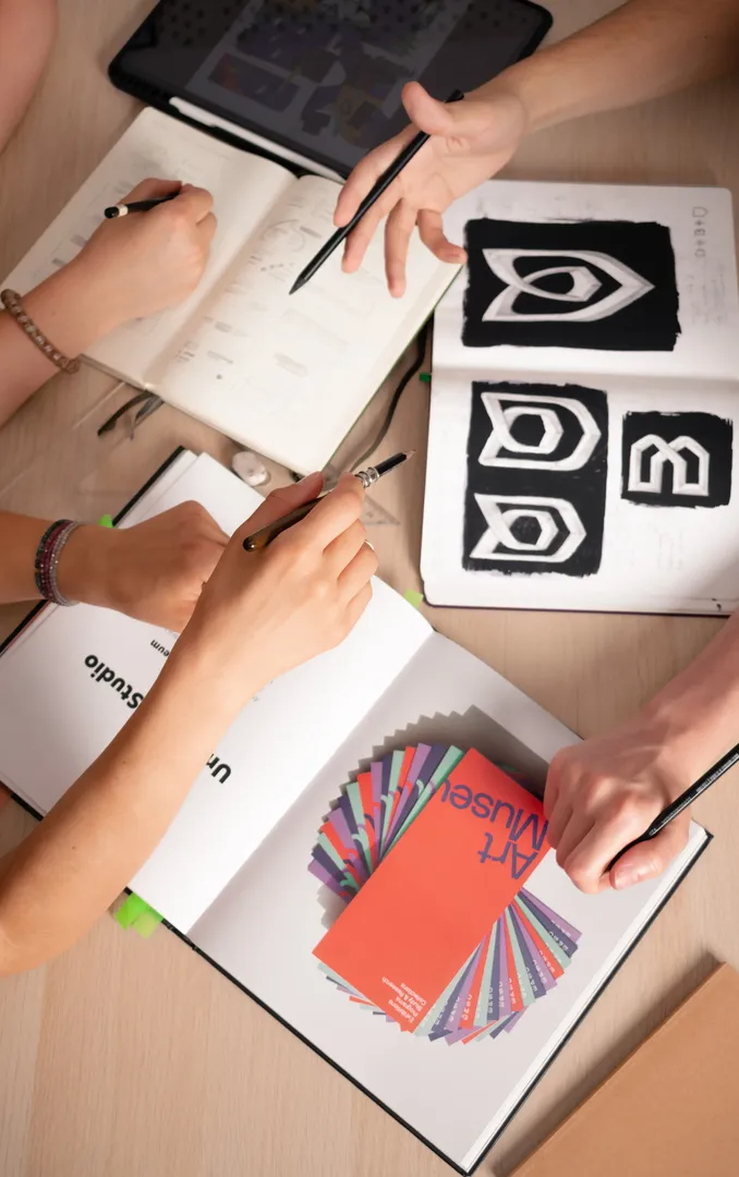
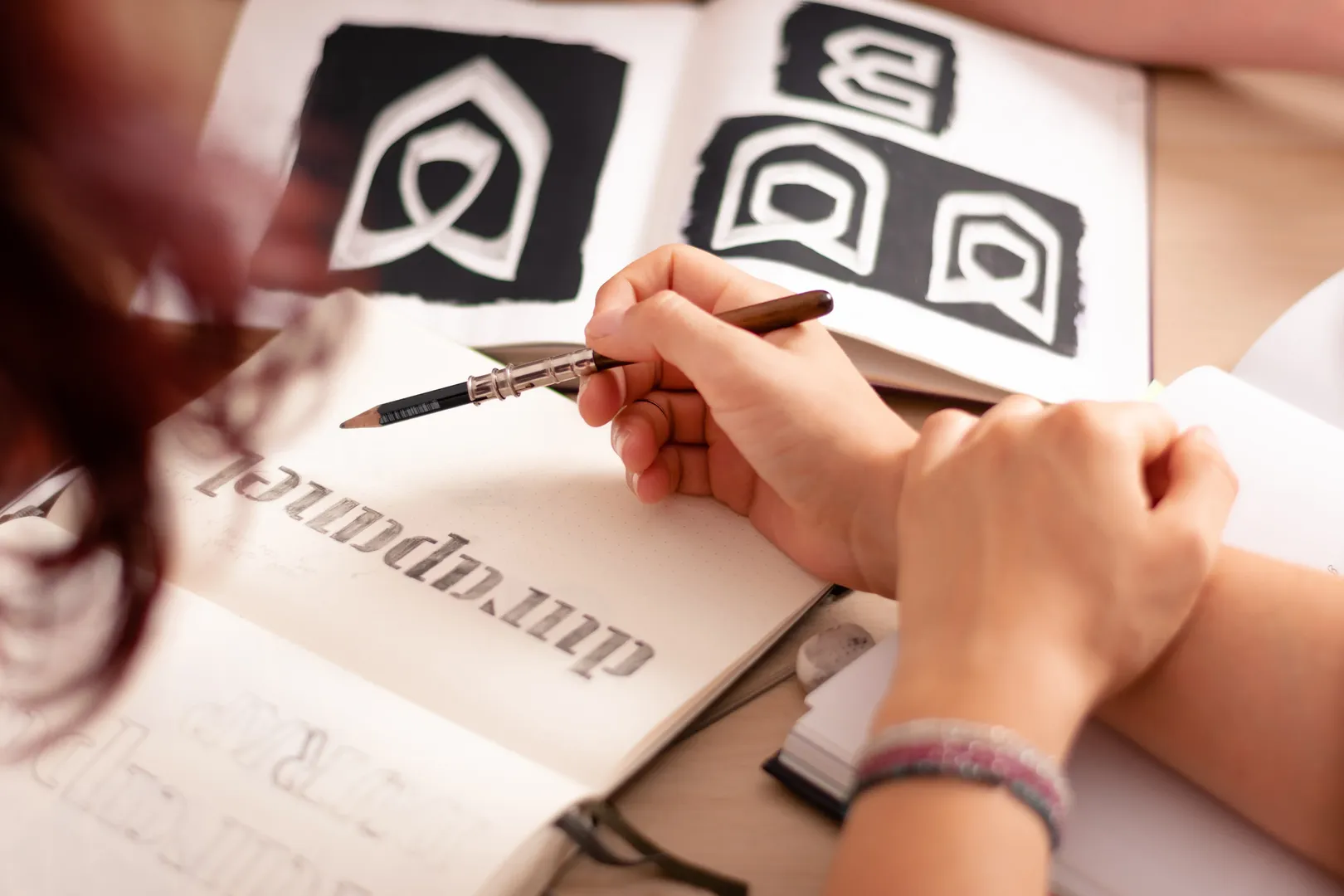
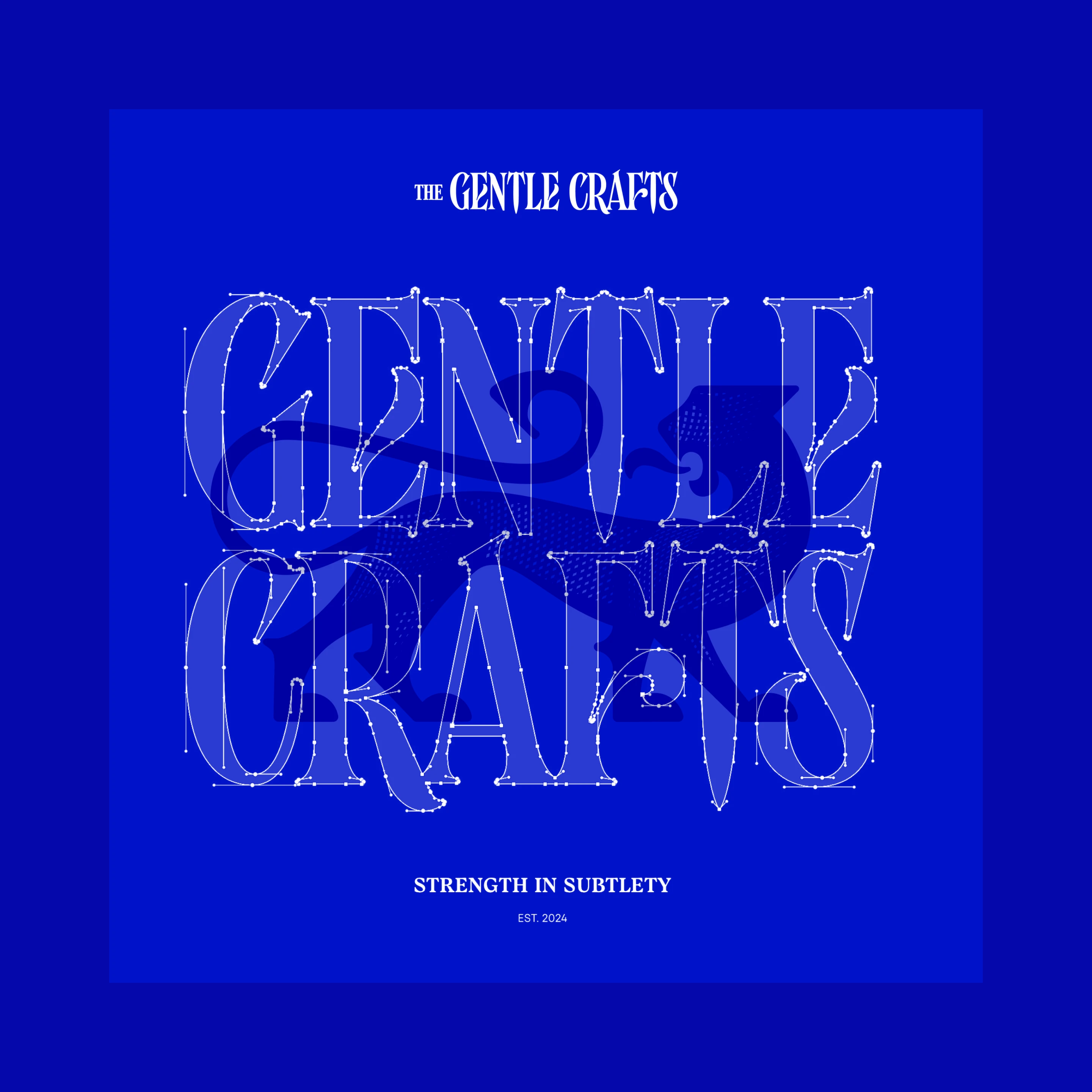
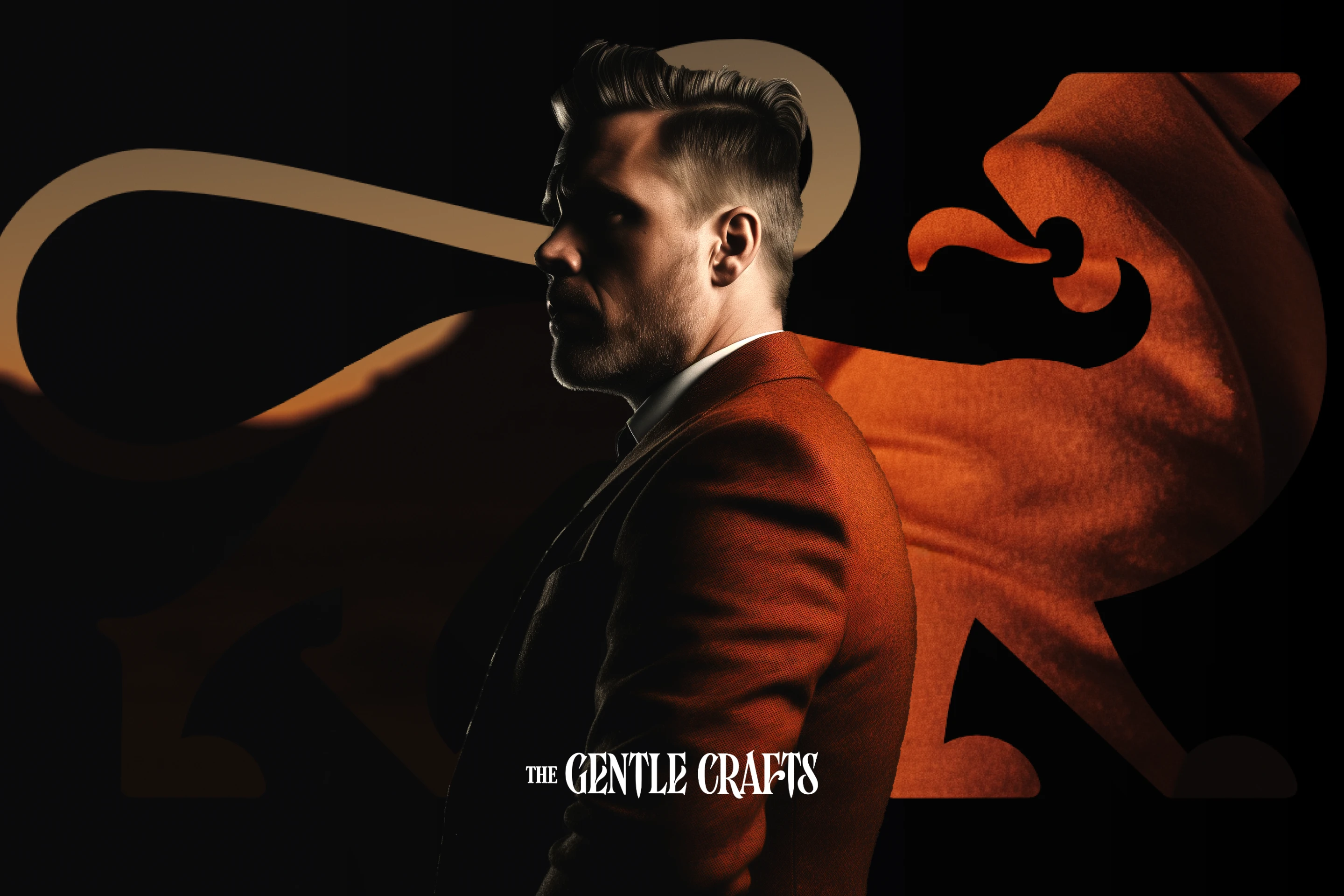
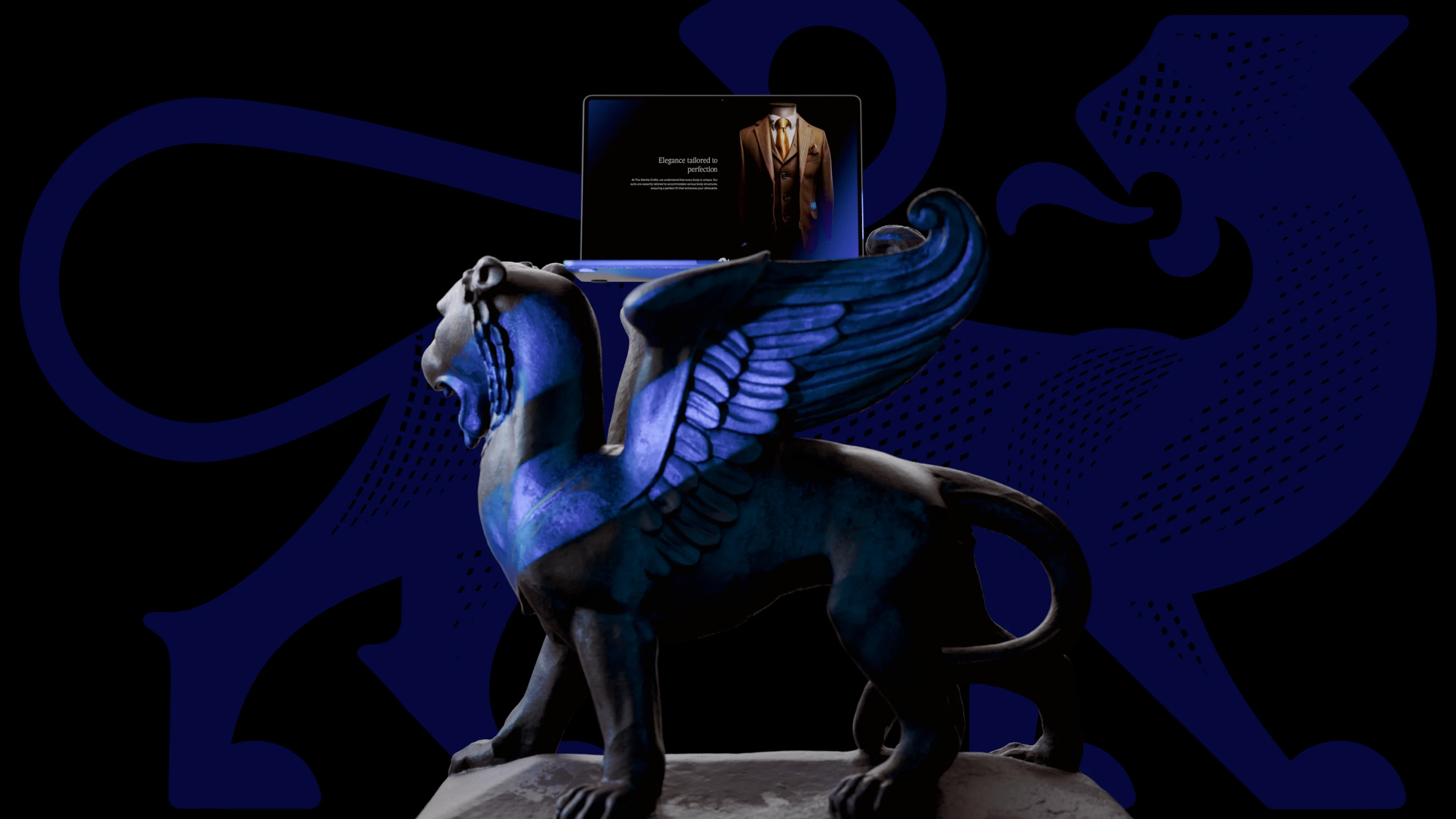
We started with strategy: vision, mission and three archetypes — the Outlaw, the Sage and the Ruler. In a world where stoic masculinity is often mistaken for toxicity, the brand shows that real strength comes from restraint, not grandstanding. We positioned it between the great houses like Brioni and Kiton, which dictate a strict code, and accessible labels like Suitsupply and Hugo Boss, which sell a uniform. The name comes from the translation of jiu-jitsu — "the gentle art" — carried into the craft of tailoring, and the line "Strength in subtlety" sums it up in three words. The emblem is a panther: a predator that moves with elegance and speed without asking for attention. It is an adaptive mascot with several variants — from the TGC monogram to a full pattern — and it comes alive in animation wherever the brand appears. A saturated blue gives the brand a regal, stoic feel, while rust and warm metal tones come from the motifs of desert sunset and adventure. The logotype is being extended into a full typeface — a story for a separate case study.
TEAM
Brand strategy, naming, identity, motion and web design: Alexander Petrov
THE RESULT
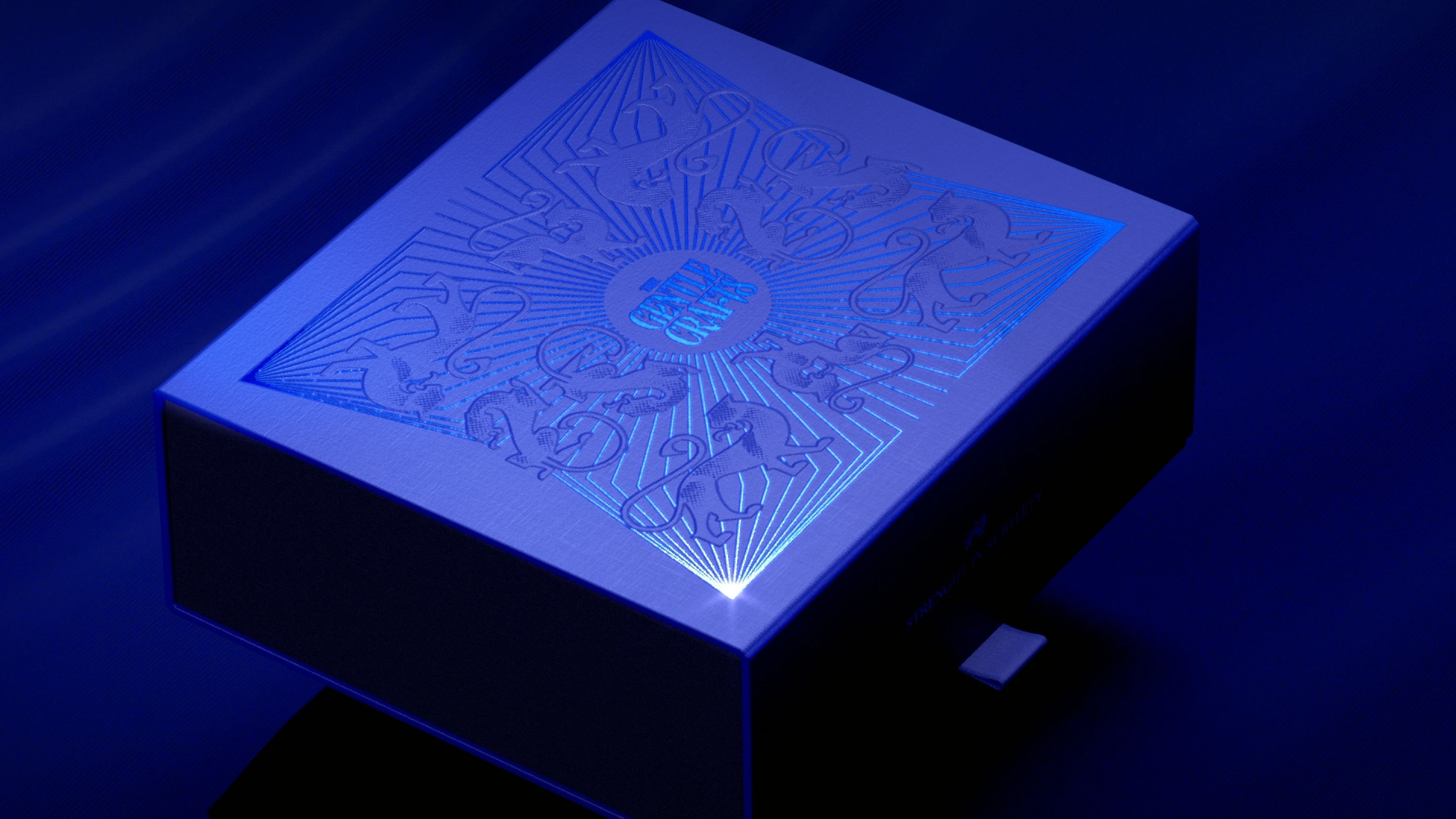
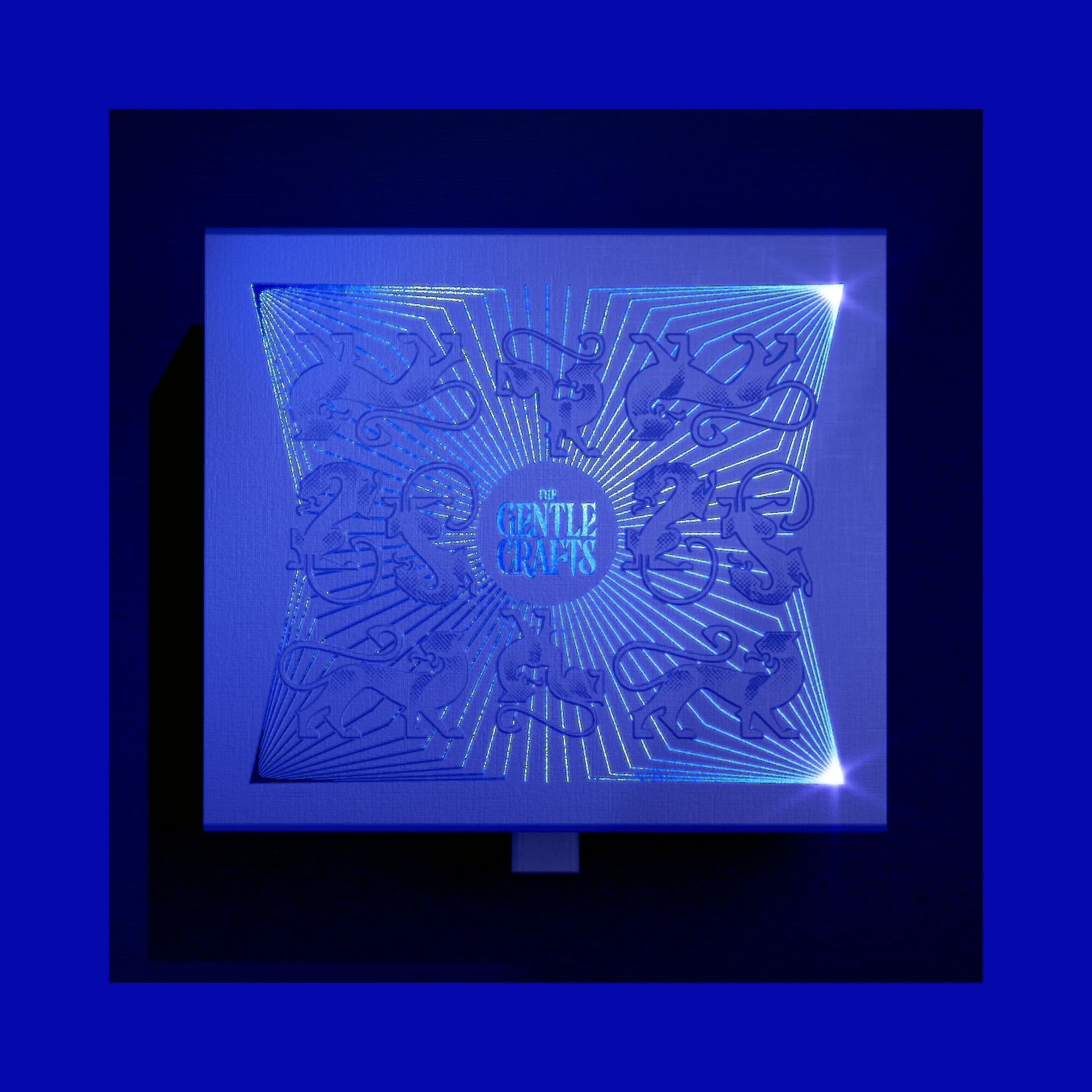
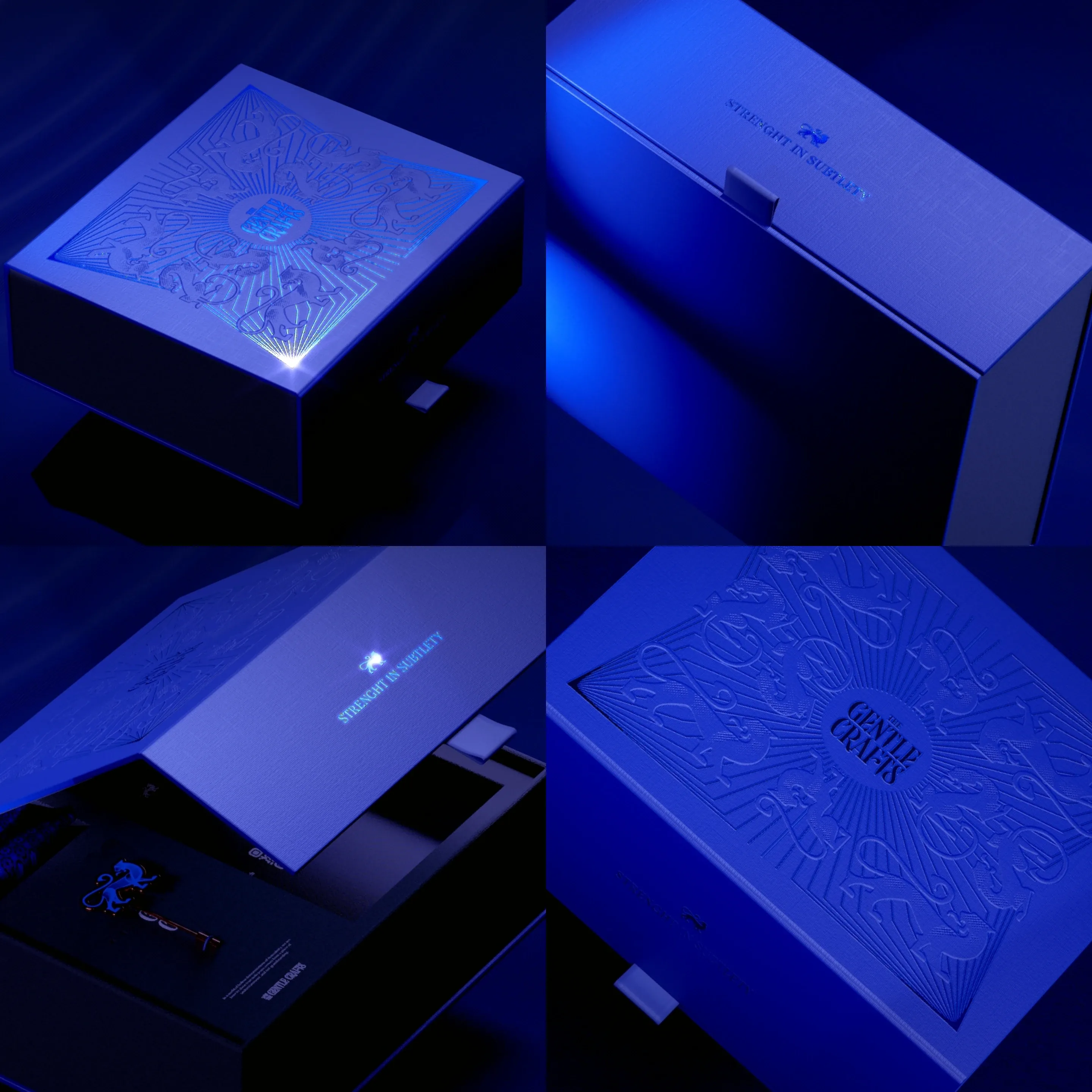
The first result is an adaptive, animated mascot that works equally well in every format, from a browser icon to a shop façade. The project was also a test of our ability to carry one brand across the widest possible range of touchpoints without losing attention to detail — an embossed gift box with silver foil, branded pins, a shopfront, a campaign, street advertising and a website.
WORDS FROM THE CLIENT
We wanted to explore an approach to male fashion that was inspired by the universe of "The Gentlemen" by Guy Ritchie. A brand that shows you that you don't HAVE to dress stylishly. You GET to do it. It is a call to exploring your own style as a man and make a statement on your terms.

Alexander Petrov — Creative Director @ Embrand studio