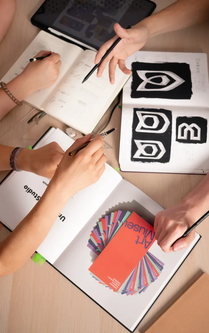
Naming, identity and packaging for handmade soaps that set the brand apart on the shelf and online
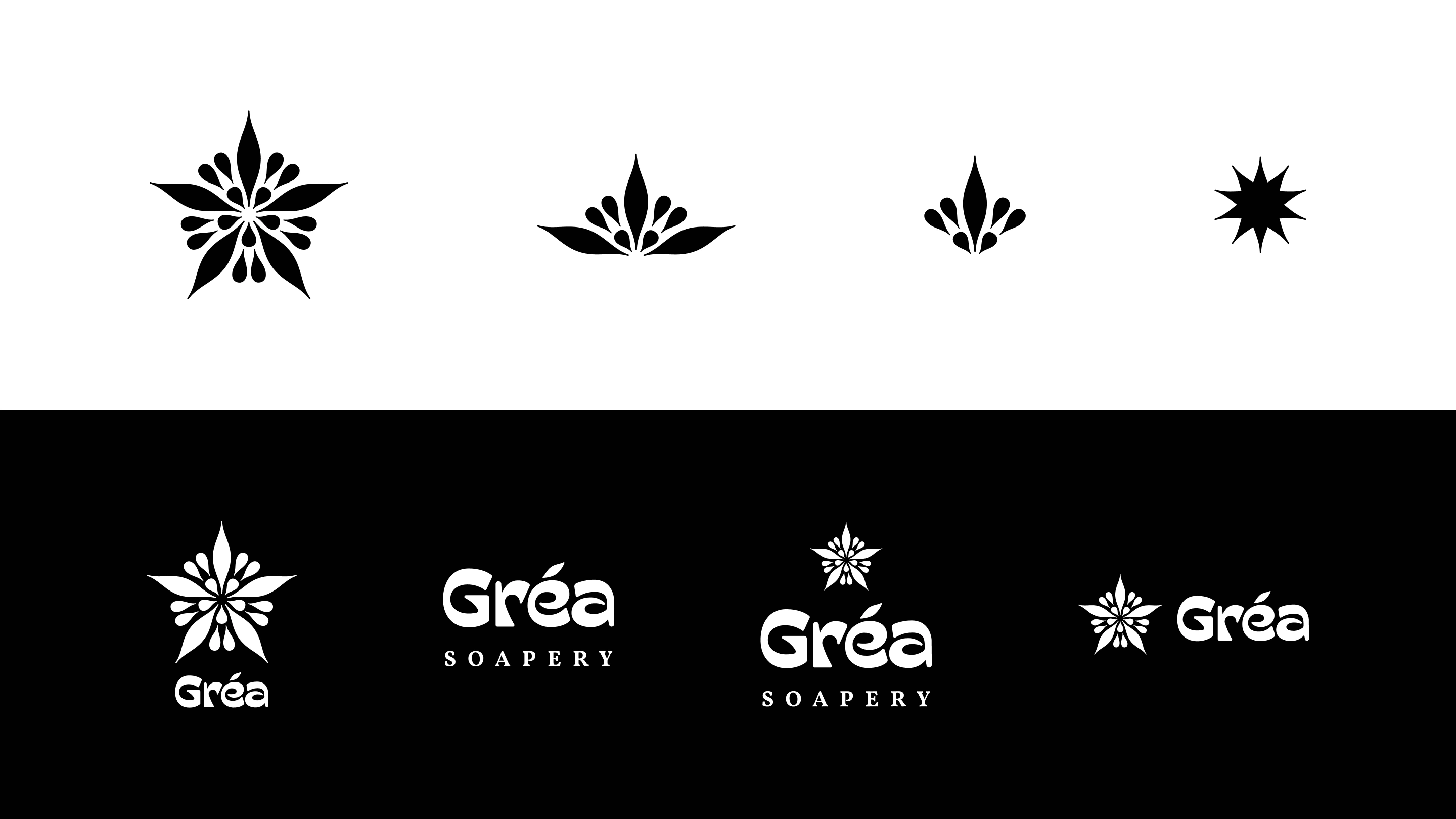
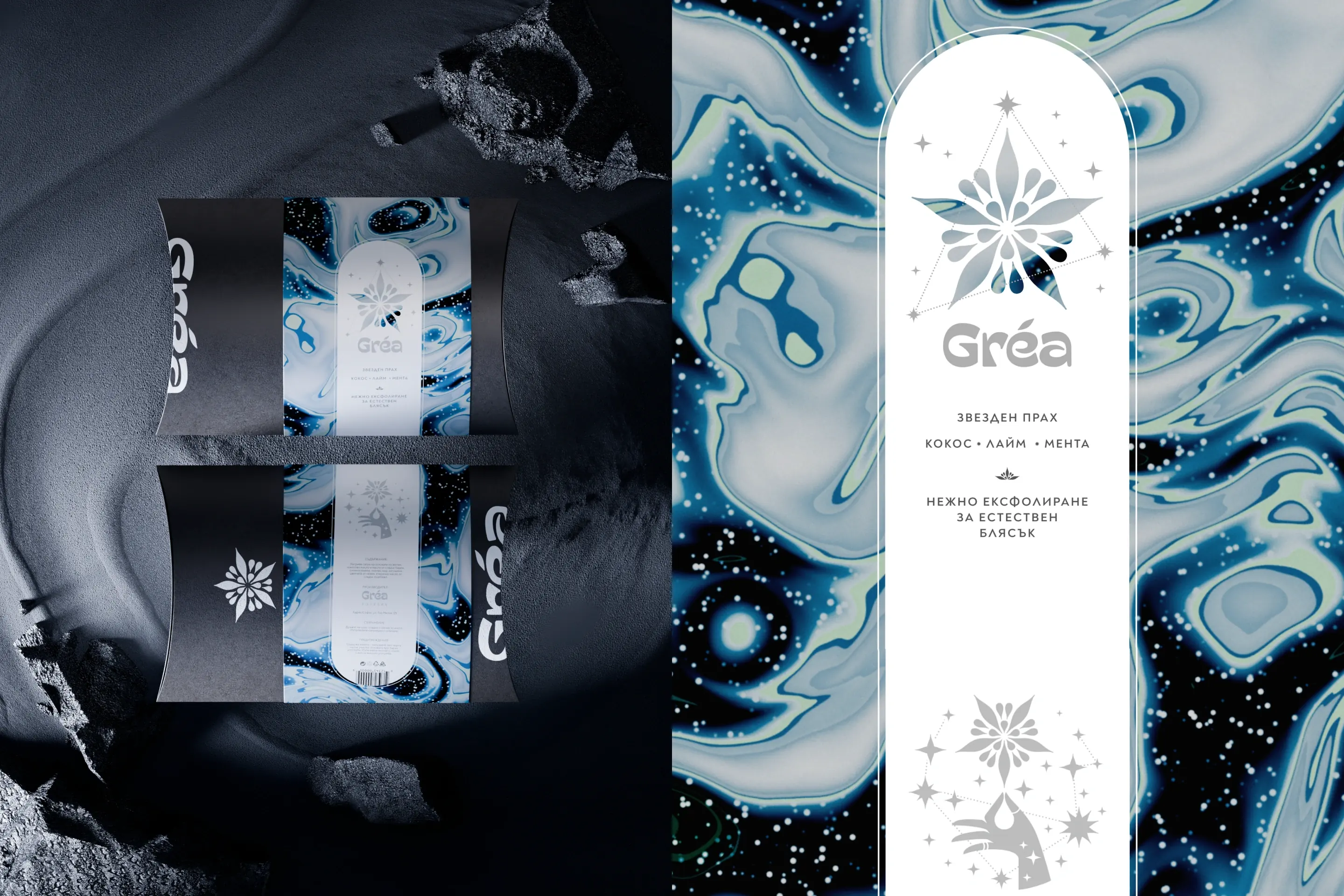
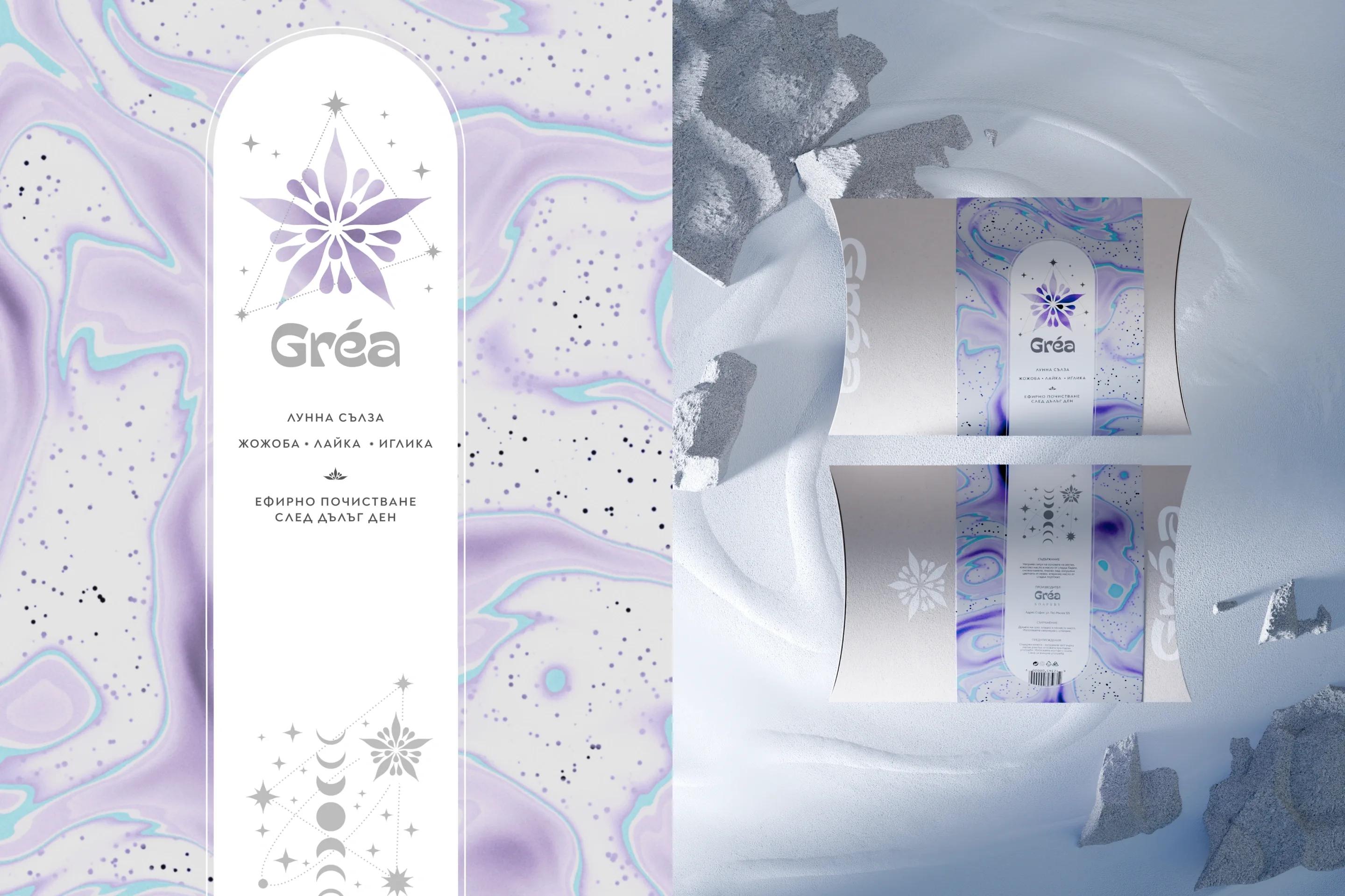
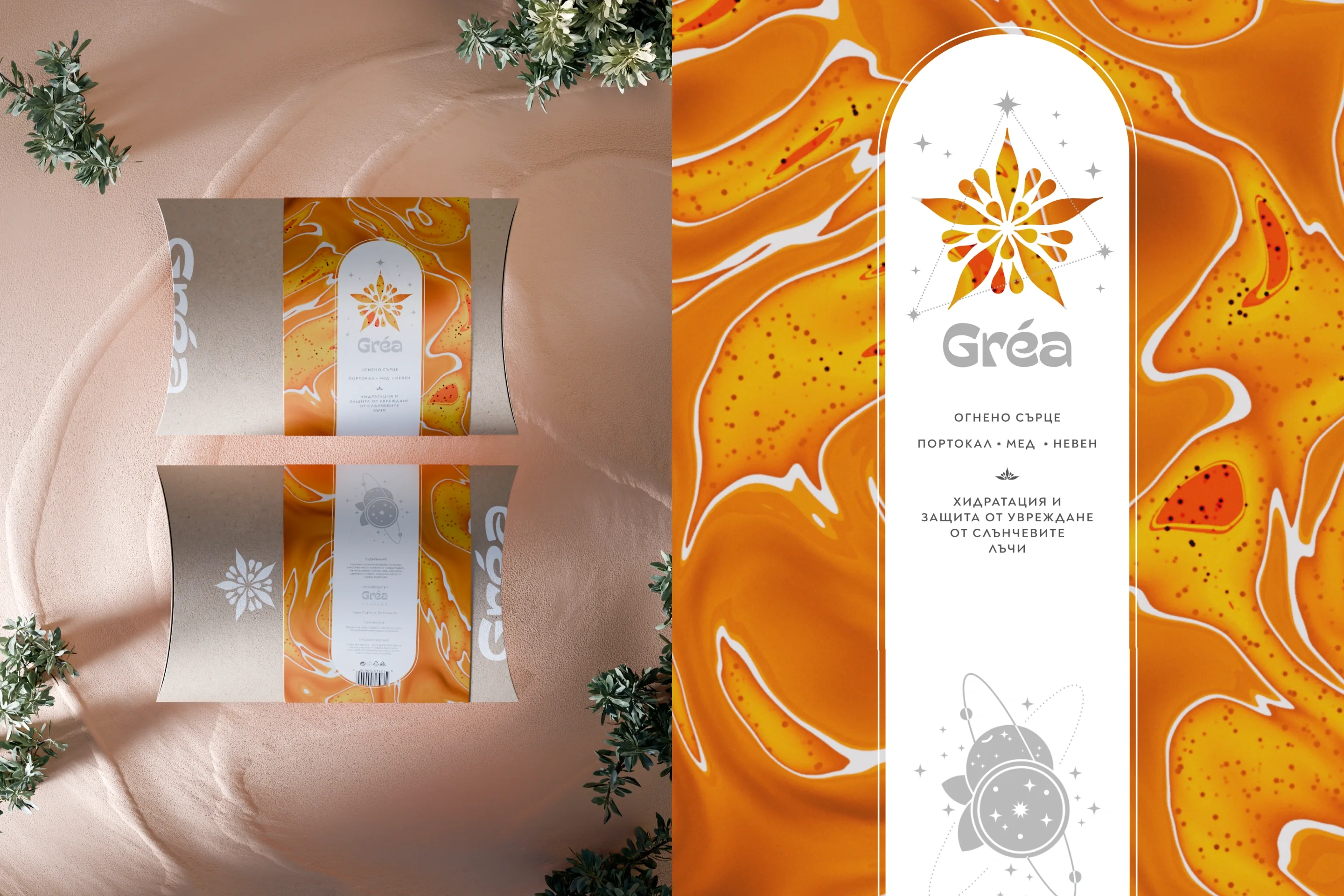
Gréa Soapery
THE SITUATION
Gréa Soapery is a handmade soap brand from Sofia. In a saturated natural-cosmetics market, the brand needed a name and an identity that would carry the senses into another dimension.
WHAT WE DID
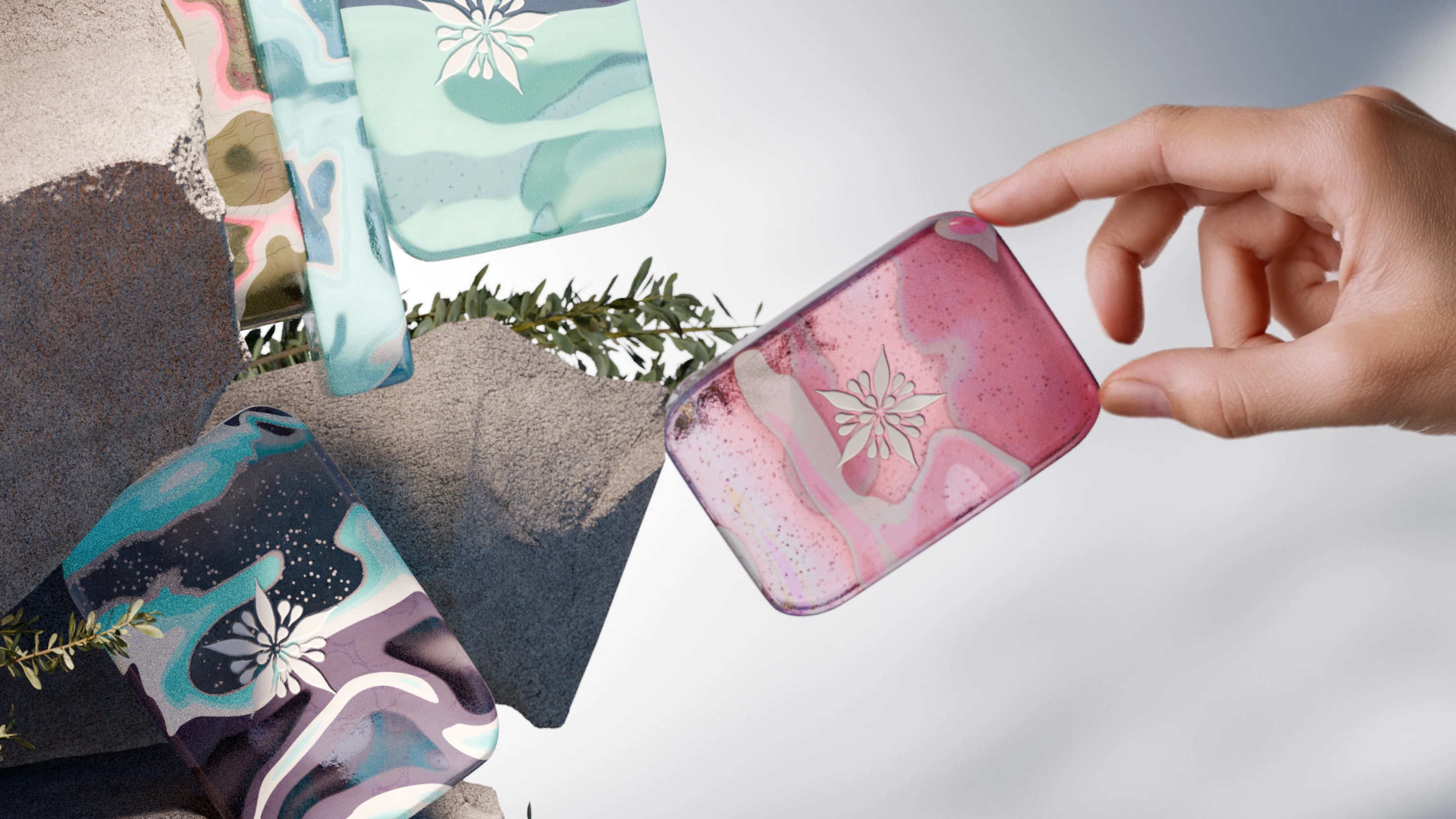
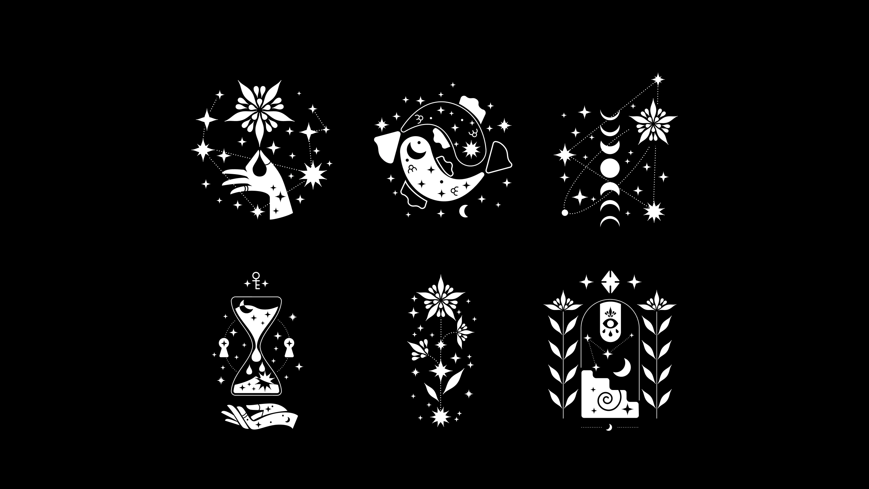
We created the name, the brand strategy and the visual identity, with packaging suited to the different recipes. Ethereal colour and texture and delicate typography turn every soap into a small sensory experience.
TEAM
Art direction: Alexander Petrov · Brand strategy: Atanas Dzhingarov · Graphic design: Radimira Yordanova, Selen Petkova, Martin Mihaylov
THE RESULT
The brand launched with a complete identity and a packaging range that sets Gréa apart on the shelf and across digital channels.