Branding and packaging design for a functional coffee — market-ready in 3 months and an official selection at Zagreb Design Week
BOOM! Coffee
THE SITUATION
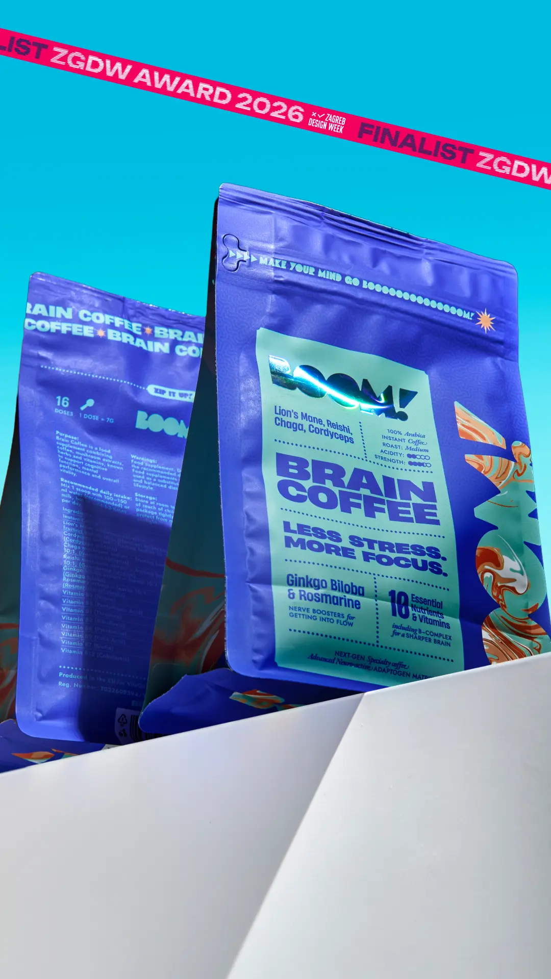
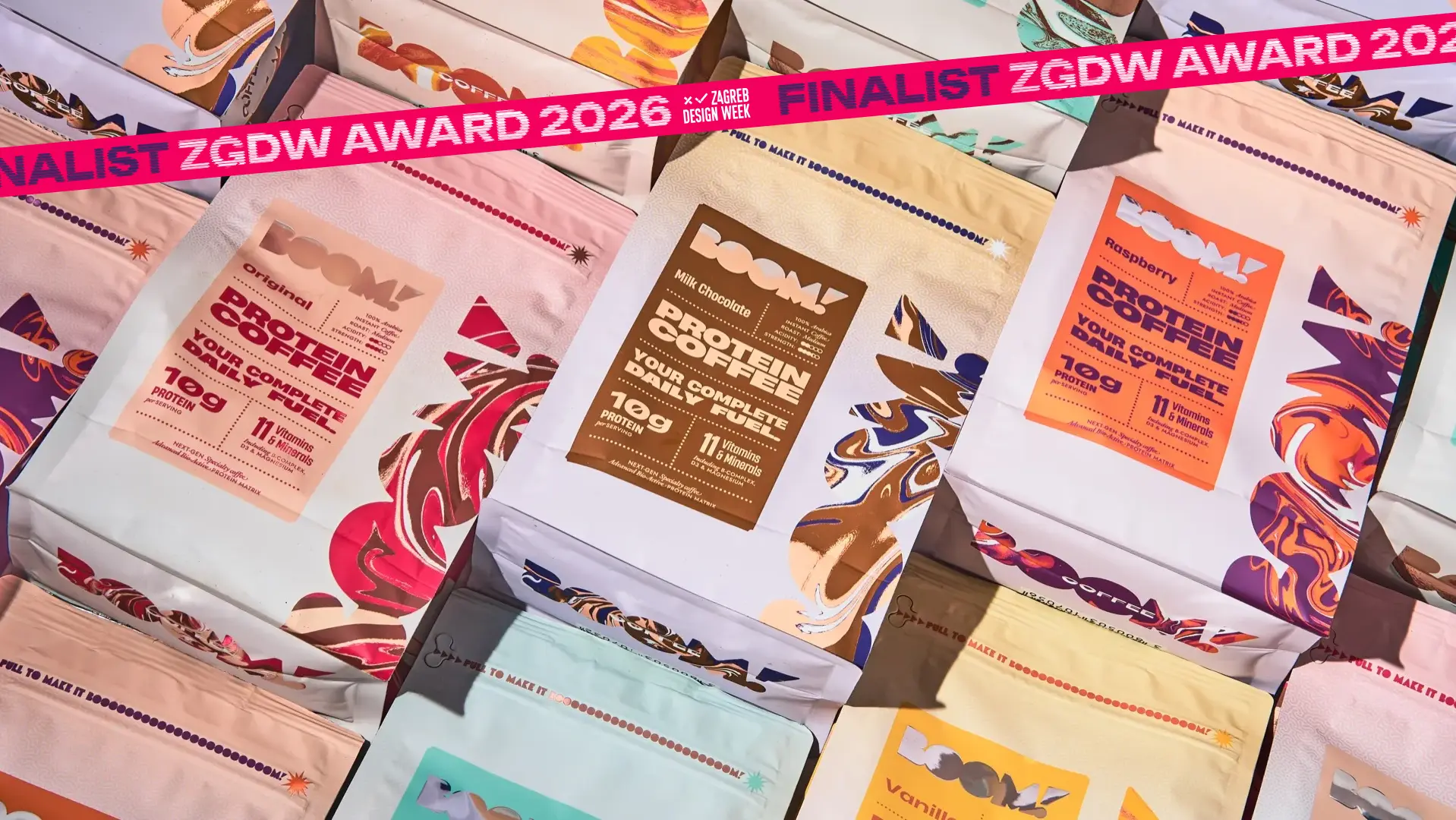
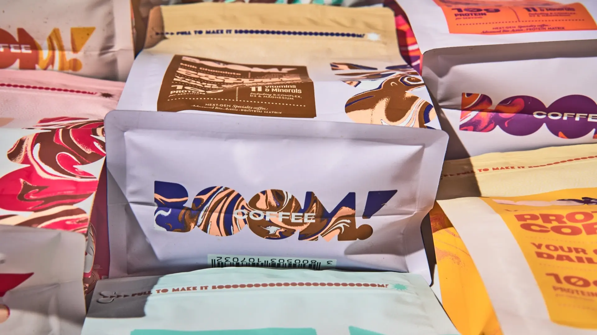
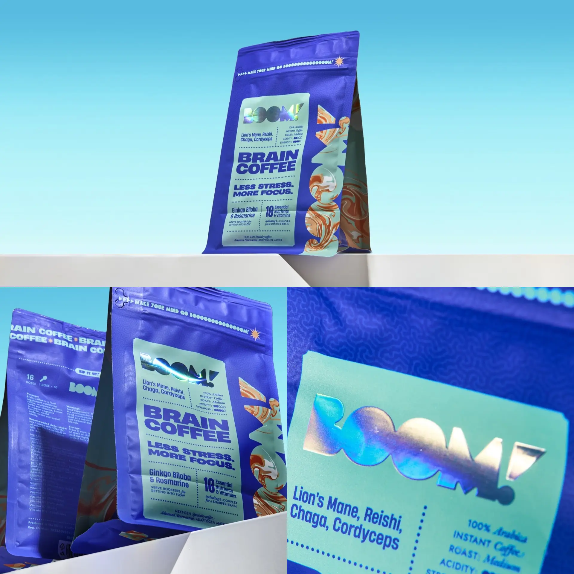
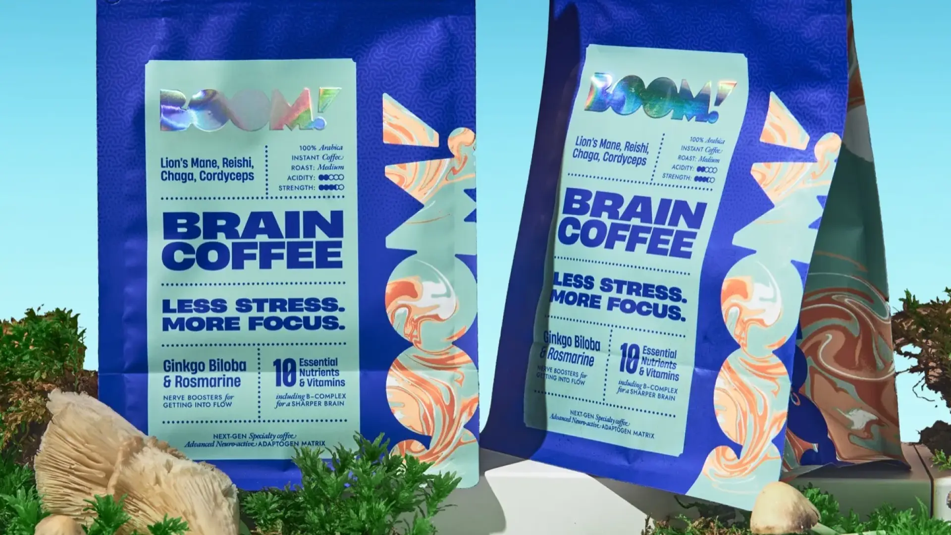
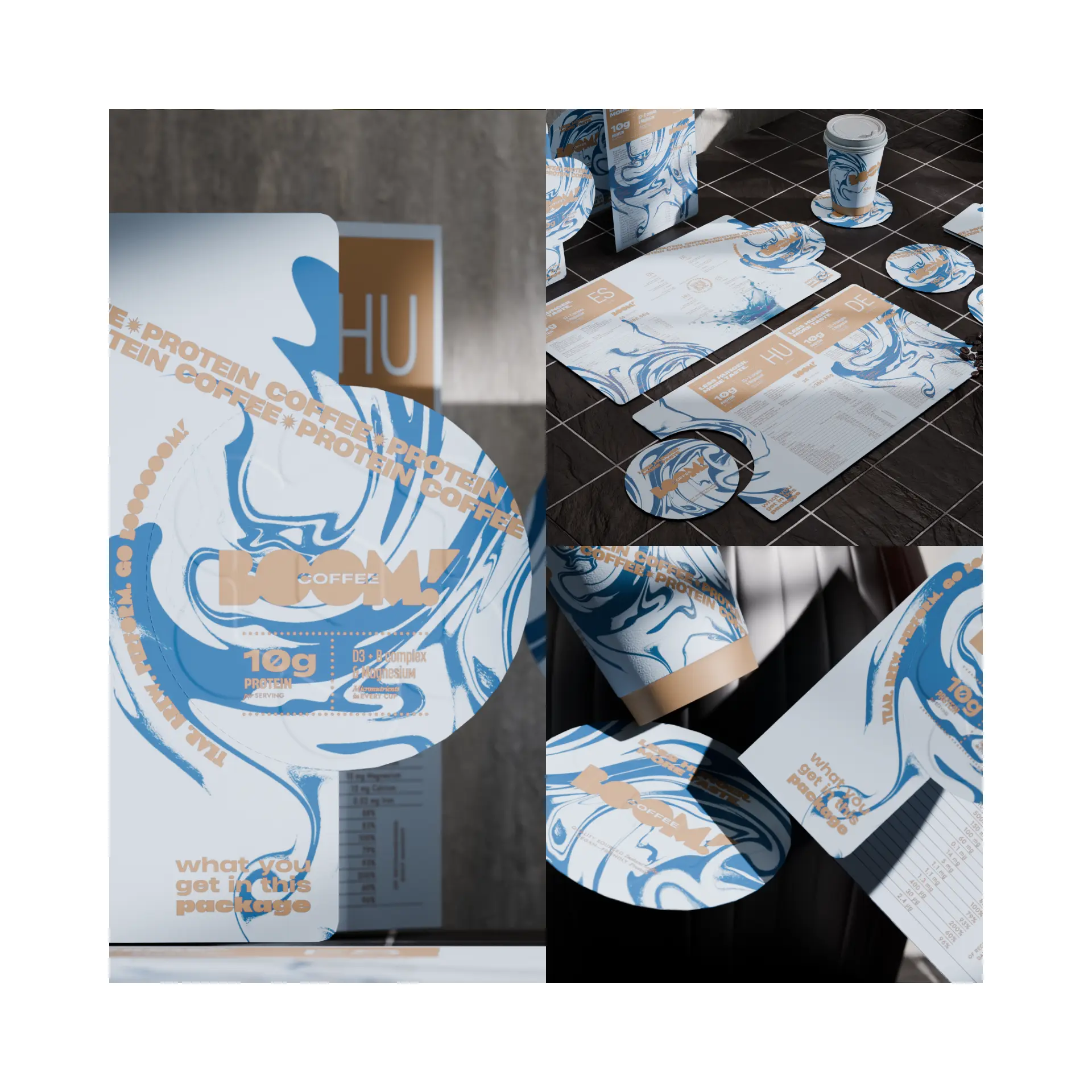
BOOM! Coffee is a new functional coffee brand with two lines: Brain Coffee, with adaptogenic mushrooms — lion's mane, reishi, chaga and cordyceps — and ginkgo biloba, and Protein Coffee, with 10 g of protein per serving. The founders had a concept for the product, but no clear brand positioning or visual identity — let alone a name — to present it to people for whom an ordinary cup of coffee is no longer enough.
WHAT WE DID
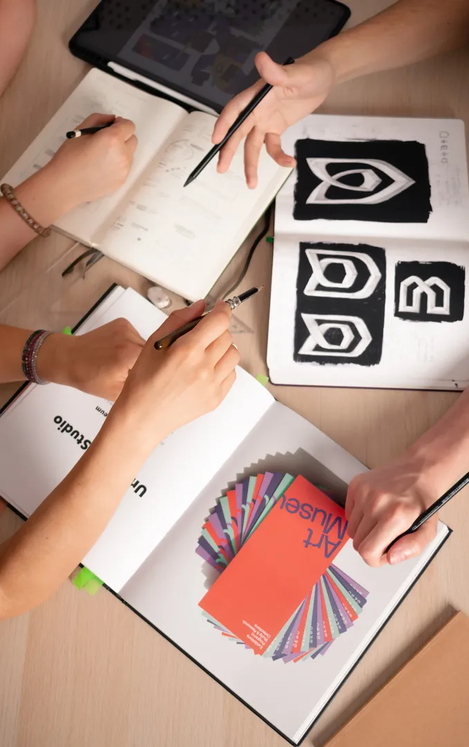
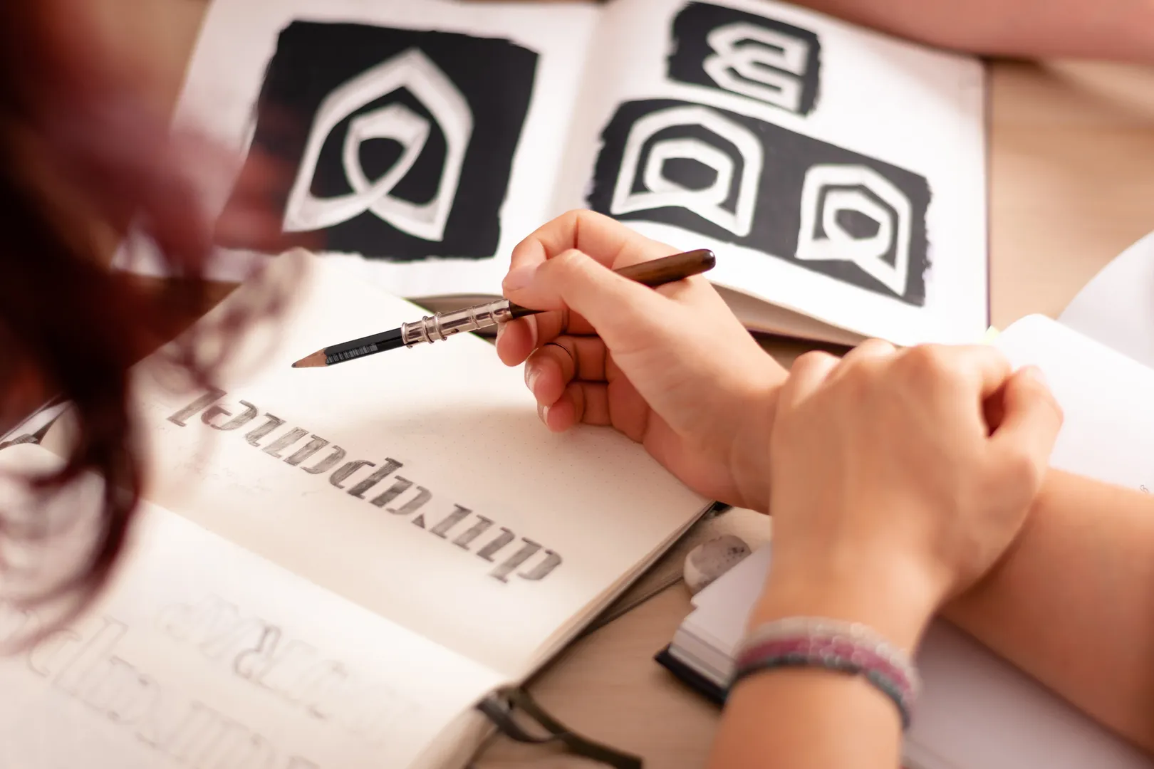
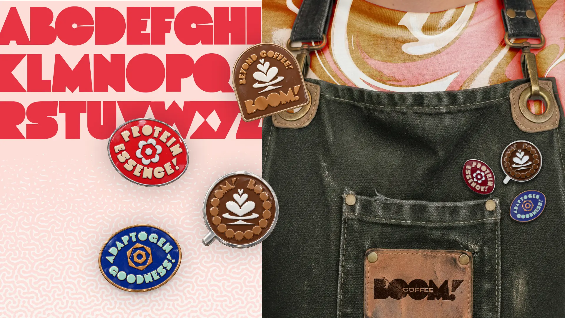
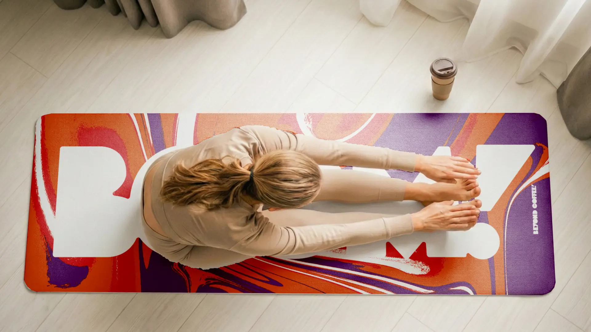
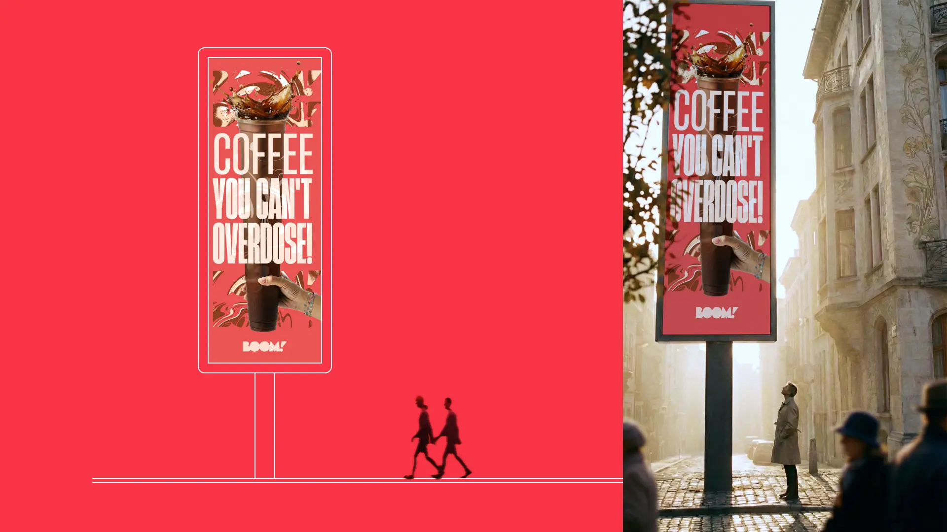
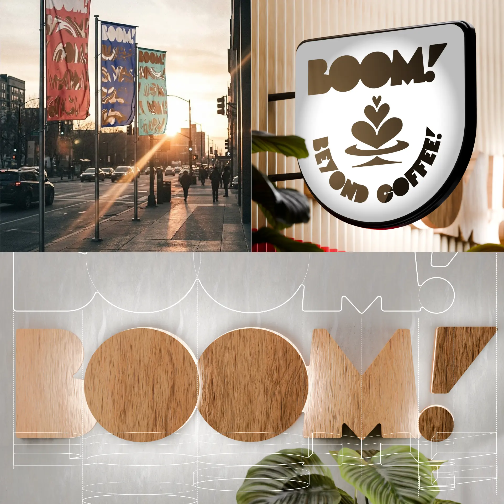
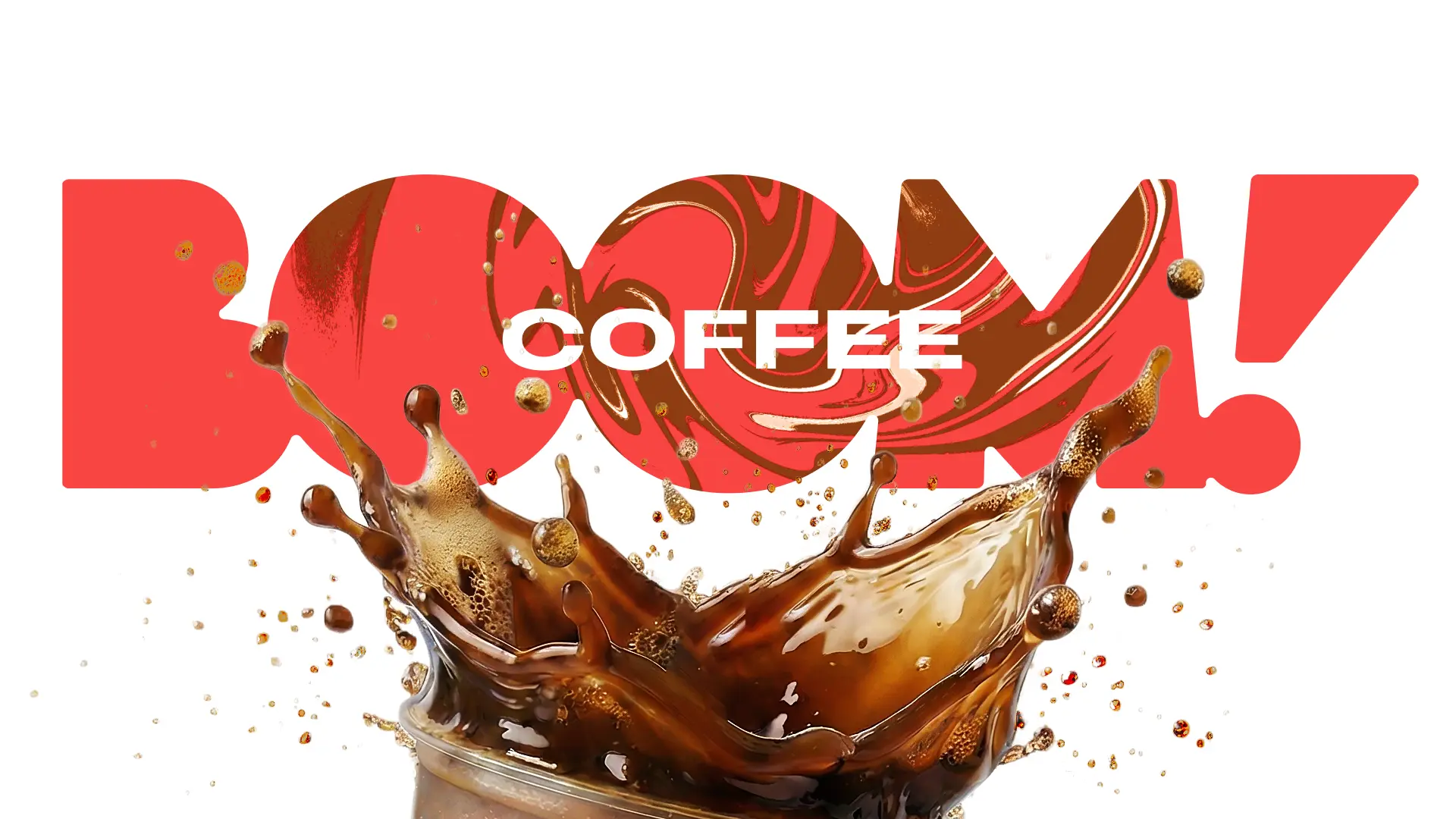
We started with a strategy sprint: personas, values and positioning, distilled into one sentence — an unexpected sip of adventure for alternative coffee enthusiasts, without the limits of an ordinary cup of coffee. In the naming sprint we went through hundreds of options, and BOOM! was the final choice because it captures the brand's central promise briefly and clearly: coffee that brings focus, health and an explosion of flavour in one. The identity uses a bold, recognisable colour scheme alongside organic textures that feel appetising. The visual presence is completed by blocky, contemporary and legible typography that gives the health-conscious shopper all the information they need at a glance at the shelf. For accent text blocks we created a custom geometric typeface based on the BOOM! logotype, used both on the packaging and across the brand's digital presence. As a final accent, the packaging carries a logo in glossy or holographic foil and refined micro-textures that invite everyone to touch the pack and take a closer look.
TEAM
Brand strategy and naming: Alexander Petrov · Creative direction: Alexander Petrov · Packaging design: Alexander Petrov · Product photography and stop motion: Katrin Staneva
THE RESULT
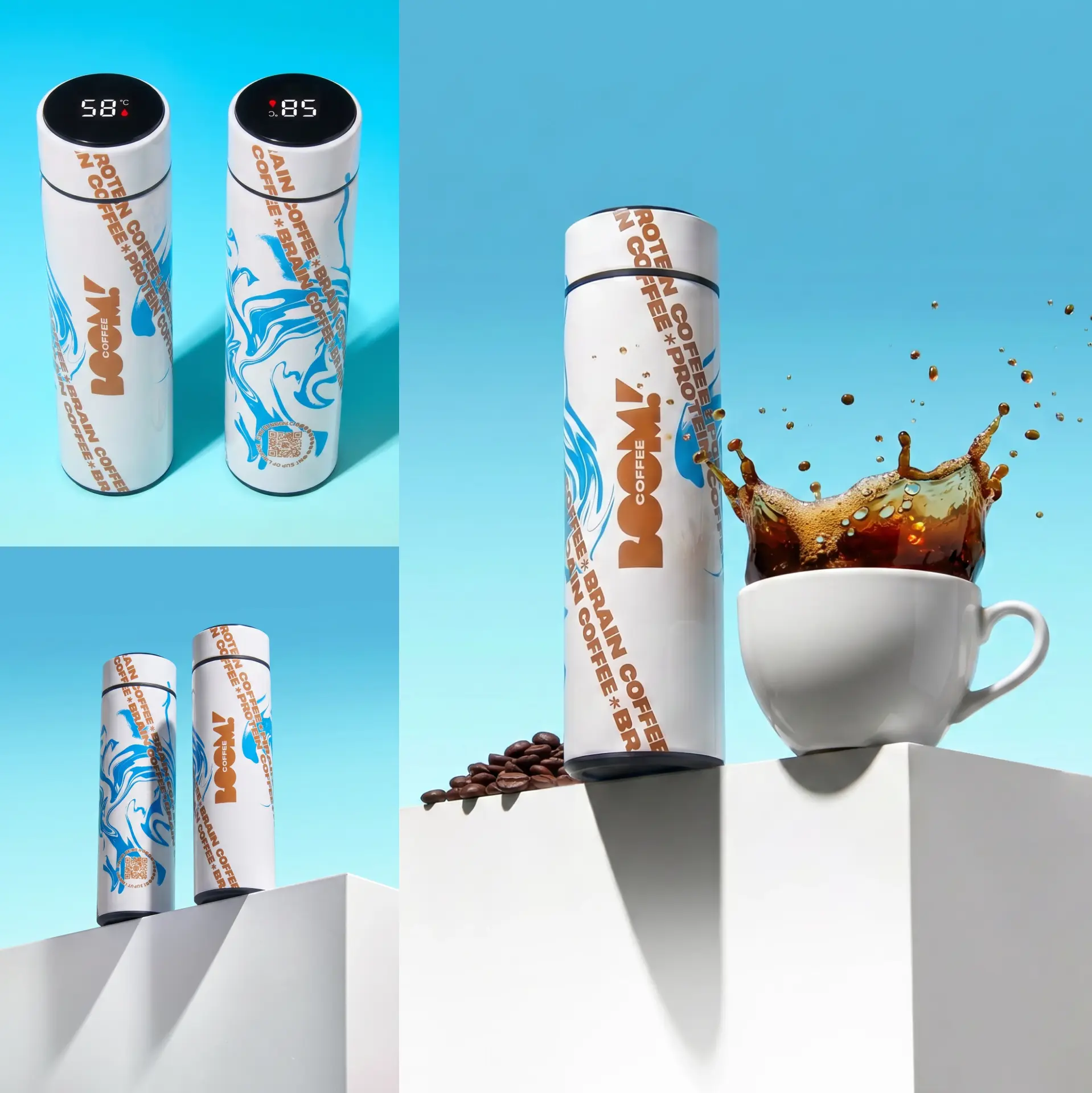
BOOM! started as a simple idea and reached the market as a complete brand — from strategy and name to packaging for 6 SKUs and a range of brand applications — in just 2–3 months. As a result of the design, the packaging became part of the official selection for the Zagreb Design Week 2026 awards.
WORDS FROM THE CLIENT
We had worked with Embrand before, so we came back without hesitation for BOOM! Coffee. We knew we would get a professional attitude from the first to the last conversation, and that is exactly what we got. The result is a brand with a clear concept and a finished visual identity, ready for the market in record time.
Georgi Georgiev — Co-founder @ BOOM! Coffee